Project Background
Course Features
Published Sample
Why does this course work?
What was my role?
Project Background
This organization had a new line of mosquito control products coming out. They needed a course that would teach their salespeople all about it so they could hit the ground selling.I was given a draft of the product brochure and some tech specs, and that was about it. Time was of the essence, since mosquito season was just about to get good, so I sprang into action.
Course Features
Here are some of the features I included in the course design, along with why I included them and the benefits they provide.
 1. A Go-Get-‘Em Introduction
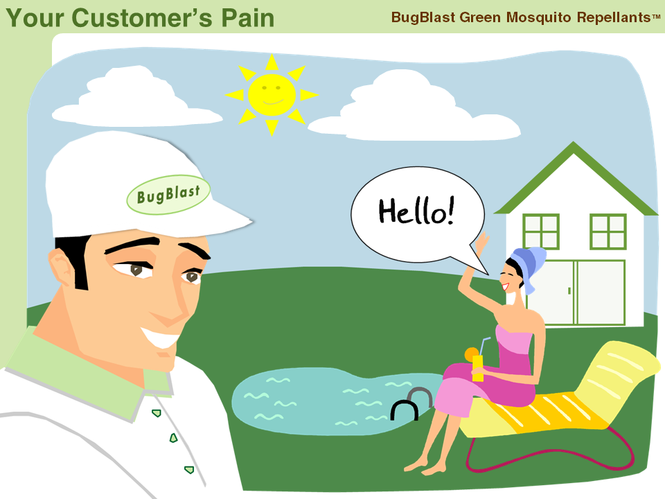
At the top of the course I quickly introduce the new products and show the learners/salespeople why they should personally care about them.
Benefit: This acts as a peppy overview of the product line and sets the stage for an upbeat course. It also graphically demonstrates the consumer need that’s out there, and that these learners can be heroes (and make some money!) by bringing it to their customers’ attention.
 2. Learning the Product in the Context of the Sales Process
Fortunately, I was well-acquainted with this company’s sales process. Once I decided to teach learners about this product line within the framework of that process, it really came together.
Benefit:For these learners, the sales process is the framework they work in all day every day. By teaching them about these products using this familiar path, it helps give them an easy place to file the new information in their heads.
 3. Reveling in the Sales Materials
Since the only sales tool available was the 4-page product brochure I exploited every image, every tech spec, every feature, and every molecule of information in it and used it at every opportunity throughout the course.
Benefit: There were several benefits to this. First, learners discovered almost everything they needed to know about these products in order to sell them. Second, they learned exactly how to use the brochure as part of the sales process. Third (and this one’s for me) in the absence of any other information or visuals, it was a piece of realia that really perked up the course.
 4. Simplified Information
I put some product information and operating instructions into simple interactions, which was a nice way to house it, but I kept visuals big and text minimal; just like the rest of the course.
Benefit: It just keeps it simple. Learners are already trying to take in a ton of information, and presenting them with just enough to expose them to the essential ideas they needed was all that was necessary. I could have written dense pages of text, but no one can memorize all of that – and they don’t want to. If they need that much text, they should be given a job aid or help site to refer to.
Published Sample
Here’s a small clip of the course so you can get an idea of the tone, pacing, narration, and overall presentation as the learner sees it.
 Why does this course work?
- Effective Context: I presented the entire course within the framework of the company’s sales process, which is second nature to these learners. This helps them not just learn about the products, but also shows them how they can easily sell them each day.
- The Right Materials: By exploiting the heck out of the product brochure, these learners couldn’t help but know it inside and out by the end of the course. That leads to a confident, well-informed salesperson, and that leads to sales.
- Motivation: From the first moment of this course I showed them that there’s a real need for this product, and that they could directly benefit from it.
- Results: When this course was released, the salespeople and their managers loved it, and the products flew off the shelf so quickly they had a lot of trouble keeping up with demand.
 What was my role?
- Instructional Designer: I designed the entire course. I chose to make it motivating, relevant, visually attractive, and easy for learners to apply the information to their daily lives as salespeople.
- Course Developer: I developed it in Articulate Studio ’09.
- Writer: I wrote the introduction, all of the information about how these products fit into the sales process, and information about how to use the pieces and parts of the brochure. I also organized and wrote the technical information to be simple and understandable.
- Visual Designer: I designed and developed all of the graphics. The brochure and product images were provided by the client.
- Voiceover Artist: That’s me!
