This week’s Articulate ELH Challenge is to create a responsive course in Rise, Articulate 360’s browser-based tool that lets you quickly create learning that looks great on any device.
The Idea
Since quick reference (QR) guides are usually better when they’re mobile-ready – and since I wanted to compare creating a course in Storyline versus creating one in Rise – I decided to make over an earlier ELH challenge where I used Storyline to make a guide for treating bee stings.
Here’s what I learned about the differences in designing, developing, managing output, and the user experience after comparing Storyline 2* and Rise.
(*Storyline 360 is a more current version of Storyline – and it has phenomenal mobile output – but since I created the original in SL2, I’m using that as my point of comparison.)
Designing
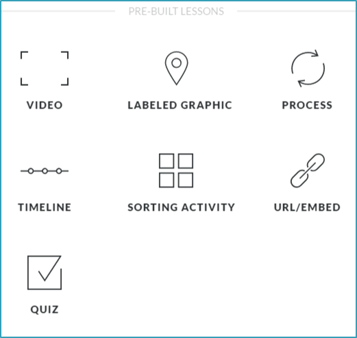
Rise’s Pre-Built Lessons
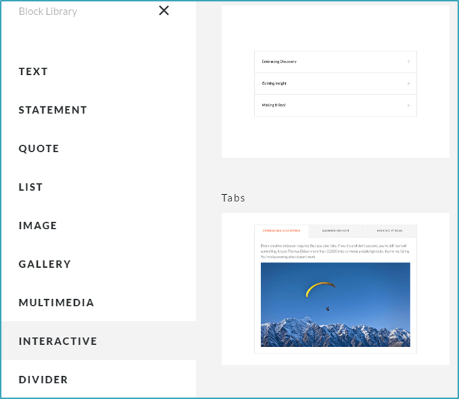
Rise’s Block Lesson Options
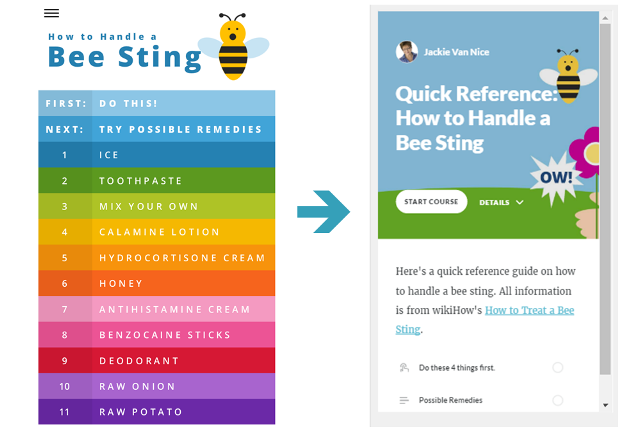
Old Versus New Menus
Unlike Storyline, where you’re working with a do-whatever-you-want blank stage, designing a presentation in Rise relies on understanding exactly what your built-in options are.
There are currently 7 “pre-built” lessons (video, labeled graphic, process, timeline, sorting activity, URL/embed, and quiz) – and customizable lessons you can build with 9 types of “blocks” (text, statement, quote, list, image, gallery, multimedia, interactive, and divider).
For me, working with the available options meant making changes from screen one. In Storyline I had a context-setting intro animation followed by a colorful animated menu, but those would need to be adapted.
For the cover images, I reworked mine to adapt to Rise’s cover image field. My result is OK – but if I were starting from scratch I’d simply use one of Rise’s built-in cover images. There are scads to choose from, they’re beautiful, and they look great on every device.
My menu was automatically replaced with Rise’s economical built-in lesson menu, which is hard to beat for efficiency and responsiveness.
If I wanted a more immersive intro I could have added an introductory lesson with additional images and blah-blah, but restricted myself to making over the same content and keeping it to just 2 lessons to make it the most concise I-just-got-stung-by-a-bee QR guide possible.
That decision – to only have 2 lessons – drove the rest of the design.
Developing
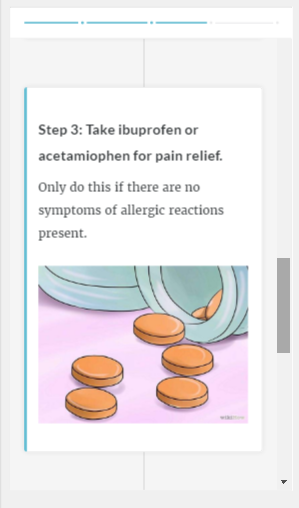
Rise lesson 1 timeline in phone view: Progress bar at top, swipe or scroll, tap to zoom images.
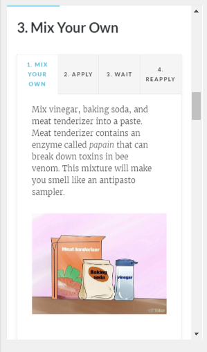
Rise lesson 2 tabs interaction in phone view: Progress bar at top, swipe or scroll, tap to zoom images.
Lesson 1: I used the pre-built timeline lesson because it allows the user to scroll through the 4 immediate steps for a bee sting. I think it works well and it was suuuuuuuuuuuper quick to build once I got through my design dilemmas above and played with a few lesson options.
By the way, you can easily preview your course on any device as you make development decisions, which is a huge help.
Lesson 2: I used customizable blocks to build one lesson with 11 bee sting remedies along with their steps.
The blocks I used for each remedy were a text headline and a tab interaction. Being able to copy and reuse those blocks made development seriously speedy.
Output
Currently your output options are to share a (password protect-able) Web link to your course in Rise or download LMS or Web-ready files to host on your own server. All options are easy as pie.
User Experience
Of course the Rise experience is exactly what you’d want a mobile experience to be: Responsive, simple, and beautiful. My original Storyline 2 version works well in mobile – but you have to tap on the hot spots (no swiping), there’s no progress bar, and it’s not going to be ingeniously responsive when changing screen orientation.
Ready to Rise?
I actually loved working in Rise and I’m reeeeeeally looking forward to creating a Rise course that lets me take full advantage of its high-res image handling and some of its more creative options than this self-imposed makeover challenge allowed.
You can see my super-simple QR guide in Rise right here – and if you need to quickly and easily create straightforward, responsive learning for desktop or mobile – Rise could be a great option!