Project Background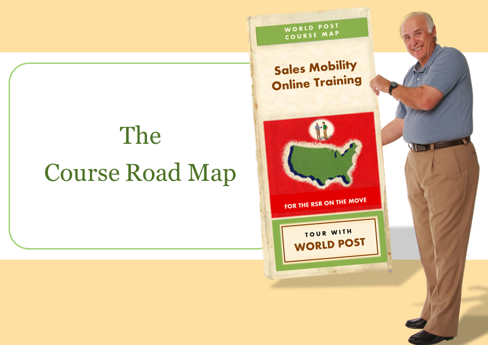
Course Features
Published Sample
Why does this course work?
What was my role?
Project Background
My client needed to train new employees on their sales mobility software and hardware. Their existing online training was abysmal, featuring:
- No audio and painfully slow pacing.
- No images beyond software screen captures and bullet points.
- No context or instruction to indicate why, when, or how the software should be used.
- No user control, no flexibility for different levels of knowledge, no opportunities for learners to practice, and no opportunities for learners to test their understanding.
With my job cut out for me, I got to work.
Course Features
Here are some of the features I included in the course design, along with my reasons for including them and the benefits they provide.
1. Many Short Lessons = One Big Course
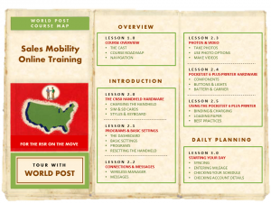
I split the content into 16 shorter lessons, each of which contained two or three tasks. Since the course was intended for salespeople who are always driving on the road, I went with an old-fashioned on-the-road theme and made a table of contents that showed the details of all 16 lessons, and made it look like an old road map.
Benefit: The shorter lessons let users get in and out more quickly. For new employees, this keeps them from being overwhelmed with too much new information all at once. For more experienced employees, they can refresh their knowledge by dipping into the exact lesson they need to see. And the map, the design of which they love, helps them quickly find the lessons they need.
2. Lessons Put in the Context of the Learner’s Day
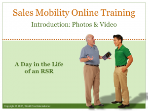
I knew context would be key to making this a successful course. I placed the learner in a position that replicates him using this mobile device each day, literally from the time he wakes up in the morning to the time he goes to sleep at night. It’s also presented in the context of the company’s sales process.
Benefit: By presenting information this way, the learner is able to much more easily take it in and successfully apply it on the job. It also keeps the learner highly motivated, since this becomes a sneak peek into what his life is going to be like as he uses this mobile sales device each day.
 3. Freedom of Navigation
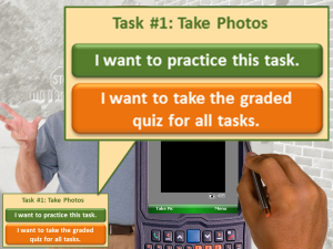
Not only do learners have the freedom to pick the lessons they’d like to see, but once they’re in a lesson they always have the option to jump ahead to practice a task, or try the graded quiz for all tasks – or wander anywhere else they’d like in the lesson, for that matter.
Benefit: Since we most easily learn the information we seek out ourselves, giving learners the freedom to move where they want and when they want simply helps them learn. A new user of this device may prefer to challenge himself by jumping ahead to practice a task before it’s presented, then jump back and see the presentation itself. A more experienced user might decide to try the graded quiz first, then go back and review the things he missed. No matter what, that freedom is empowering, and who doesn’t want their salespeople to feel empowered?
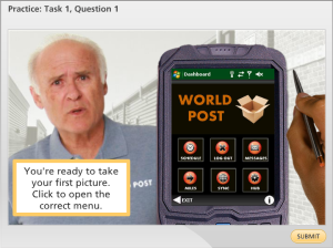
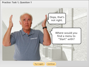 4. Lots of Practice
Especially with software, there’s no substitute for hands-on practice. I designed practice exercises for each task that learners can repeat as many times as they’d like.
Benefit: Not only does free practice let the learner try out the task, but the appropriate (and sometimes silly) feedback helps him remember the right answer. Even if you can’t remember the right answer later, there’s a good chance you’ll remember the corny hint and figure it out. Free practice is also non-threatening and, as its name suggests, freeing.
 5. Sense of Humor
Not many courses will show a salesperson peacefully snoring away in bed after having synced his mobile device in preparation for the next day, or taking pictures of his boss in a variety of compromising positions. But I did.
Benefit: For me, if I’m taking a buttoned-down, joyless course I have a terrible time paying attention. Everyone likes a little humor thrown in. When we first gave a sneak peek of this course to managers during a meeting, they laughed and hooted and loved it. Why wouldn’t they? All it takes is a touch of in-context fun to lighten the load (your learner’s cognitive load, in this case) and make the information easier to digest.
Published Sample – Short Demo
Here’s a small sample of the course so you can get an idea of the tone, pacing, narration, and overall presentation.
Published Sample – Full SolutionFest Entry
Here’s the full version I showed at the eLearning Guild’s SolutionFest in 2013, where it was received quite well. You can read more about the entry right here.
 Why does this course work?
- Context: The entire course, from initial introduction to the device all the way through closing a sale, is shown from the point of view of the learner when he’s on the job. Whether chatting with a prospect or meeting with his manager at a diner to check in during the day, the situations are all real. This makes it much easier for learners to understand and apply an enormous amount of information to their jobs.
- Flexibility: Especially in a software course, learners are going to have different levels of experience and comfort with technology in general, and this software specifically. The only way to teach it without frustrating the learner is to offer the freedom to let them find their level and go from there.
- Humor: There is a ton of information in this course. The topic is software, but because of the context, it’s instructive about what a new hire’s job is going to look like each day. Without humor, not only is the software information going to be tougher to take, but the new hire is going to wonder why his days ahead look like they’re going to be so grim.
- Results: Feedback from every salesperson and sales manager has been spectacular. Yes, it’s more visually interesting and creative than anything they’ve had before, but it’s more than that. The context is on the nose, using the software is clearly demonstrated, and learners have the chance to practice their moves as much or as little as they need to. Learners are shown respect by allowing them the freedom of movement to find the information they need. It’s a flat-out success.
 What was my role?
- Instructional Designer: To make the information “stick” I chunked this course into smaller, targeted lessons and organized and presented them in the context of a salesperson’s day and the company’s sales process. I also designed the flexible navigation and free practice features so that learners could feel more like masters of their own training destinies. Basically, I designed the whole course.
- Course Developer: I developed it in Articulate Studio ’09. Articulate Storyline was just being released as I started the development process, but the client wasn’t ready for it at that point. Dan Sweigert also did a lot of work in the development process.
- Writer: I took what was essentially software documentation and turned it into training that was easy and conversational in tone. Then I threaded it into scenarios I wrote in order to give the tasks real-world meaning.
- Visual Designer: I designed and developed all of the graphics with the assistance of Dan Sweigert, who worked on development. Some of Dan’s visual gems include the riding-in-the-car scenes and the at-home scenes.
- Voiceover Artist: That’s me!
