• Skip to primary navigation
  • Skip to main content
  • Skip to primary sidebar

Jackie Van Nice

E-Learning Goodness by Jackie Van Nice

  • Home
  • About
  • Blog
  • Portfolio
    • Articulate’s ELH Challenges
    • Sales Mobility Software
    • Product Sales
    • Sexual Harassment
    • Code of Conduct
  • Freebies
    • Free Storyline Templates
    • Free PowerPoint Templates
    • Free Images
    • Freelancing Tips
    • Free Resources to Help Get Started in eLearning
  • Work With Me
  • Contact

Quick Reference

When Postcards Need Glossaries

May 14, 2018 By Jackie Van Nice 2 Comments

Select Image to Launch Demo

Select Image to Launch Demo

This week’s Articulate ELH Challenge is to create an example of a glossary for e-learning. I’ve been meaning to make one lately, so this was a good chance to play.

The Idea

People have done some wonderfully creative interactions for this challenge that you can check out here. In my case I wanted to create an über-practical glossary that was incredibly quick to build, easy to maintain, and that could handle a lot of entries. Oh, and my example helps decode German idioms used by someone visiting Bali.

The Design

Back of the Postcard

Back of the Postcard

The Postcard

The postcard itself is straightforward: A front-of-postcard screen and a back-of-postcard screen. On the back of the postcard there’s an instruction to hover over/select underlined text to see its meaning. When you do, a lightboxed glossary slide is displayed.

The Glossary

Inserted Table Lightboxed Glossary

Inserted Table Lightboxed Glossary

The glossary itself is built using an inserted Storyline 360 table; a feature I love. In this example I only have a few glossary entries, but for more you could either place a longer table into a scrolling panel, or you could use multiple glossary screens with lightbox navigation to jump between them.

The Result

Ready to see which German idioms cause vacation confusion? See the glossary that straightens it all out in this air mail special delivery interaction!

Filed Under: E-Learning Tagged With: Articulate 360, Articulate Storyline, Community, E-Learning Design, ELHChallenge, German, Glossary, Instructional Design, Languages, Quick Reference, Show Your Work, Storyline 360, Tables, Visual Design

From Articulate Storyline to Rise: It’s A Makeover!

December 11, 2016 By Jackie Van Nice Leave a Comment

Click Image to Launch Rise Demo

Select Image to Launch Rise Demo

This week’s Articulate ELH Challenge is to create a responsive course in Rise, Articulate 360’s browser-based tool that lets you quickly create learning that looks great on any device.

The Idea

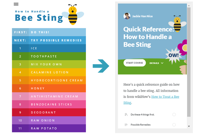
Since quick reference (QR) guides are usually better when they’re mobile-ready – and since I wanted to compare creating a course in Storyline versus creating one in Rise – I decided to make over an earlier ELH challenge where I used Storyline to make a guide for treating bee stings.

Here’s what I learned about the differences in designing, developing, managing output, and the user experience after comparing Storyline 2* and Rise.

(*Storyline 360 is a more current version of Storyline – and it has phenomenal mobile output – but since I created the original in SL2, I’m using that as my point of comparison.)

Designing

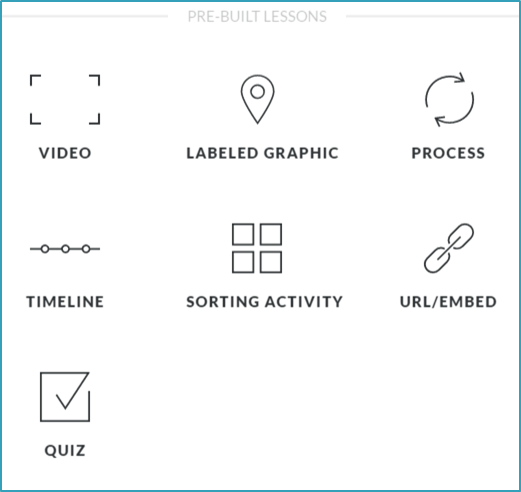
Rise's Pre-Built Lessons

Rise’s Pre-Built Lessons

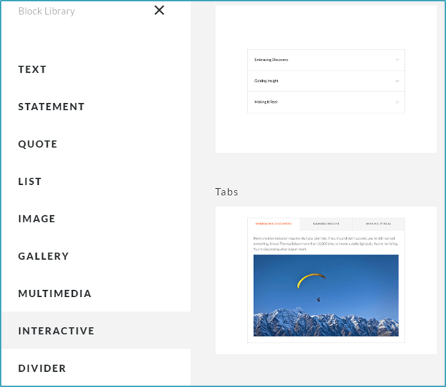
Rise's Block Lesson Options

Rise’s Block Lesson Options

Old Versus New Menus

Old Versus New Menus

Unlike Storyline, where you’re working with a do-whatever-you-want blank stage, designing a presentation in Rise relies on understanding exactly what your built-in options are.

There are currently 7 “pre-built” lessons (video, labeled graphic, process, timeline, sorting activity, URL/embed, and quiz) – and customizable lessons you can build with 9 types of “blocks” (text, statement, quote, list, image, gallery, multimedia, interactive, and divider).

For me, working with the available options meant making changes from screen one. In Storyline I had a context-setting intro animation followed by a colorful animated menu, but those would need to be adapted.

For the cover images, I reworked mine to adapt to Rise’s cover image field. My result is OK – but if I were starting from scratch I’d simply use one of Rise’s built-in cover images. There are scads to choose from, they’re beautiful, and they look great on every device.

My menu was automatically replaced with Rise’s economical built-in lesson menu, which is hard to beat for efficiency and responsiveness.

If I wanted a more immersive intro I could have added an introductory lesson with additional images and blah-blah, but restricted myself to making over the  same content and keeping it to just 2 lessons to make it the most concise I-just-got-stung-by-a-bee QR guide possible.

That decision – to only have 2 lessons – drove the rest of the design.

Developing

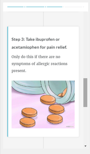
Rise lesson 1 timeline in phone view: Progress bar at top, swipe or scroll, tap to zoom images.

Rise lesson 1 timeline in phone view: Progress bar at top, swipe or scroll, tap to zoom images.

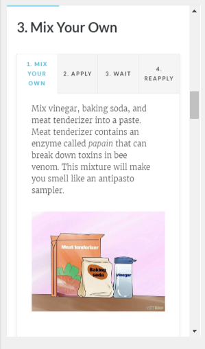
Rise lesson 2 tabs interaction in phone view: Progress bar at top, swipe or scroll, tap to zoom images.

Rise lesson 2 tabs interaction in phone view: Progress bar at top, swipe or scroll, tap to zoom images.

Lesson 1: I used the pre-built timeline lesson because it allows the user to scroll through the 4 immediate steps for a bee sting. I think it works well and it was suuuuuuuuuuuper quick to build once I got through my design dilemmas above and played with a few lesson options.

By the way, you can easily preview your course on any device as you make development decisions, which is a huge help.

Lesson 2: I used customizable blocks to build one lesson with 11 bee sting remedies along with their steps.

The blocks I used for each remedy were a text headline and a tab interaction. Being able to copy and reuse those blocks made development seriously speedy.

Output

Currently your output options are to share a (password protect-able) Web link to your course in Rise or download LMS or Web-ready files to host on your own server.  All options are easy as pie.

User Experience

Of course the Rise experience is exactly what you’d want a mobile experience to be: Responsive, simple, and beautiful. My original Storyline 2 version works well in mobile – but you have to tap on the hot spots (no swiping), there’s no progress bar, and it’s not going to be ingeniously responsive when changing screen orientation.

Ready to Rise?

I actually loved working in Rise and I’m reeeeeeally looking forward to creating a Rise course that lets me take full advantage of its high-res image handling and some of its more creative options than this self-imposed makeover challenge allowed.

You can see my super-simple QR guide in Rise right here – and if you need to quickly and easily create straightforward, responsive learning for desktop or mobile – Rise could be a great option!

Filed Under: E-Learning, Front Featured Tagged With: Articulate 360, Articulate Rise, Articulate Storyline, E-Learning Design, ELHChallenge, Makeover, Quick Reference, Show Your Work

How Long Does It Take To Create E-Learning?

January 8, 2016 By Jackie Van Nice 14 Comments

Select Image to Launch Demo

Select Image to Launch Demo

This week’s challenge is to share an instructional design cheat sheet, job aid, or reference you use in your work.

The Idea

The Chapman Alliance Study

The Chapman Alliance Study

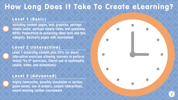
I alllllllllways refer to this Chapman study on how long it takes to create e-learning every time someone approaches me about a project. Since that makes it my most-used reference piece by far, I thought I’d translate it into a zippy little interaction that might even be a tad easier to follow than the original.

The Design

Since the study is focusing on hours, I thought it would be smart to build it around the image of a clock.

Once I found a flat design clock I liked, I added Chapman’s three primary levels of e-learning design to the main slide and used layers to animate the hour estimates for each level onto the clock face itself.

After that I used lots of triggers to make the interaction as intuitive and user-friendly as possible, both visually and functionally, and added a lightboxed slide to provide more detail about the study that also links back to the original.

The Result

As much as I love the original info from Chapman, I’ll no doubt point to this one more. If you’d like to see it in action, you can start estimating your e-learning project hours right here!

Filed Under: E-Learning, Working for Yourself Tagged With: Articulate Storyline, E-Learning Design, ELHChallenge, Freelancing, Instructional Design, Professional Development, Quick Reference, Show Your Work, Visual Design

Taking the Sting Out of Medical Training

February 10, 2015 By Jackie Van Nice 4 Comments

Select Image to Launch Demo

Select Image to Launch Demo

This week David Anderson challenged us to present a bit of medical training. Good thing this e-learning doctor is “in”.

A Quick-Reference App

I liked the idea of addressing something relatively simple – like a bee sting – and if you need that kind of info you want it quickly and on-the-go.

I kept picturing something app-like that would work well on my iPhone, so that’s where the screen size, orientation, and much of the navigation came from.

Speeding Things Up

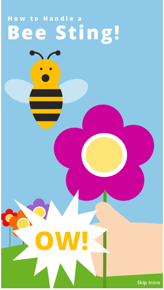
I’d originally pictured more animations and transitions, but chose to let you get to the information more quickly rather than waste time waiting for extras like that. You’ll notice there’s even a “Skip Intro” option so you can go straight to the remedies.

The Content

All of the how-to images and written information came from Wiki How’s How to Treat a Bee Sting. In my demo I give credit and link to their post in the main menu.

I made all of the pictographs for the intro by creating shapes in PowerPoint and saving them as PNGs that I brought into Storyline as pictures, with a few added shapes I created right in Storyline.

My Bee

My Bee

The Result

You’re welcome to try it out and enjoy my pictogram bee, too! He didn’t mean to do anything wrong. He’s just an innocent guy putting in a hard day’s work among the flowers.

This works great on my iPhone, by the way. I’m very happy (appy?) with it. I hope you like it, too!

Filed Under: E-Learning Tagged With: Articulate Storyline, Context, E-Learning Design, ELHChallenge, Emotional Engagement, Instructional Design, Mobile, Quick Reference, Show Your Work, Visual Design

Primary Sidebar

Welcome!

I’m an award-winning instructional designer and proud Articulate Super Hero who creates e-learning for large organizations. I blog to explain my design process, share tips and tricks, and help others succeed. I hope you enjoy my refreshing gallery of e-learning goodness!

  • View jackietrains’s profile on Instagram
  • View jackievannice’s profile on LinkedIn

Tags

Articulate 360 Articulate Rise Articulate Storyline Articulate Studio Audio Avatars CCAF Characters Community Context Design Makeover Dials Drag & Drop E-Learning Design ELHChallenge Emotional Engagement Free Download Freelancing Games German Glossary Instructional Design Languages Makeover Menu Mobile Motivation Pantone Portfolio PowerPoint Professional Development Quick Reference Quizzes Sales Training Scenarios Show Your Work Software Training Storyline 360 Tables Technical Training Templates Typography Video Visual Design Voiceover

Top Posts & Pages

  • Portfolio
    Portfolio
  • Home
    Home
  • Sexual Harassment Training
    Sexual Harassment Training
  • Sales Mobility Software Training
    Sales Mobility Software Training
  • Navigating a Tasty Circular Menu
    Navigating a Tasty Circular Menu
  • Articulate's E-Learning Heroes Challenges
    Articulate's E-Learning Heroes Challenges
  • About
    About
  • Free Visual Storyboard Template
    Free Visual Storyboard Template
  • Free Storyline Templates
    Free Storyline Templates
  • How to Go Full-Screen & Lose the Player in Storyline
    How to Go Full-Screen & Lose the Player in Storyline

Copyright © 2025 Jackie Van Nice and E-Learning Goodness by Jackie Van Nice