This week’s ELH challenge is to create an example of using text with images. Woo-hoo!
The Idea
My plan was to finally go through some of my Death to Stock photos, select one I like, and add some text so it looks appealingly cool. I felt good about this.
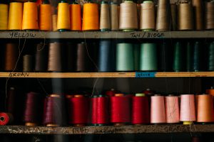
The Original Image
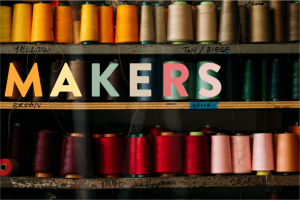
The Colorful Title
The Design
I put it together in Storyline.
The Image
It didn’t take long to choose one. This photo of colorful spools of thread on carefully hand-labeled shelves was too good to pass up.
Title Text
The image made me think of artisans, craftspeople, and the maker movement. So “Makers” became my title.
Using the eyedropper tool I started pulling those vibrant colors out of the threads and applying them to the title letters so that each one sort of echoed the look and feel of the individual spools. I looooooved the result, and that the title could sit right on the middle shelf in the picture.
Body Text
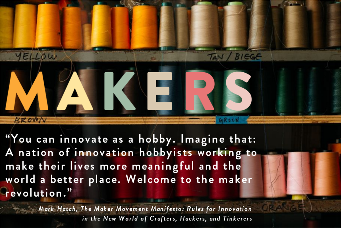
I found a quote from Mark Hatch, a maker movement guy, and placed it on the shelf just below the title. To make it a bit easier to read I added a semi-transparent dark shadow just behind the text. Because the edges of the shadow follow visual breaks in the image, it’s nearly invisible.
I expanded both title and body text to make it more visually pleasing and a bit easier to read. After that I added some entrance animations and called it good!
Make it Work!
Ready to see how it turned out? You can view it right here.
 Our Gators
 Our Golfers