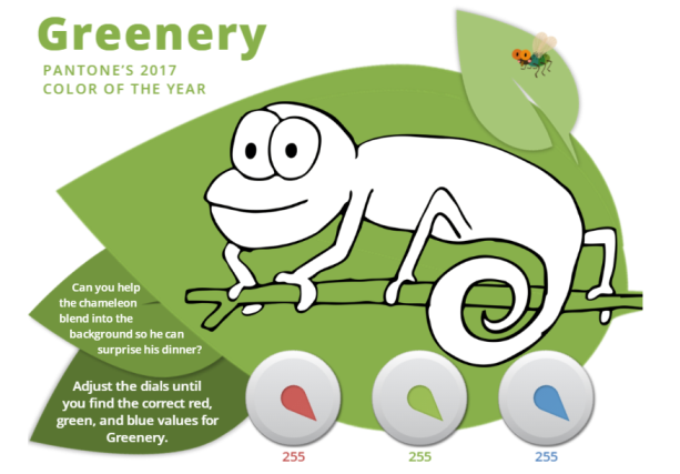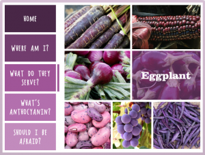
Select Image to See Demo
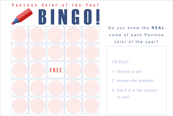
This week’s Articulate ELH Challenge is to design a template or interaction featuring Pantone’s color of the year: Ultra Violet.
The Idea
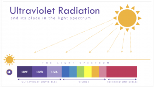
The name, of course, made me think of ultraviolet (UV) light, and since it’s part of the light spectrum, a slider interaction to explore it seemed like a good way to go.
The Design

Attitude: One of Pantone’s suggested color palettes to use with Ultra Violet, and the one I used
The Colors
I used Ultra Violet for the titles, labels, other text, and everything in the UV section – but after that I was going to need a range of colors to create a whole light spectrum.
To the rescue came Pantone’s Attitude palette, which had a color I liked for the sun (Citrus), one I could use for the infrared spectrum (Raspberry), and other brights I could use in the visible spectrum.
For the UV spectrum I put Ultra Violet in the middle and used one Ultra Violet shade darker and one Ultra Violet tint lighter on either end.
The Slider
After inserting a sun icon from Storyline 360’s Content Library (love that so much), I colored it using a Pantone Citrus fill, then also used it as the thumb image on the slider.

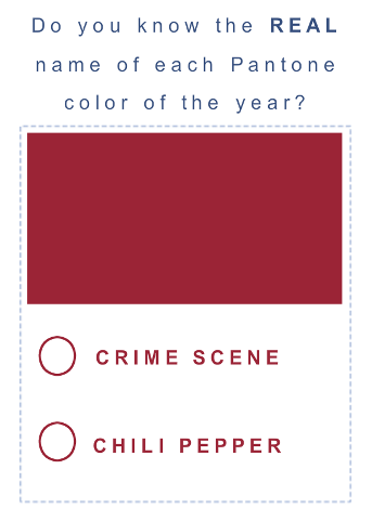
Ultraviolet details revealed in Ultra Violet
Other than that, it’s a simple slider with light spectrum details I built on layers that are revealed as you slide the sun icon to each section. I also decided to make the larger sun’s arrow “rays” disappear when you’re viewing the layers to give it a cleaner look.
I added an Ultra Violet slider prompt using an arrow marker that shows up after a few seconds. Once you move the slider it’s programmed to remain hidden.
The Result
In the end it seems the ultraviolet spectrum is all about sunscreen for us, but you can view this Ultra Violet result just as well in the shade.