Select Image to Launch Demo
With one eye on project deadlines and flights this week, I trained the other on goofing off with Articulate’s E-Learning Heroes challenge to bring the Inc.com What Kind of Leader Are You? infographic to life by interpreting it as a branching scenario.

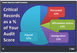
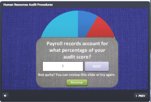
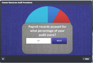
The Original Infographic
Approach
Since this is a personality assessment that briefly flirts with a teaching moment, I chose not to set up full-blown scenarios with characters to put each decision point in context. It would be fun; but it would also seem kind of silly to spend all that time illustrating such abstract concepts when the only world that matters here is the user’s internal one.
I decided the cleanest and most expeditious way to bring some life and abbreviated context to this interaction was through good use of color, text, animation, and simple images.
Color
Since the world is flat these days, I snagged some flat design colors from one of Damon Nofar’s SlideShare presentations.


 Text & Animation
I suppose Damon decided he could inspire me with text, too, which must be why he posted this presentation. (And I now see he posted another one about using typography a few hours ago where he lays out a number of principles I used in my piece – but I hadn’t seen that one.)
In the end, Swiss921 BT made me happy, so that’s my title font. I threw in some Helvetica in honor of Damon’s devotion to it; though I’m more of a Calibri fan. (So there’s some of that, too.)
I decided that pulling key words and making them stand out would be the easiest way to let the user quickly scan the decision point.
I also messed with the keywords so they’re more expressive – whether changing the word itself (using lots of extra “a”s in “relax”), changing the type layout (so “interact’s” letters get all inter-mingly), and so on. I also used animation. My favorite is when the word “direction” comes in backwards, then quickly realizes its mistake and comes in forwards. But that’s just me.
Simple Images
I originally envisioned hand-drawn white line drawings to soften and balance the strong font I’d chosen, and gave Microsoft clipart a quick search.
I started by looking for a mountain image to illustrate the idea of a challenge. When I found one in Microsoft Clipart Style #1306, and took a quick look to see if the rest of the style could work, I had my images.
I wanted to take out, or at least adjust, the colors, but given time constraints I just made a few alterations to specific images (like the clouds that float across the sky at the beginning) and left it at that.
Devices and Navigation

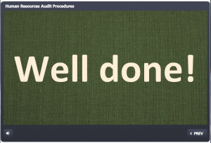
One Possible Result
This piece seemed to want to be a little app, so I had the iPad in mind as I designed it. Works just fine.
I kept navigation simple, since it’s really just a one-way path.
Audio
I would love to put in audio (sound effects, etc.), but no time. Maybe I’ll add some later.
See the Result!
You can see this guy (and find out what kind of leader you are) right here!