• Skip to primary navigation
  • Skip to main content
  • Skip to primary sidebar

Jackie Van Nice

E-Learning Goodness by Jackie Van Nice

  • Home
  • About
  • Blog
  • Portfolio
    • Articulate’s ELH Challenges
    • Sales Mobility Software
    • Product Sales
    • Sexual Harassment
    • Code of Conduct
  • Freebies
    • Free Storyline Templates
    • Free PowerPoint Templates
    • Free Images
    • Freelancing Tips
    • Free Resources to Help Get Started in eLearning
  • Work With Me
  • Contact

Typography

You Can Quote Me

March 1, 2014 By Jackie Van Nice 2 Comments

Select Image to See Larger

Select Image to See Larger

After running us ragged lately, Articulate’s David Anderson gave us a design challenge that was a relative walk in the park this week. His humble request was to take a favorite instructional design quote and create a poster making good use of typography to express it.

The Quote

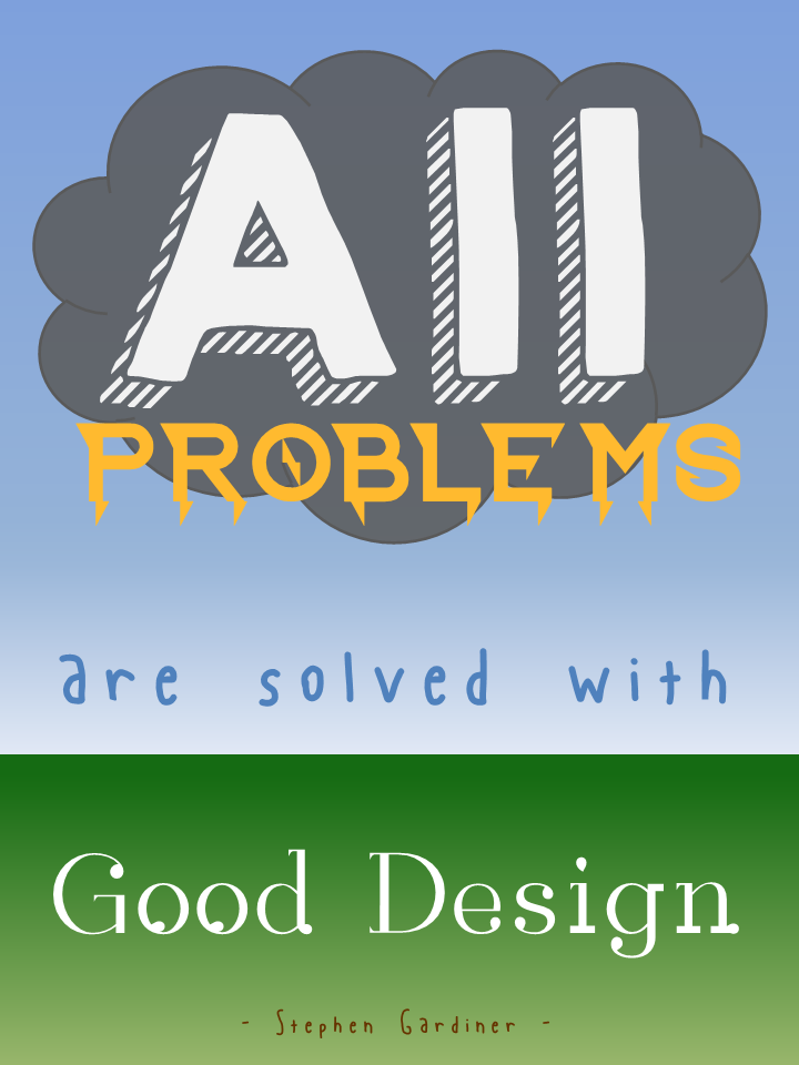
Since I believe that design (instructional and otherwise) rules all (and that solving design problems is the biggest kick there is), I chose architect Stephen Gardiner’s quote “All problems are solved with good design.”

The Idea

I tried to think of a visual expression of “all problems” that could somehow resolve itself in “good design” and, as you can see, pretty quickly came up with a storm-cloud-laden sky giving way to raindrops and then to the new growth of earth below. To keep it quick and easy, I mocked it up in PowerPoint. Since I needed vertical sky-to-ground space, I changed the layout to portrait orientation by going to Design > Slide Orientation > Portrait.

Typography

Fonts: I found all fonts on dafont.com.

“All”: After trying out a good number of cloud-like fonts, I wasn’t happy. Once I placed a basic cloud shape and tried out fonts on top of it, I got happy with, appropriately enough, KG HAPPY. Something about the shadow made me think of storm clouds and rain.

“Problems”: This had to look like lightning, and I got lucky with Ride the Lightning. It was clean enough and bold enough to work, and it gave the visual sense of lightning bolts coming down from the clouds that I wanted.

“Are Solved With”: I wanted these words to have the feel of raindrops, but literal raindrop fonts were just too much. This is Blue Chucks, which the designer says was “inspired by my wonderful shoes”. (Well done, Sir.) I like that his baseline and topline are uneven and it looks sort of loose, like rain. I tried messing with it by puttting each letter into its own text box so that I could make it even more uneven and rain-like, but I wasn’t crazy about that. I was happier letting this nice font be true to itself.

“Good Design”: This one worried me a bit. I wanted it to look like new growth coming from the earth, but the plant-like fonts I found weren’t clean enough. I liked this one because I thought it was suggestive of buds starting to come out of a plant; though oddly enough it’s called Rain.

The Attribution: Well, hopefully Mr. Gardiner would have had a sense of humor about this, because I wanted the font to look like worms deep in the ground helping to start new life. I went with Blue Chucks again for the same wriggly, uneven, yet clean feel. And, of course, using the same font again gives a little more unity to this font-heavy design.

Background

I went with simple blue and green gradients. For the sky, I liked that it looked more like a storm to have the sky darker near the clouds and lighter near the ground, and I thought the green gradient made the ground look a little more alive – worms and all.

The Result

Here it is, full-size.

Filed Under: E-Learning Tagged With: E-Learning Design, ELHChallenge, Instructional Design, Typography, Visual Design

Please Don’t Let Me Be Martha Stewart

February 17, 2014 By Jackie Van Nice 8 Comments

Select Image to Launch Demo

Select Image to Launch Demo

With one eye on project deadlines and flights this week, I trained the other on goofing off with Articulate’s E-Learning Heroes challenge to bring the Inc.com What Kind of Leader Are You? infographic to life by interpreting it as a branching scenario.

The Original Infographic

The Original Infographic

Approach

Since this is a personality assessment that briefly flirts with a teaching moment, I chose not to set up full-blown scenarios with characters to put each decision point in context. It would be fun; but it would also seem kind of silly to spend all that time illustrating such abstract concepts when the only world that matters here is the user’s internal one.

I decided the cleanest and most expeditious way to bring some life and abbreviated context to this interaction was through good use of color, text, animation, and simple images.

Color

Since the world is flat these days, I snagged some flat design colors from one of Damon Nofar’s SlideShare presentations.

I like to relaaaaaaax by...Where are you most likely to interact with employees?Backwards DirectionForwards DirectionText & Animation

I suppose Damon decided he could inspire me with text, too, which must be why he posted this presentation. (And I now see he posted another one about using typography a few hours ago where he lays out a number of principles I used in my piece – but I hadn’t seen that one.)

In the end, Swiss921 BT made me happy, so that’s my title font. I threw in some Helvetica in honor of Damon’s devotion to it; though I’m more of a Calibri fan. (So there’s some of that, too.)

I decided that pulling key words and making them stand out would be the easiest way to let the user quickly scan the decision point.

I also messed with the keywords so they’re more expressive – whether changing the word itself (using lots of extra “a”s in “relax”), changing the type layout (so “interact’s” letters get all inter-mingly), and so on. I also used animation. My favorite is when the word “direction” comes in backwards, then quickly realizes its mistake and comes in forwards. But that’s just me.

Simple Images

I originally envisioned hand-drawn white line drawings to soften and balance the strong font I’d chosen, and gave Microsoft clipart a quick search.

I started by looking for a mountain image to illustrate the idea of a challenge. When I found one in Microsoft Clipart Style #1306, and took a quick look to see if the rest of the style could work, I had my images.

I wanted to take out, or at least adjust, the colors, but given time constraints I just made a few alterations to specific images (like the clouds that float across the sky at the beginning) and left it at that.

Devices and Navigation

One Possible Result

One Possible Result

This piece seemed to want to be a little app, so I had the iPad in mind as I designed it. Works just fine.

I kept navigation simple, since it’s really just a one-way path.

Audio

I would love to put in audio (sound effects, etc.), but no time. Maybe I’ll add some later.

See the Result!

You can see this guy (and find out what kind of leader you are) right here!

Filed Under: E-Learning Tagged With: Community, E-Learning Design, ELHChallenge, Emotional Engagement, Typography

  • « Go to Previous Page
  • Go to page 1
  • Go to page 2
  • Go to page 3

Primary Sidebar

Welcome!

I’m an award-winning instructional designer and proud Articulate Super Hero who creates e-learning for large organizations. I blog to explain my design process, share tips and tricks, and help others succeed. I hope you enjoy my refreshing gallery of e-learning goodness!

  • View jackietrains’s profile on Instagram
  • View jackievannice’s profile on LinkedIn

Tags

Articulate 360 Articulate Rise Articulate Storyline Articulate Studio Audio Avatars CCAF Characters Community Context Design Makeover Dials Drag & Drop E-Learning Design ELHChallenge Emotional Engagement Free Download Freelancing Games German Glossary Instructional Design Languages Makeover Menu Mobile Motivation Pantone Portfolio PowerPoint Professional Development Quick Reference Quizzes Sales Training Scenarios Show Your Work Software Training Storyline 360 Tables Technical Training Templates Typography Video Visual Design Voiceover

Top Posts & Pages

  • Portfolio
    Portfolio
  • Home
    Home
  • Sexual Harassment Training
    Sexual Harassment Training
  • Sales Mobility Software Training
    Sales Mobility Software Training
  • Navigating a Tasty Circular Menu
    Navigating a Tasty Circular Menu
  • Articulate's E-Learning Heroes Challenges
    Articulate's E-Learning Heroes Challenges
  • About
    About
  • Free Visual Storyboard Template
    Free Visual Storyboard Template
  • Free Storyline Templates
    Free Storyline Templates
  • How to Go Full-Screen & Lose the Player in Storyline
    How to Go Full-Screen & Lose the Player in Storyline

Copyright © 2025 Jackie Van Nice and E-Learning Goodness by Jackie Van Nice