This week’s challenge is to show how video backgrounds can be used to make elearning more engaging. Thanks to some free assets, it was a quick way to have some fun this week.
The Idea
As challenged, I wanted to design e-learning start screens, but make them more engaging using simple video backgrounds to lure learners in.
The Design
I started by browsing some of the free video assets David Anderson linked to, and found these videos at Coverr. I was looking for something that would loop well and that I was inspired to play with. After that it was a matter of coming up with course topics and visual and audio design elements to fit.
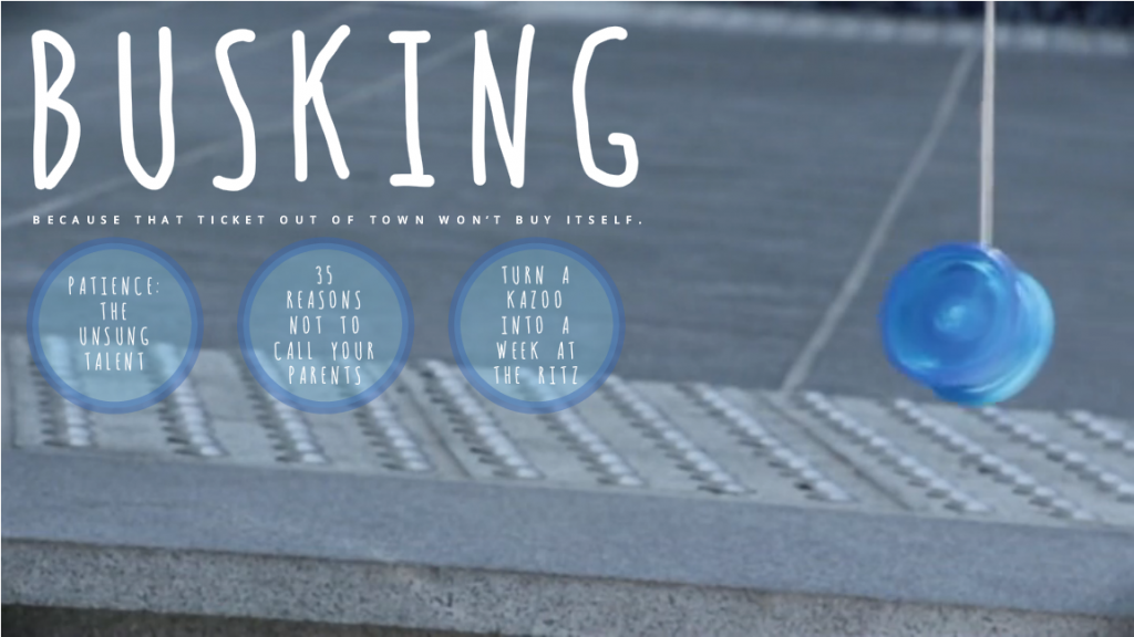
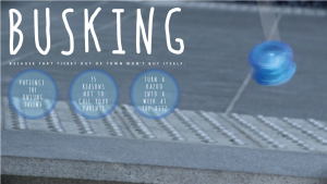 Entry #1 – Busking
I’m sure there are countless reasons someone would be outdoors playing with a yoyo, but it made me think of street performers and buskers. I added a font that looked rather string-like and buttons designed to mimic the color, shape, animation, and position of the yoyo. I also added a bluesy acoustic bit of music from audionautix to complete the scene.
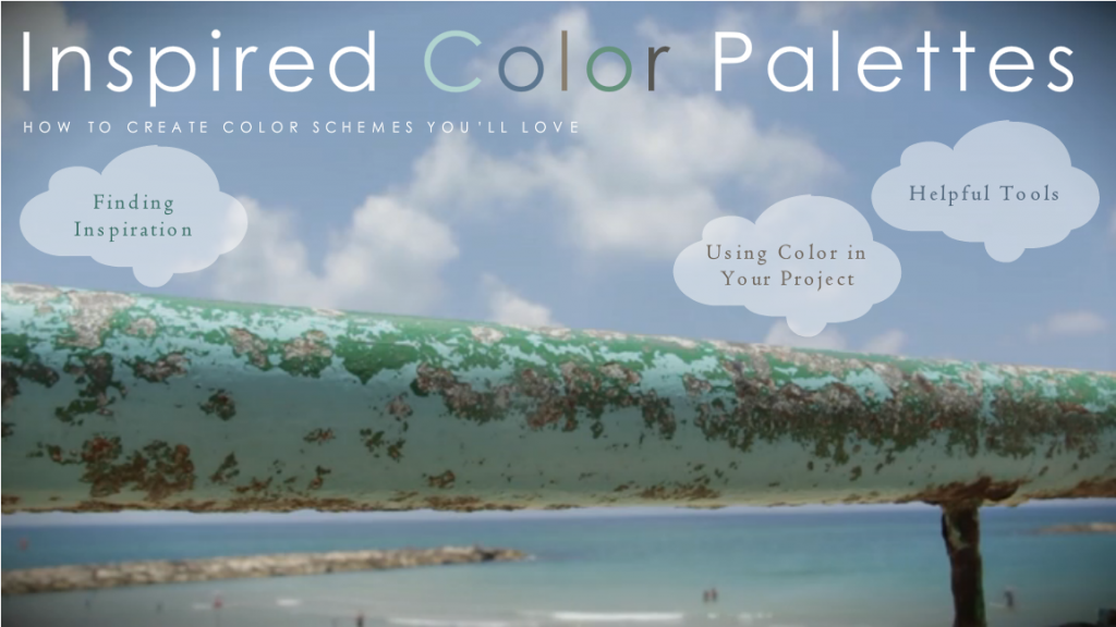
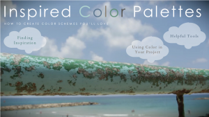 Entry #2 – Inspired Color Palettes
To me, the most stunning part of this video was the gorgeous natural palette that had developed on this railing at the beach, so that became my theme. The button shapes mimic the clouds in the sky, and I looped an audio track of ocean waves beneath the video. Of course, the most important part was to integrate the natural palette on the railing into my own color scheme, and you’ll see it in the text colors. The sans-serif font is Century Gothic and the serif font is Centaur.
See (and Hear) Them in Action!
Ready to see if video backgrounds make these courses seem a little more appealing? You can decide right here:




 Today a reader asked me where I get my images, and since that comes up a lot I thought it might be time to write a post. In case it’s helpful, here’s where I get them.




 Oh – and I made the featured image for this post using images from DollarPhotoClub.com (background and flower on the right), my own travel photos (a sweet shop in Istanbul in the middle), and Microsoft Clipart (the flower on the left). Sometimes it takes a village.


 The Idea
