That darned David Anderson and his e-learning challenges. Why am I hooked on these? This week, as a good citizen of the world, he put forth the challenge to build an e-learning template themed for the 2014 Winter Olympics in Sochi. Since sports-related design is waaaaaaay outside of my comfort zone, it was irresistible. I grabbed my design skis and headed for the nearest Black Diamond drawing board. Here are the 5 template slides he wanted:
The Cover Slide
Title
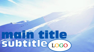
I knew I could slap in a lot of images from the official site, but I wanted it to be inspired by them rather than looking like a dead-on copy. So I took the official logo, seen below, and made my own cover slide based on that – finding a similar font and replacing the Olympic rings with a logo placeholder.
Title Slide

2014 Olympics Logo
Background
I then found a nice, frigid landscape for the background and ended up using that throughout the template.
Sound Effects
I knew that having the design elements come schussing in to skiing sounds would be an obvious choice, but I did it anyway. For some reason I really wanted the cry of an unseen, anguished skier at the end of this slide. I put it in to entertain myself, not knowing whether I’d find a reason to keep it, and moved on.
What to Design Next?
My inclination was to design the objectives slide next, but I wanted to present them in context and at a point of need. Unless I care about why I’m going somewhere in a course, I’m not inspired to design it – much less subject learners to it. I thought Tom Kuhlman did a great job of illustrating the idea in this post about making objectives interesting. His demo of the emergency-preparedness kit objectives being presented in an involving way was along the lines of what I wanted. So I knew the scenario had to come next.
Scenario Slide
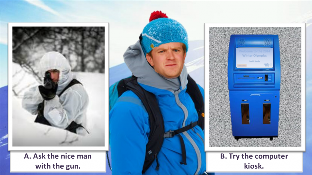
Since I had already established that our as-yet-unseen protagonist had been skiing in a generic frozen landscape and that something alarming had happened, I decided he was lost and had skied his way to the games by accident, and that he had no idea where he was.
So he needed to figure out where he was and what was going on. I gave him the option of asking a guy with a gun (who could be a biathlon participant – or not), or visiting some random computer kiosk nearby.

Scenario Slide

Scenario Decision
So the scenario establishes the context (I’m lost on a frozen mountain), which gives him the motivation to take action. Once we get him to the “Need Help?” button on the kiosk screen, he’s on his way.
Objectives Slide
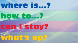
NOW I was ready for the objectives. I used the title font and Olympic ring colors and had each objective come schussing in over the mountainous background.
Hovering over each one reveals its general content, and clicking takes you there. I like to express objectives as questions, since they’re more involving, so that was the general scheme.
Objectives Slide
Figuring our protagonist might like a map and the general lay of the land, I had the “where is…” section point to some Olympic park venue content for him.
Interaction Slide
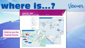
In the interest of keeping this simple, I used an interactive map that starts with an overview of the area. You can choose to see more detail for a particular section, and from that detail you have the option of pulling up a PDF to see the extreme detail and lots more information.
Interaction Slide
Of course you could also present interactive content here using video, games, tabs, links, or whatever you’d like.
I used variables so that the button that allows you to continue doesn’t show up until both map sections have been visited. Because I could.
Quiz Slide
Which brings us to the big payoff. What have we learned on this mountain today? It occurred to me that my “correct” answer could explain how this guy ended up here – and offer him some medical help as his reward – so that’s what I did. Who doesn’t like a story with a happy ending?
