• Skip to primary navigation
  • Skip to main content
  • Skip to primary sidebar

Jackie Van Nice

E-Learning Goodness by Jackie Van Nice

  • Home
  • About
  • Blog
  • Portfolio
    • Articulate’s ELH Challenges
    • Sales Mobility Software
    • Product Sales
    • Sexual Harassment
    • Code of Conduct
  • Freebies
    • Free Storyline Templates
    • Free PowerPoint Templates
    • Free Images
    • Freelancing Tips
    • Free Resources to Help Get Started in eLearning
  • Work With Me
  • Contact

Digital Magazine: Can You Give a Better Speech Than a 12-Year-Old?

November 9, 2014 By Jackie Van Nice 10 Comments

Select Image to Launch Demo

Select Image to Launch Demo

This week’s Articulate challenge is to create a demo of a digital learning magazine.

Inspiration

For approach, look, and feel I used Forma Magazine as my inspiration, using Charles Hamper’s suggestion to check out digital magazine samples at ReadyMag.

Content

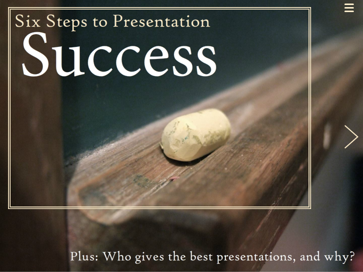
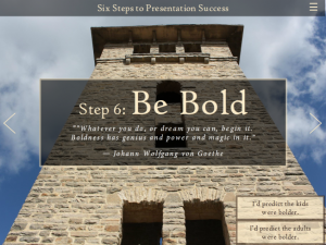
I decided on the topic of presentations when I found this post by speech coach George Torok who was comparing his experience judging 12-year-olds in a speech contest versus high-level sales and marketing executives giving their own talks. For this demo I wanted simple-yet-interesting content that was easy to explore and browse, so this worked. To make it easier to compare the adults versus children, I organized it into six steps and compared their performance for each one.

Since digital magazines tend to make the most of stunning photography, I found large images that would render well at MorgueFile.

Jump-to-Screen Navigation

Jump-to-Screen Navigation

Navigation Options

I included two types of navigation to imitate Forma’s:
Screen-to-Screen: I used their approach of having on-screen right and left arrow icons. I also added hotspots on top of the arrows to make them easier to tap if you’re on a tablet. You could just add a trigger to the arrow image, rather than use a hotspot, but the target area would be too small to work well.
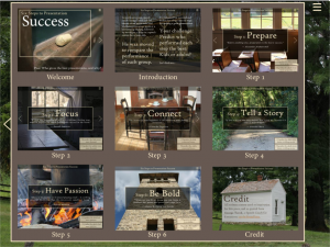
Jump-To: I might have been able to create a fabulous slider to imitate Forma’s jump-to navigation, but settled for the speedier option of a slide layer with thumbnails of each screen. It gives you an overview of the content, plus lets you jump around. You can access it via the menu icon in the upper right.

Check it Out!

Find out if a 12-year-old’s speech stands a chance against a high-level marketing executive’s right here!

Select Image to Launch Demo

Select Image to Launch Demo

Share this:

  • Click to share on LinkedIn (Opens in new window) LinkedIn
  • Click to share on Facebook (Opens in new window) Facebook
  • Click to share on X (Opens in new window) X
  • Click to share on Pinterest (Opens in new window) Pinterest
  • Click to share on Tumblr (Opens in new window) Tumblr
  • Click to email a link to a friend (Opens in new window) Email
  • Click to print (Opens in new window) Print
  • More
  • Click to share on Reddit (Opens in new window) Reddit
  • Click to share on Pocket (Opens in new window) Pocket

Like this:

Like Loading...

Related

Filed Under: E-Learning Tagged With: Articulate Storyline, E-Learning Design, ELHChallenge, Mobile, Show Your Work, Typography, Visual Design

Previous Post: « Preventing Workplace Violence Holiday-Style!
Next Post: Learning to Spend Money the Yummy Way »

Reader Interactions

Comments

  1. Kristin says

    November 10, 2014 at 11:24 am

    Jackie – I love what you’ve done here – having us pull the information, rather than pushing out the info to us. I also love your sense of design – pretty much every one of these challenges is fun to look at – engaging to the eye, as well as the mind. You are an inspiration to me – so thank you for sharing your examples, and your “how tos!”

    Reply
    • Jackie Van Nice says

      November 10, 2014 at 3:20 pm

      Thank you, Kristin! You just officially made my day. :)

      Good point about pulling rather than pushing the content. I meant to talk about that in the post. Back when I did more classroom instruction, using a predictive approach was always a lot of fun. This wasn’t set up as thoroughly as that since it’s just a quickie demo, but it was a nod to that method.

      I’m so happy if what I share helps you. Thank you soooooo much for your wonderful comments!

      Reply
  2. dmascott says

    November 11, 2014 at 6:34 am

    Just a quick message to tell you how much I liked the backdrop. (Looks like Sturbridge Village in Massachusetts)… Well done.

    Reply
    • Jackie Van Nice says

      November 11, 2014 at 8:38 am

      Hi Debra!

      Thanks – I’m glad you like it! I’ll pull up the details of where these pictures were taken later today and let you know here in the comments.

      Reply
    • Jackie Van Nice says

      November 11, 2014 at 6:58 pm

      Okay Debra – I checked and believe these pictures were taken in Missouri – in Ha Ha Tonka State Park. So funny that they’d look so much like Massachusetts – but maybe some of the construction was of the same era? In any event, they are beautiful.

      Reply
  3. Wanda Simpson says

    December 17, 2014 at 10:52 am

    Jackie, I love this design. So clean and simple. If I may ask, what type of slide did you use for the interactions? Part of me thinks it was a modified quiz slide. Would lo ve to use this sort of engagement rather than the typical T/F or MC. Thanks for sharing!

    Reply
    • Jackie Van Nice says

      December 17, 2014 at 11:15 am

      Hi Wanda – Thank you so much! I used blank slides and simply put feedback on layers on the blank slides. I hope that helps!

      Reply
  4. Wendy Morgan says

    August 11, 2015 at 9:44 am

    Jackie: where did you source the photography? Did you hire a photographer, or did you get these stock somewhere? (If so, where?!)

    Reply
  5. Wendy Morgan says

    August 11, 2015 at 9:51 am

    Oops, I was too excited & asked before thoroughly reading! Checking out MorgueFile immediately! :)

    Reply
    • Jackie Van Nice says

      August 11, 2015 at 1:20 pm

      That’s great, Wendy! I hope you find what you’re looking for. :)

      Reply

What do you think?Cancel reply

Primary Sidebar

Welcome!

I’m an award-winning instructional designer and proud Articulate Super Hero who creates e-learning for large organizations. I blog to explain my design process, share tips and tricks, and help others succeed. I hope you enjoy my refreshing gallery of e-learning goodness!

  • View jackietrains’s profile on Instagram
  • View jackievannice’s profile on LinkedIn

Tags

Articulate 360 Articulate Rise Articulate Storyline Articulate Studio Audio Avatars CCAF Characters Community Context Design Makeover Dials Drag & Drop E-Learning Design ELHChallenge Emotional Engagement Free Download Freelancing Games German Glossary Instructional Design Languages Makeover Menu Mobile Motivation Pantone Portfolio PowerPoint Professional Development Quick Reference Quizzes Sales Training Scenarios Show Your Work Software Training Storyline 360 Tables Technical Training Templates Typography Video Visual Design Voiceover

Top Posts & Pages

  • Portfolio
    Portfolio
  • Home
    Home
  • Sexual Harassment Training
    Sexual Harassment Training
  • Sales Mobility Software Training
    Sales Mobility Software Training
  • Navigating a Tasty Circular Menu
    Navigating a Tasty Circular Menu
  • Articulate's E-Learning Heroes Challenges
    Articulate's E-Learning Heroes Challenges
  • About
    About
  • Free Visual Storyboard Template
    Free Visual Storyboard Template
  • Free Storyline Templates
    Free Storyline Templates
  • How to Go Full-Screen & Lose the Player in Storyline
    How to Go Full-Screen & Lose the Player in Storyline

Copyright © 2025 Jackie Van Nice and E-Learning Goodness by Jackie Van Nice

%d