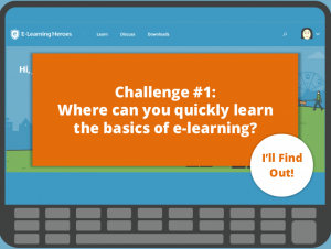
Select Image to Launch Demo
This week’s challenge is to create an interactive graphic based on a recent Articulate survey about what people love and hate about e-learning. So I did!
The Idea
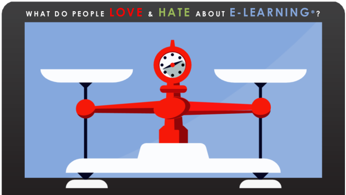
The Original Infographic (Select Image to View)
Above all, I thought the biggest advantage of the interactive graphic would be to add a main menu so the user could quickly scan topics and jump to the details. It can be a struggle to scroll through a long graphic – especially on mobile devices – so the quick jump would be a plus.
The other thing I noticed was that even though the original infographic talks about love and hate, I wasn’t seeing much hate. So my other idea was to graphically represent that imbalance.
The Design
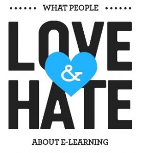
Ultimately I ended up designing it around two things: The idea and image of a scale to illustrate the imbalance of positive and negative survey results – and the idea and image of e-learning devices. After falling in love with a red vector scale, I let it determine part of the color scheme and most of the overall design aesthetic. That’s a pretty good scale.
I put the content detail on slide layers and let e-learning devices have a hand in presenting them.

The Influential Scale

Details On Layers
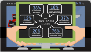
Helpful Hands
Weighing the Results
If you’d like to see my interactive version of the survey results, you can enjoy them right here. And remember – if there’s something you don’t love about e-learning, you can be the change.
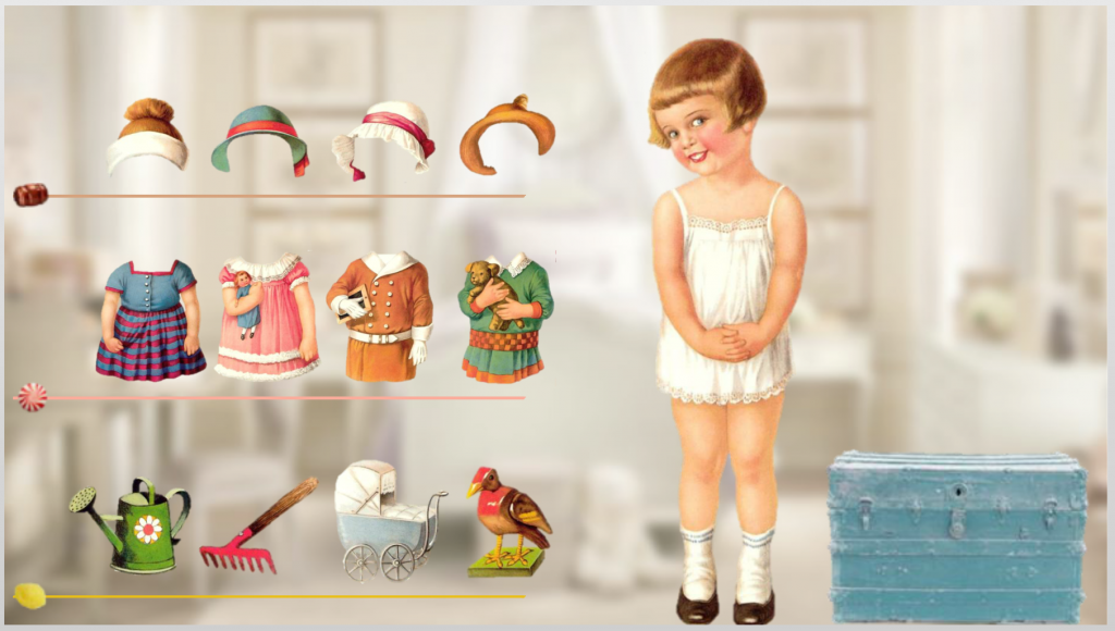
Select Image to Launch Demo
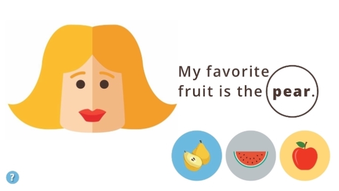
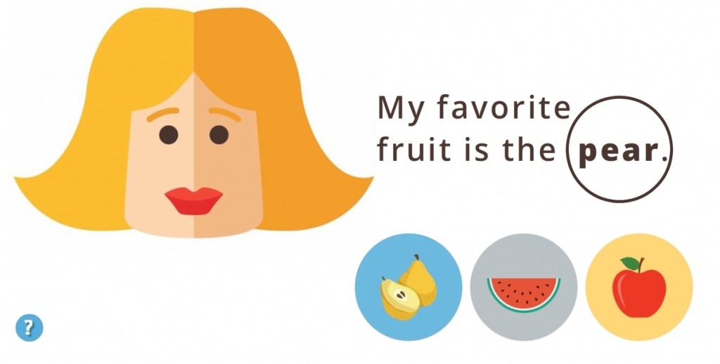
 The Idea: Vocabulary Practice
 I wanted it to be in Turkish, partly because it would be way cool and partly because I need the practice, but to save time I stuck with English.
 I kept it emoji-simple. From layout to images to instructions it’s easy to figure out, easy to navigate, and easy to understand the teaching points.