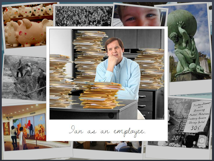
This week’s Articulate E-Learning Heroes Challenge is to create a photo collage that tells a story.
I’ve just gotten home from a (great!) week at the E-Learning Guild’s Learning Solutions Conference in Orlando, and the theme that kept coming up was freelancing. Not just in sessions, but in countless random conversations, and I found myself offering a lot of advice to hopeful freelancers.
I Smell a Theme
So because there’s only so much space in my head and this is the topic currently on tap in there, my photo collage story this week is about a guy who wants to freelance. The points I’ve included are a summary I quickly put together for this piece, but it’s similar to what I was sharing all week.
The Story
If I’m going to tell a story, I need a starting point. So I overlaid our (miserable) hero on top of the rest of the photo collage so that I could establish his yearning-to-go-freelance motivation. The underlying photos and their content, each of which reveals a portion of our hero’s journey, can be visited in any order. And of course you get to see the result of his efforts at the end.
 Visual Design
I kept the visual design pretty simple. The photos are framed in a pseudo-Polaroid fashion. The caption font on the top photo is Dawning of a New Day. The title font on the pop-ups is Swiss921 BT, and the main pop-up font is Candy Round BTN Condensed.
I reused a beach and palm tree from a recent post about freelancing, mostly because I wanted the tree for the end scene.
And I reused poor Ian again. I’ve forced that poor man into service as an airline pilot and a beer-guzzling traveler in recent weeks and wanted to give him a rest, but I needed someone who could fit into the outfit at the end, and he had the perfect figure. (Sorry, guy.)
 Storyline Design
When clicked, each photo in the collage pops up on a slide layer with more info. Then I have each photo disappear after viewing it. That way I was able to set up a new layer of interest below.
That interest includes having each photo, in miniature, drop down into the palm tree and hang there like an ornament. You can then click on those ornaments to review their content. I did this by adding a second slide layer for each collage photo.
And, of course, I had to show Ian’s transformation after he’d followed his own plan, but I could only show that after all photos had been viewed. To do this, I created a variable for each photo. After all of them have been visited, Ian and his final outfit are triggered to appear.


 See the Result!
I love the way the photographs gently fall onto the tree after you’ve viewed them. I also appreciate the amount of triggers, variables, etc it takes to do this. One last thing: thanks for actually putting some useful content into the challenge itself, you’ve really gone the extra mile here!
Thanks so much, Dan! As always, I start out thinking it’ll be very simple and then it morphs into something more elaborate during the design process. I was just aiming for placeholder content, for example, but after it started to take shape I realized there was some value there – so that was a nice surprise. :)
Thanks for this example, Jackie, and your recent post on freelancing. It is definitely something I am working my way towards and I am soaking up as much advice as I can get!
Hi Allison – Thanks so much! I’m glad you liked this and the freelancing post, too. You cleeeeeearly can do it! Just takes a little planning and determination. If I can ever offer any advice or encouragement, just let me know. :)
I will absolutely take you up on that ! :)
Hi Jackie,
Thanks so much for your informative and entertaining posts. You are very good at what you do and, fortunately for us, you are sharing your experience and tips too. As a newcomer to e-learning development, I really appreciate that! :)
All the best,
Anne
Thanks, Anne! I really appreciate that. (Your blog is fascinating to me, by the way!)
Thank you very much, Jackie! My blog is still a work in progress, but you have inspired me to make it even better. Here’s to learning from each other! :)
Loved it Jackie! Great points and as always, nice use of graphics!
You are very creative!
Thank you so much, Richard! You are too!!