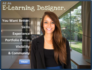
This week’s challenge was to create a step graphic to tell a story or explain a process. It came at the end of a week where I kept hearing concerns from e-learning designers who felt stuck due to lack of skills, experience, usable portfolio pieces, visibility in the field, and/or confidence. So when the challenge hit, that was my topic.

Step Graphic Main Screen
Design
I wanted it to be fresh, direct, and maybe a bit inspiring – so I chose the character, the approach, and the background based on that.
The layout bothered me for a full week. Still does, but I have to let it go. I tried countless ideas with different graphics, colors, fonts, animations, and audio. It started out with more depth (links to resources, etc.) but it was taking too long, so I stripped it down and kept it simple. My concern was keeping the user’s attention focused on an already-busy screen. It seems to work, based on the little bit of user testing I did, so I’m going with it.
The step navigation is simple. I chose buttons with a full set of states, including a clear selected state so it’s easy to see where you are.
Content
I added the intro screen to make it clear that you should probably be (a) an e-learning designer who (b) has these goals, if the content is going to apply to you.
After that, it’s what I do each week for the challenges combined with a little bit of advice based on personal experience.
The Result
Ready to give it a try? Take a look! And if you’re an e-learning designer who feels stuck or wants to learn more and improve your skills, you might want to give the challenges a try. They’ve worked for me!


Jackie I love this and enjoy your posts so much. Thanks for sharing!
Thank you so much, Natalia! That means a lot to me.
You should be blogging, too! It’s just one small step from Twitter to WordPress, you know. :)
Yeah Natalia – why aren’t you blogging? You’ve got so many cool ideas to share. I’m going to start retweeting your Screenrs to nudge you…
Thanks guys. I know you’re right. I blog a bit internally at work but I should set up something public. I appreciate your gentle encouragement. :)
Maybe just keep it really simple, if it’s a time issue? When you start I hope you’ll let me know so I can be one of your charter subscribers.
This looks great Jackie! Thanks for sharing!
Thanks, Tim! I really appreciate your comment!
What a great demo, Jackie. You totally captured the value of the Articulate community in this demo. Thinking that this would make an interesting conference session, webinar, or e-presentation.
Thanks, David! From your lips to the ears of conference organizers everywhere. :)
Beautiful job Jackie. I love the pictures you selected, especially of the office with the full view of the outdoors symbolizing freedom. I also liked your choice of fonts, the character and all her various expressions, and the use of the semi-transparent rectangles (always a favorite from my point of view for putting text on top of pictures), and the content itself which is very concise and helpful.
Thanks so much, Dan! I really appreciated your encouragement to stick with it – and for being my test user, too!
Great job Jackie! Nice display of the menu structure! Gave me some good ideas…
That’s great! Thanks for your comment. :)
Wow! This has definetly pushed me even more to start participating in the challanges. I’m currently trying to find a balance between work, life and blogging. I’ll have to give myself a deadline lol
Hi Jennifer! If you can find a little time, it’s really worth it. I’ll just bet you can do it. Thanks for stopping by!
Thank you for sharing! Loved the design and the inspiration.
Hi Nicole – My pleasure! So glad you liked it. I really appreciate your comments. :)
Hi, I really like this post as well. Nice design and use of the room. I was wondering who the character is and where you got her from. Been looking for someone similar.
Hi Esben – Thank you so much for your wonderful comments! I get my transparent-background character images at elearningart.com – including the ones I used in this piece. Bryan Jones (who is wonderful) runs it, and it’s an affordable subscription site. If you use characters even now and then – it’s worth it!