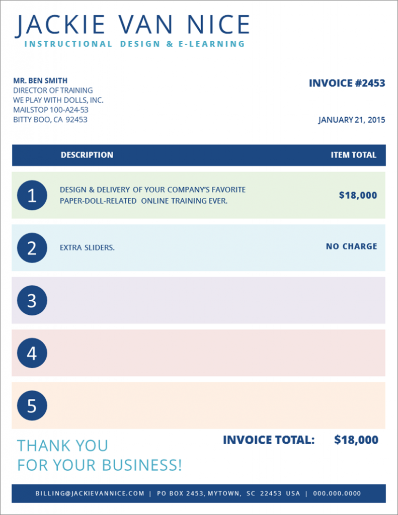
This week’s challenge is to come up with a creative invoice design.
I’m pretty sure David wanted us to create graphs of awesomeness to remind clients of why they should be excited to pay us (a genius idea!) but in the interest of time I went graph-less.
The Design
In real life I currently use a very vanilla invoice. To create one that’s a better reflection of my work I started with the general look and feel of my website, then added some color.
My first drafts were graphically bolder in both shapes and colors, but I kind of like this tamed-down-yet-colorful version. I also played with adding my logo and some other images, but just didn’t like them. I preferred the cleaner look you see here.
There were a lot of comments about and interest in my paper doll slider interaction today (featured on Articulate’s E-Learning Examples page), so I went with that and themed my invoice accordingly.
This is a mock-up I did in PowerPoint because it’s so easy to quickly play with shapes, color, and text there – but I may build it in InDesign next. At that point I’ll also add in a tiny bit more text to capture the practical details.
So What’s the Easy Way to Make Money?
Just remember to invoice your clients! It’s easy to get so caught up in the work that minor details like actually charging them can slip through the cracks. Make yourself a kicky little invoice and bill ’em!

Haaa….. Nice one stating the extra sliders at no charge; who doesn’t love the bonuses?
Love your unified color scheme, makes you easily identifiable… And you’ve managed to work with your personal name and without a logo… Hmm
Thanks, Daniel! Yes, everyone loves a freebie. :)
I tried the design with and without the logo I use here on the website, but found it more distracting than helpful. I also played with adding various images, but liked the cleaner look without them. Thanks for your comments!
Lovely, Jackie! I look forward to receiving one of these beautiful invoices. :)
Oh no! Now the pressure’s on to make it functional. David never warned us there’d be increased demand to send invoices once they got prettier!
Hey Jackie! Don’t poach my Bitty Boo, CA, clients. :) Love your color choices and simple, yet elegant design approach.
Yeah – I’ve been working the Bitty Boo territory for awhile now, but I promise not to poach your existing clients. :) Glad you like the invoice. You should do one, too!
I will be doing one soon. Just finishing up a few loose ends and then getting back to the Challenges.
Excellent!
By the way, based on the invoice amount, I think I might consider designing Doll interactions moving forward! They appear to be very lucrative. I’m also surprised you shared your “real” financial information with us. :)