This week’s challenge, in honor of you brave back-to-schoolers, is to create an education-themed template and demonstrate how it can handle a real-world project.
The Idea

Lots of Room for Subtopics
I went back to the last template I made (using pieces and parts of Nicole Legault’s and Tom Kuhlmann’s fab templates) with the intent of making it over in a kid-friendly way.
Since that template has a free menu and a good amount of depth, it needed a pretty large topic. I brainstormed until I came up with everyone’s favorite – the science fair project.
The Design

Content Slides with Depth
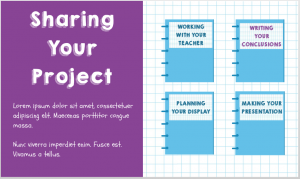
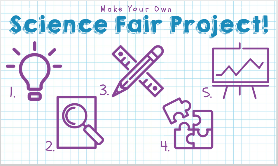
Since most of the science projects I’ve seen get sketched out on paper, I thought graph paper would work well as the themed background.
The color palette came from the blues of the graph paper lines and the purple ink I was seeing in lots of kids’ projects – plus I added a perky green to warm it up.
The kid-riffic fonts I used are KG Happy (it always makes me happy), and Schoolbell. I found the main menu and quiz icons at flaticon.com. I like them a lot and they’re free to use with attribution.
The Result
Ready for a template you can use to teach any number of topics? You can see it here, and even prove your mettle in the quiz.
Get It!
If you’d like to customize it yourself, you can also grab it on the download page.
Have fun!


From the kid-riffic fonts, to the old school graph paper, you make e-learning design as easy as ABC, Jackie!
Ha :) Thanks, David! Glad you like it. It was a fun one this week!
Clever Jackie. Thank you for the inspiration!
You’re welcome, Jenny! I’m happy you like it. :)
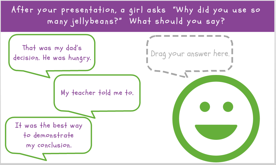
I love it! Cool idea using the grid background, and the fonts and icons really look good on top of it. I can definitely see how useful this could be, the navigation and categories make good sense and it’s easy to get around. The little drag and drop quiz was fun. Again, excellent look and feel, very clean design, yet warm and fuzzy as well. Great job Jackie!
Thanks so much for your thoughtful comments, Dan! Any time I can score a “clean design” and a “warm and fuzzy” in the same interaction I have no choice but to click my virtual heels. Thank you again. :)