• Skip to primary navigation
  • Skip to main content
  • Skip to primary sidebar

Jackie Van Nice

E-Learning Goodness by Jackie Van Nice

  • Home
  • About
  • Blog
  • Portfolio
    • Articulate’s ELH Challenges
    • Sales Mobility Software
    • Product Sales
    • Sexual Harassment
    • Code of Conduct
  • Freebies
    • Free Storyline Templates
    • Free PowerPoint Templates
    • Free Images
    • Freelancing Tips
    • Free Resources to Help Get Started in eLearning
  • Work With Me
  • Contact

ELHChallenge

The Stuff That Résumés Are Made Of

April 22, 2014 By Jackie Van Nice 10 Comments

Select Image to Launch Demo

Select Image to Launch Demo

I’d recently been admiring some examples of graphic résumés, but couldn’t imagine how I could ever do one. Turns out Articulate’s resident nudger, David Anderson, keeps an eye out for that sort of thing and his challenge this week is to come up with an interactive résumé or portfolio. So time for me to figure it out.

I haven’t had much call for a résumé since I’ve been independent, but creating an interactive graphic where I could play with the idea of a résumé sounded like fun, so off I went.

Inspiration

My friend and talented freelance e-learning designer Donna Carson gave me edits for a bio I submitted with my DevLearn speaking proposals on Friday. The phrases she used made me want to both laugh and go conquer the world at the same time. Her description of my “fearless flair” in designing training inspired me to come up with “Fearless Designs!” “Bold Voiceovers!” and “Daring Development!” to describe what I do. For graphic inspiration I turned to old movie posters. They had the expressive graphics and cool details I wanted, plus they could handle the dramatic phrases I had in mind.
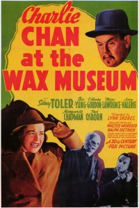
My Graphic Inspiration

My Graphic Inspiration

Design

Graphics: To start, I pinned old movie posters I liked and chose a color scheme that resonated with me. You can clearly see I used the colors and rough layout of the Charlie Chan at the Wax Museum poster. For text callouts and credits I used elements based on other posters including The Beast From 20,000 Fathoms.

Theme: I chose a detective theme because I was drawn to the idea of Humphrey Bogart’s Sam Spade. He’s on the right side of the law, but still seems a little shady. (His line that the Maltese Falcon is “the stuff that dreams are made of” inspired this post’s title.)
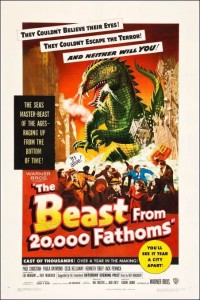
More Graphic Inspiration

More Graphic Inspiration

The Theater: I wanted an entry screen so that, once clicked, the user’s full attention is on the initial visuals, music, and animation when they hit the main screen – and having them click a ticket to get inside made sense.

The way the overall flow works is based on the little theater I practically lived at as an undergrad at Humboldt State University in Arcata, California. The Minor, off the little town square, was an old art house movie theater that changed its double or triple features at least three times a week. I spent a few thousand of the happiest hours I’ve ever spent in my life there, and got to see a gabillion classic movies like the ones that inspired this piece.

The Minor Theater

The Minor Theater

When it was cold out, you’d come off the street through a thick red curtain, get popcorn and admire the old movie posters in the lobby, then go through another red curtain to enter the theater. So I was seeing my résumé as one of those old posters in the lobby.

Audio: I wanted to bring it to life with sound. There are effects for audience buzz, curtains being pulled aside, cheers, applause, police whistles, sirens, screams, breaking glass, etc., but I wanted a theme song. The whole time I was working on this I kept hearing a driving theme somewhere between Peter Gunn and James Bond. Lucky for me I’ve got an “in” with talented songwriter, musician, and freelance e-learning guy Dan Sweigert who was able to write and produce the theme song in no time flat.

Content

EducationRésumé Elements: I kept it simple and included my (boldly-phrased) skill set, education, experience, and the main software I use. The sections for education and experience were by far the biggest creative challenges, but in the end I was happy to find a quick way to blow through them that still maintains the tone and theme.

Brevity: I find it endlessly entertaining that each of the links from the main screen shows just one screen of content (at best) that makes the audience go wild. I wanted to get in, show a glimpse of just a morsel of my work, and get out.
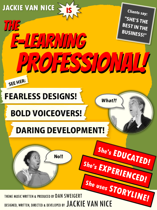
See It In Action!

Enjoy the vintage-inspired goodness right here.

Filed Under: E-Learning Tagged With: Articulate Storyline, Audio, Characters, Community, E-Learning Design, ELHChallenge, Emotional Engagement, German, Instructional Design, Portfolio, Professional Development, Typography, Video, Visual Design

My Sketchy Life as an E-Learning Designer

April 14, 2014 By Jackie Van Nice 11 Comments

Click Image to Launch Demo

Click Image to Launch Demo

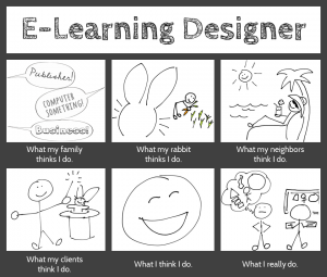
Since so many people are sketchy about what we do as e-learning designers, it seems appropriate to answer this week’s Articulate challenge in a similar vein. This week’s challenge is to answer the question “What do e-learning designers really do?” using the architecture of a visual meme supplied by David Anderson.

Design

I considered doing something interactive in Storyline, but went for a simple image instead. I’ve been playing with sketches lately and it seemed like a good sketching exercise. I created the finished image in PowerPoint.

Sketches: I made these on an iPad with an app called Pencilicious and a generic cell phone stylus. It would have been hugely easier with a stylus that wasn’t shaped like a big fat pencil eraser, but they don’t call this a “challenge” for nothing.

My process to go from scribbling to having usable PNG files: Sketch on iPad > email to self as PDF > export images as PNGs > use ’em! I was impressed with Pencilicious. It was the simple, easy-to-use app I was hoping for at only $2.99, and I’m looking forward to using it more.

Colors: I tamed the all-black frame of David’s example to more of a graphite color to work with the pencil-like theme. The only other colors are in the carrot garden, and that was because I didn’t think my carrots would look like carrots without color. I tried balancing that color with color elsewhere, but didn’t like it. So it’s an unbalanced design in favor of my bunny’s carrots.

Fonts: I’ve been in love with the header font, Cabin Sketch, since we first met. I’ve not had a chance to use it until now, so color me happy. The caption font is Cabin (brother of Cabin Sketch), and the three fonts in the first frame are Cedarville Cursive, Chocolate Windows, and Sneakerhead BTN Shadow.

Content

What my family thinks I do. This is dead accurate. My sister-in-law just sent me a job post, happily noting that it sounds “just like you!” It was for a publishing job. My brother suspects I do something with computers, and my lovely mother excitedly tells everyone she can that I’m an extraordinary businesswoman. (She’s sweet like that.)

What my family thinks I do.

What my rabbit thinks I do. All she knows is that I come up with endless feasts of carrots and kale, and she knows you get carrots by digging them up, so she probably thinks this is what I’m up to all day.

What my neighbors think I do. There’s no way they’d even have a guess. Best case, they think I spend all my time goofing off between vacations.

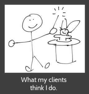
What my clients think I do. I adore them because they think I make magic happen.

What my clients think I do.What I think I do. I love what I do as an e-learning designer (don’t tell anyone), and between that and getting to work for myself from home, it’s hard not to be happy.
What I really do. I do what we all do: I work with clients; take in a gazillion project details; organize, analyze, and process them; dream up attractive, effective, and fun training solutions; and build them. (In a computer! So my brother was right.)

Hope you like it!

Filed Under: E-Learning Tagged With: Community, E-Learning Design, ELHChallenge, Emotional Engagement, Instructional Design, Professional Development, Show Your Work, Typography, Visual Design

Let’s Start at the End (Of Your Course)

April 8, 2014 By Jackie Van Nice 2 Comments

Select Image to Launch Demo

Select Image to Launch Demo

This week’s Articulate E-Learning Heroes challenge is to send a little love to the end of your course. It can be lonely and confusing back there – (“Is it over?” “What am I supposed to do?”) – so this week we’re sending back a life line.

Context & Theme

I wanted to indicate we’re starting at the very end of an interminably long course. My first choice was to start at the end of pi, but finding the end of pi is even more nebulous than the end of most courses, so that was out. (Maybe when I see Neil DeGrasse Tyson at DevLearn in October I’ll ask him if he’s made any progress on that Pi issue.)

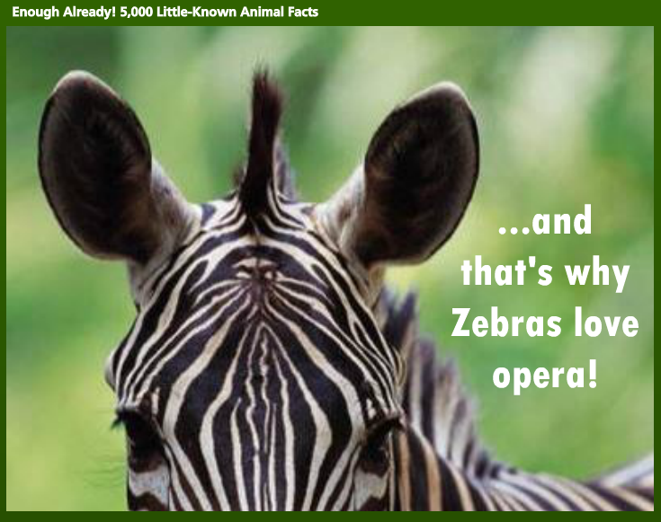
So instead I created (the end of) a course called “Enough Already! 5,000 Little-Known Animal Facts”, which starts on the last part of the last fact about the last animal.

Indicating Completion and Next Steps

Indicating Completion and Next Steps

Spelling it Out

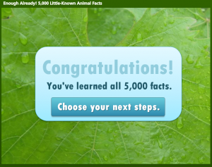
To be clear that you’ve reached the end of the course, I start with a congrats slide that also indicates you have a little more to do before you go.

Final Decisions

Final Decisions

Final Decisions

Which leads to an animal-themed screen where you get to make decisions. Hover State Visual: Hovering over each picture reveals where you’ll go if you click on it. Hover State Audio: Hovering also reveals a bit of audio. Its purpose is to add a touch of interest, amusement, and wake you up – but there have been reports of startled coworkers and kitties as of late, so consider yourself warned.

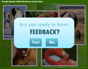
Gate Screen for Feedback

Gate Screen for Feedback

Gate Screens

After you make a selection you’ll go to a gate screen to confirm your choice. David Anderson had a gate screen challenge a few months ago where he talked about them, and you can also see the different examples created by members of the community.

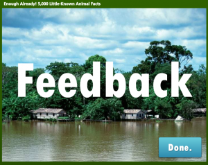
Feedback Placeholder

Feedback Placeholder

Room for More

In this example, if you choose anything other than “Exit” you’re taken to placeholder slides that could harbor summarizing thoughts, more resources, ideas for review, or a means of leaving feedback.

See it in Action!

Take a look at this wild little ending right here.

Filed Under: E-Learning Tagged With: Articulate Storyline, Community, E-Learning Design, ELHChallenge, Emotional Engagement, Instructional Design, Show Your Work, Visual Design

What Do I Think of Storyline? Well, Since You Asked…

March 30, 2014 By Jackie Van Nice 8 Comments

Select Image to Launch Demo

Select Image to Launch Demo

This week’s E-Learning Heroes Challenge is to come up with a “Top 10” list of things you’d tell someone about Storyline. You can collect your favorite resource links and curate them any way you’d like.

I basically took everything that I normally say to someone who asks me about Storyline, put it all together with appropriate links, and tied a bow on it. (Not unlike last week’s challenge where I did the same for what I tell future freelancers.)

Main Menu

Main Menu

The Design

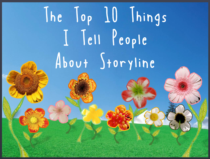
One advantage of the gallery layout on my blog is that I can instantly see what sort of design I should do to contrast with my recent work. Since my last two entries haven’t had vibrant color palettes, and since spring is officially here, I went for bright and springy with a little bit of silliness and a little bit of elegance.

I also didn’t want a main menu with squares or buttons that linked to the 10 points. I wanted the menu to be a creative, vibrant, graphic embodiment of the theme. Once I made that decision, the idea for the springing-up flowers came easily.

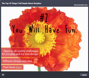
Content Page #2

Content Page #2

Main Menu Flowers: I wanted flower shapes that I could fill with photo captures from their related content pages. So I took out my trusty Wacom tablet and started drawing the basic outlines of the flowers, stems, and leaves. I did it in Storyline by going to Insert > Shape > Lines > Scribble and drew them right on the slide.

Then I adjusted the outline weight and color and did a picture background fill for each shape using a tight capture from each of the larger flower photos.

To make the flowers pop in their hover states, I increased the weight of the flower’s outline by a pixel or two, and increased the size of each flower by about 4 pixels in width and height.

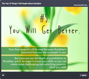
Content Page #5

Content Page #5

Audio: The sound effects for the flowers are two different sounds on top of each other. One’s a pop and one’s a spring. The singing birds are a piece of audio that I looped. I knew it was possible, but had never done it before. A quick Google search took me to this simple how-to. (Thanks, David!)

Content Page Colors: To get colors for my text, fills, and outlines that went perfectly with the flower images, I used the heck out of the eyedropper tool.

Photos: They’re all from Microsoft Clipart. I wanted big, clean, bold, colorful images.

Fonts: I’ve used the title font, Blue Chucks, a couple of times lately. Same with the paragraph font Copse. When you’re a cute font, you’re gonna get used.

Content Page #9

Content Page #9

The Content

It is what it is! This is what I tell people who ask, and these are the resources I direct them to.

The Finished Product

You can see it in all of its springy loveliness right here.

Filed Under: E-Learning Tagged With: Articulate Storyline, Community, E-Learning Design, ELHChallenge, Emotional Engagement, Professional Development, Software Training, Technical Training, Templates

This is Why Freelancers Need Floaties

March 24, 2014 By Jackie Van Nice 11 Comments

Select Image to Launch Demo

Select Image to Launch Demo

This week’s Articulate E-Learning Heroes Challenge is to create a photo collage that tells a story.

I’ve just gotten home from a (great!) week at the E-Learning Guild’s Learning Solutions Conference in Orlando, and the theme that kept coming up was freelancing. Not just in sessions, but in countless random conversations, and I found myself offering a lot of advice to hopeful freelancers.

I Smell a Theme

So because there’s only so much space in my head and this is the topic currently on tap in there, my photo collage story this week is about a guy who wants to freelance. The points I’ve included are a summary I quickly put together for this piece, but it’s similar to what I was sharing all week.

The Story

Select Image to Launch Demo

Select Image to Launch Demo

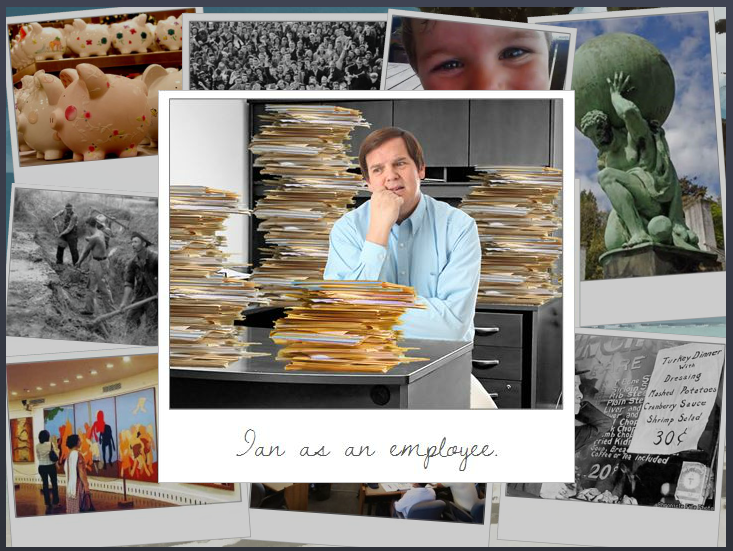
If I’m going to tell a story, I need a starting point. So I overlaid our (miserable) hero on top of the rest of the photo collage so that I could establish his yearning-to-go-freelance motivation. The underlying photos and their content, each of which reveals a portion of our hero’s journey, can be visited in any order. And of course you get to see the result of his efforts at the end.

Visual DesignVisual Design

I kept the visual design pretty simple. The photos are framed in a pseudo-Polaroid fashion. The caption font on the top photo is Dawning of a New Day. The title font on the pop-ups is Swiss921 BT, and the main pop-up font is Candy Round BTN Condensed.

I reused a beach and palm tree from a recent post about freelancing, mostly because I wanted the tree for the end scene.

And I reused poor Ian again. I’ve forced that poor man into service as an airline pilot and a beer-guzzling traveler in recent weeks and wanted to give him a rest, but I needed someone who could fit into the outfit at the end, and he had the perfect figure. (Sorry, guy.)

Storyline DesignStoryline Design

When clicked, each photo in the collage pops up on a slide layer with more info. Then I have each photo disappear after viewing it. That way I was able to set up a new layer of interest below.

That interest includes having each photo, in miniature, drop down into the palm tree and hang there like an ornament. You can then click on those ornaments to review their content. I did this by adding a second slide layer for each collage photo.

And, of course, I had to show Ian’s transformation after he’d followed his own plan, but I could only show that after all photos had been viewed. To do this, I created a variable for each photo. After all of them have been visited, Ian and his final outfit are triggered to appear.

The ResultSee the Result!

You can see Ian in all his freelance glory here. Enjoy!

Filed Under: Working for Yourself Tagged With: Articulate Storyline, Characters, Community, E-Learning Design, ELHChallenge, Freelancing, Instructional Design, Mobile, Portfolio, Professional Development, Show Your Work, Visual Design

  • « Go to Previous Page
  • Go to page 1
  • Interim pages omitted …
  • Go to page 19
  • Go to page 20
  • Go to page 21
  • Go to page 22
  • Go to page 23
  • Go to Next Page »

Primary Sidebar

Welcome!

I’m an award-winning instructional designer and proud Articulate Super Hero who creates e-learning for large organizations. I blog to explain my design process, share tips and tricks, and help others succeed. I hope you enjoy my refreshing gallery of e-learning goodness!

  • View jackietrains’s profile on Instagram
  • View jackievannice’s profile on LinkedIn

Tags

Articulate 360 Articulate Rise Articulate Storyline Articulate Studio Audio Avatars CCAF Characters Community Context Design Makeover Dials Drag & Drop E-Learning Design ELHChallenge Emotional Engagement Free Download Freelancing Games German Glossary Instructional Design Languages Makeover Menu Mobile Motivation Pantone Portfolio PowerPoint Professional Development Quick Reference Quizzes Sales Training Scenarios Show Your Work Software Training Storyline 360 Tables Technical Training Templates Typography Video Visual Design Voiceover

Top Posts & Pages

  • Portfolio
    Portfolio
  • Home
    Home
  • Sexual Harassment Training
    Sexual Harassment Training
  • Sales Mobility Software Training
    Sales Mobility Software Training
  • Navigating a Tasty Circular Menu
    Navigating a Tasty Circular Menu
  • Articulate's E-Learning Heroes Challenges
    Articulate's E-Learning Heroes Challenges
  • About
    About
  • Free Visual Storyboard Template
    Free Visual Storyboard Template
  • Free Storyline Templates
    Free Storyline Templates
  • How to Go Full-Screen & Lose the Player in Storyline
    How to Go Full-Screen & Lose the Player in Storyline

Copyright © 2025 Jackie Van Nice and E-Learning Goodness by Jackie Van Nice