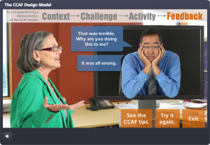
Select Image to Launch Demo
This challenge is to create your own characters in pictogram style. You simply take basic shapes (I used PowerPoint) and mold them until you have the custom characters you need.
The Idea
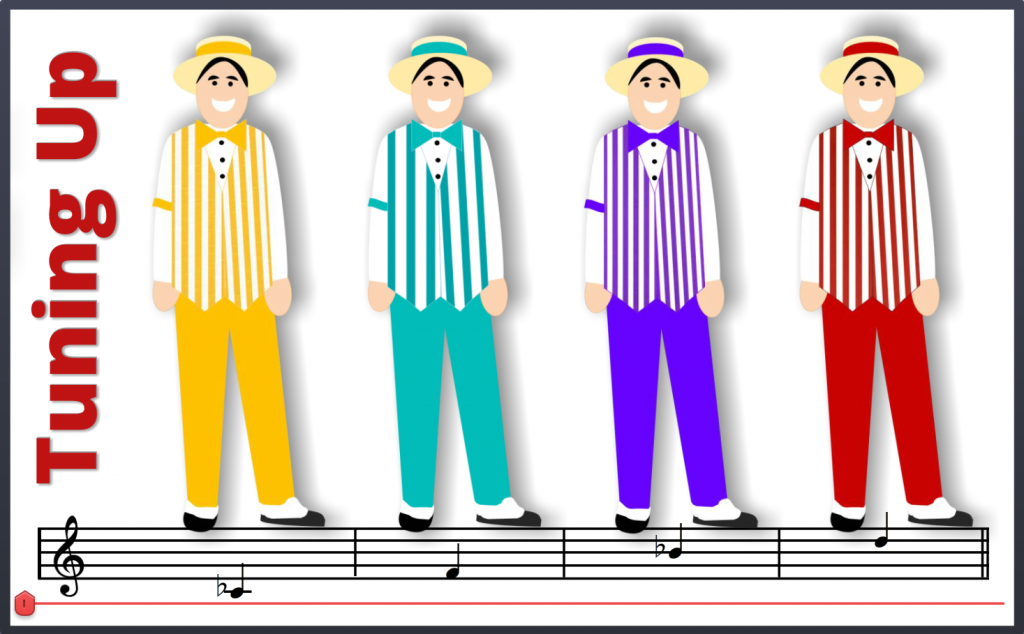
Inexplicably, the only characters I was motivated to pictogram were the Dapper Dans – a barbershop quartet at Disney. David Anderson was clear that these characters should be “aligned with an industry”, so apparently I opted for the entertainment industry’s thriving barbershop sector; strolling division.
The Approach
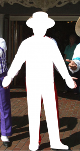
After finding an image of a Dapper Dan I brought it into PowerPoint and started slapping basic shapes on it to mimic the outlines. Then I added some color, smaller details, and used images of striped fabric as the fill for their vests.
Dan Before
Dan During
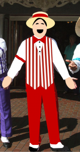
Dan After
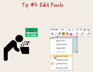
Mike Taylor’s Helpful Video
Mike Taylor’s blog post explaining how he created his own pictograms – and especially this video he did to demonstrate – helped me a lot. Specifically, I’ve never been satisfied with the amount of control I’ve had over editing points on shapes in PowerPoint, but starting at 7:20 in the video he reveals finer points I never knew about, and that was a big help. Thanks, Mike!
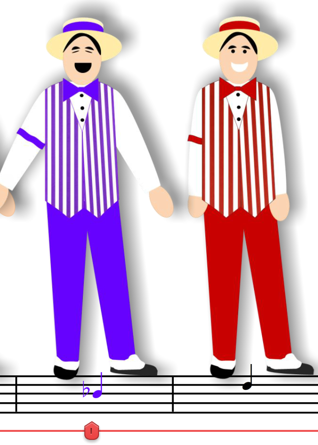
State Change: The Dan’s Stance & Note Color Change When Selected
The Slider
I guess I didn’t get enough of a slider fix in last week’s challenge, and this one was just asking for it. The idea of having each stop be a different vocal that harmonizes with the others seemed like a good idea, so I roped Dan Sweigert into recording some quick audio and was off to the races.
I set it up so that when a Dan is selected (1) his audio plays, (2) he changes to a singing stance, and (3) the note on the musical notation below him changes to match his outfit. Those image changes are set up as states, and they’re triggered to revert to their normal states once the audio stops playing.
Have a Look & Listen
Here’s the finished product. Have your audio ready and enjoy the performance!
Download the Free Image and Slider Files!
In case these might help you in your own work, you can download the PowerPoint source file with the customizable pictogram characters and download the Storyline singing slider file, too. Have fun!