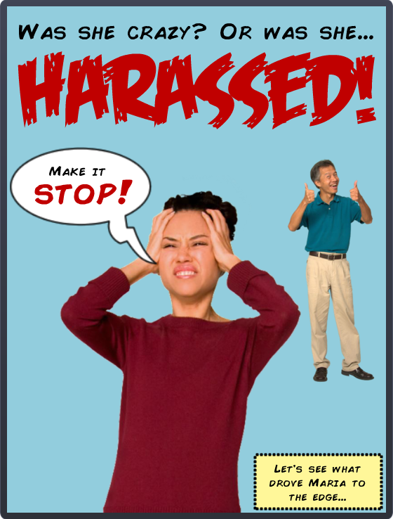
I’m so excited! Today I completed the entire first year of Articulate’s E-Learning Heroes challenges – all 48 of them! I started participating about 5 months into the challenge year so there were a lot to make up, but I did it. Before collapsing I’ll share one of my favorites I uncovered back at #11: Comic Style Themes for E-Learning.
Figuring Out the Style
I don’t know much about comic books and didn’t have a clue how to handle this challenge, but figured it out the same way I did the interactive resume one. I searched for comic books on Pinterest, pinned a couple of things, then took in the rest. That made it easy to assess the approach and style and I got the gist very quickly.
How About Harassment?
I thought about courses I’ve done that I could adapt, and harassment seemed like just the ticket. I already had the material and characters in place; I just needed to change the style and ramp up the drama.
Colors & Fonts
The color palette came from the outfits of the characters on the cover. Add in the classic yellow box for narration, and you’re all set. The fonts were free from Dafont: That great title font is Feast of Flesh BB and the paragraph font is Comic Book.
Before & After
Here are a couple of screens from this harassment course I did a few years back. You can see how I adapted them to the comic book demo. You can also see that the comic book style gave me an acceptable way to make it more personal and cut to the chase more quickly and with greater emotional impact.

“Before” Screen

“Before” Screen

“After” Screen
Next Time
Given more time I’d have loved to add in music, sound effects, and background images; but as a quick learning exercise I’m pretty happy with it. Fortunately David Anderson promises he’ll have another comic book challenge coming up in the new challenge year. (Ka-zam!!!)
Here it Is!
If you’d like to check out this quick comic-book style demo, it’s right here.


Nice work Jackie! I’m working my way back through the challenges as well. Maybe one day I can join the “Jackie Van Nice Completed all First Year Challenges Club”. :)
How in the world did you get here to comment so quickly?! You’re taking on some of David’s super powers. :)
That’s great you’re working through them too! I learned so much by doing it. I’m sure you’ll be able to join the club soon, but won’t we have to change the name at that point?
Comic style designs are always fun. You captured the core elements (fonts, heavy strokes, and panels) but in a corporate-safe design. I think that could be a good angle for our next comic challenge.
Congrats on completing all current challenges. I wish I had a hidden challenge or two I could spring on you.
Thanks, David! It was a lot of work, but well worth it. I’m delighted to hear you don’t have any others up your sleeve at the moment. I need a little Challenge R & R so I’m ready for the new year.
Corporate-safe comics. I guess I can add them to my menu of services, right? I like it. Good challenge angle, too. I’m looking forward to it!
Right, Jackie! You could start your own line of CSFW (comics safe for work) elearning templates!