A Zippier Part of the Course
For this challenge, David Anderson asked us to take static content and turn it into an interactive knowledge check. I grabbed some of the least appealing content I know and got to work.

Version 1: The Grim Original
The Idea

Version 2 Improvements: Visual Design, Hover, & Audio
I did a cost share course for a nonprofit a few years ago, and even though I was able to perk most of it up, there were a few screens that didn’t lend themselves to perking.
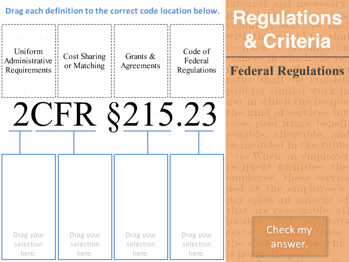
My idea was to take the worst – a screen about parts of a government code – and turn it into an interactive knowledge check.
The Design

Version 3: Fully Interactive Knowledge Check
I took my improved version (you can see the client’s original above) – and challenged myself to leave the layout intact.
I converted it into a drag-and-drop interaction that actually took quite awhile to get exactly as I wanted it.
My focus was not only on making it clean and functional, but on giving the learner the freedom to play with it as much as they’d like.
The Result
What I like best is that it gives you a chance to interact with the content. You can puzzle it through and learn a bit along the way.
What I like least is that it’s not the memorable, motivational, or meaningful star I would like it to be – but you have to pick your battles. 95% of the course uses scenarios and good context; but the client’s goal was to introduce the idea that each part of the code has meaning – not to memorize it. If you needed it on the job, you’d look it up! (Who doesn’t love performance support?)
Ready to get all interactive with a federal regulation? You can do it right here!

 The Idea
