Do you know how many times I’ve heard about a learner getting confused about course navigation? Close to zero. Nonetheless, organizations like to include instructions, and those instructions tend to get short shrift. So when David Anderson challenged us to get a little more creative with navigation intros – I was in.
 The Idea
I wanted an approach that was simple and replicable; but unique enough to capture the learner’s attention. I hadn’t used photographic characters for awhile, so I grabbed one and riffed off of his lab coat to determine the topic.
Though my process was backwards, the idea is that you can theme your navigation instructions to match your course content. It makes it more fun and gets the learner ready for the topic.
The Design
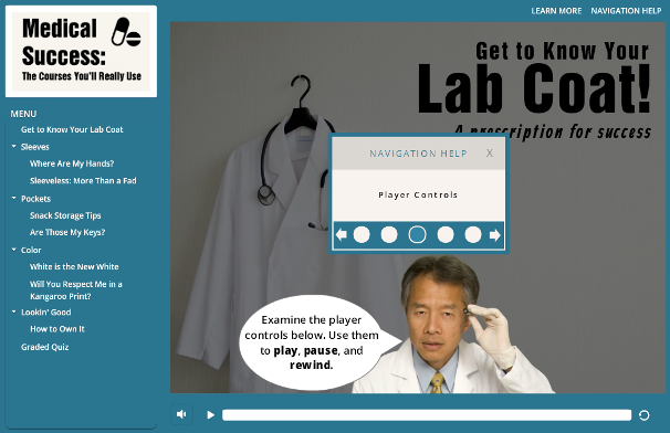
I like Coolors’ navigation tutorial, so I played with their center-of-screen dashboard approach, which then gave my lab-coated gentleman the freedom to point out navigation elements on the rest of the screen.

Coolors’ Navigation Start

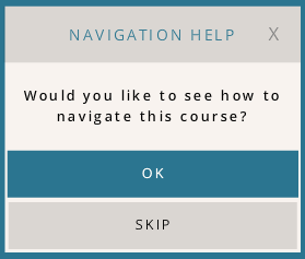
My Navigation Start

Coolors’ Navigation Navigation

My Navigation Navigation
I also made sure that if you choose to skip the navigation intro that you’re confronted with a nurse with some good advice, but your consequences are your own.
The Result
It’s simple, but still more interesting than any of the standard navigation instructions I’ve done. With more time I’d refine it, but this gives you the general idea.
If you’d like to navigate these white-coated waters, you can see it right here!


