This week’s Articulate challenge is to create a science-related interaction, so I legged it to my desk and started spinning a plan.
Web Inspiration
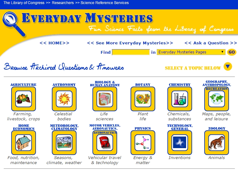
I wanted a simple topic and found inspiration on the Everyday Mysteries/Fun Science Facts page of the Library of Congress. “How do spiders avoid getting tangled in their own webs?” seemed like a fair question, so I brainstormed from there.
Creating The Spider Slider
Visual Design
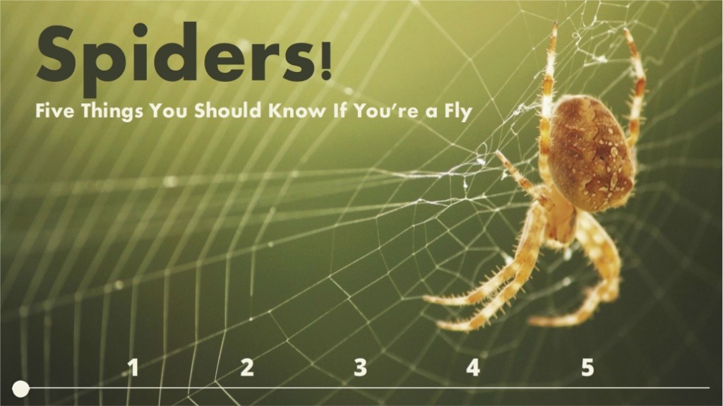
It had to be inviting enough to get you into the topic, so I went with a good-quality image with a color scheme I liked. All colors came from the photo using Storyline’s eyedropper tool.
Instructional Design
How can I pique your interest enough to get you to check out the content? By making you the fly. Not unlike my golfer safety course, you’re going to pay more attention if you think you might get eaten. It’s Motivation 101.
With more time I would have shown you your fly self (you’re already familiar with your fly self – but I mean detailed visuals of you as an actual fly), used motion paths to zip you around, and embedded more content – but this is a quick version to give you a sense of the approach.
Storyline Design
It’s a slider done in Storyline 2. It’s one slide and each slider position reveals a slide layer. Add in some animations and transitions and it’s a quick, clean way to present information. One of many reasons to love Storyline 2’s sliders.
Will You Click Into My Demo?*
Watch your step and enjoy it right here.
*Homage to Mary Howitt’s poem The Spider and the Fly. (Here’s a nice reading of it!)


 The Idea: Vocabulary Practice
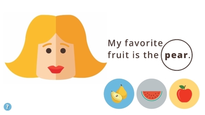
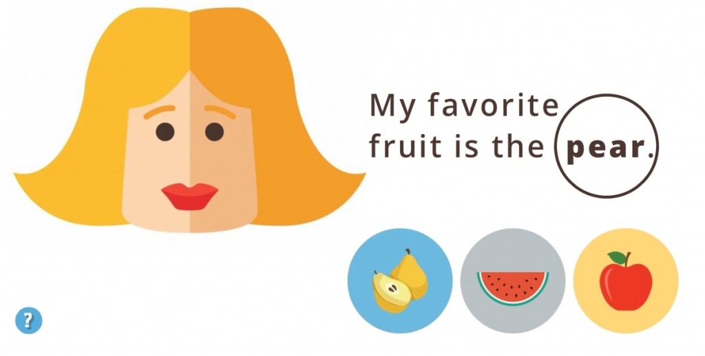
 I wanted it to be in Turkish, partly because it would be way cool and partly because I need the practice, but to save time I stuck with English.
 I kept it emoji-simple. From layout to images to instructions it’s easy to figure out, easy to navigate, and easy to understand the teaching points.


 Our Gators
 Our Golfers