This week’s E-Learning Heroes Challenge is to come up with a “Top 10” list of things you’d tell someone about Storyline. You can collect your favorite resource links and curate them any way you’d like.
I basically took everything that I normally say to someone who asks me about Storyline, put it all together with appropriate links, and tied a bow on it. (Not unlike last week’s challenge where I did the same for what I tell future freelancers.)
Main Menu
The Design
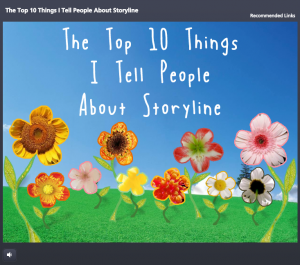
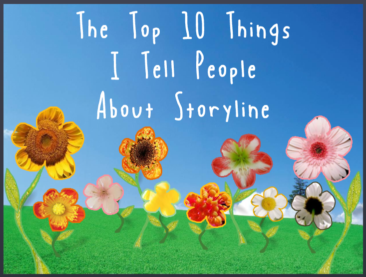
One advantage of the gallery layout on my blog is that I can instantly see what sort of design I should do to contrast with my recent work. Since my last two entries haven’t had vibrant color palettes, and since spring is officially here, I went for bright and springy with a little bit of silliness and a little bit of elegance.
I also didn’t want a main menu with squares or buttons that linked to the 10 points. I wanted the menu to be a creative, vibrant, graphic embodiment of the theme. Once I made that decision, the idea for the springing-up flowers came easily.
Content Page #2
Main Menu Flowers: I wanted flower shapes that I could fill with photo captures from their related content pages. So I took out my trusty Wacom tablet and started drawing the basic outlines of the flowers, stems, and leaves. I did it in Storyline by going to Insert > Shape > Lines > Scribble and drew them right on the slide.
Then I adjusted the outline weight and color and did a picture background fill for each shape using a tight capture from each of the larger flower photos.
To make the flowers pop in their hover states, I increased the weight of the flower’s outline by a pixel or two, and increased the size of each flower by about 4 pixels in width and height.
Content Page #5
Audio: The sound effects for the flowers are two different sounds on top of each other. One’s a pop and one’s a spring. The singing birds are a piece of audio that I looped. I knew it was possible, but had never done it before. A quick Google search took me to this simple how-to. (Thanks, David!)
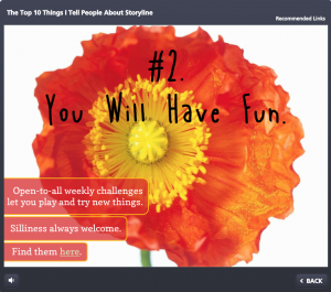
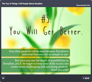
Content Page Colors: To get colors for my text, fills, and outlines that went perfectly with the flower images, I used the heck out of the eyedropper tool.
Photos: They’re all from Microsoft Clipart. I wanted big, clean, bold, colorful images.
Fonts: I’ve used the title font, Blue Chucks, a couple of times lately. Same with the paragraph font Copse. When you’re a cute font, you’re gonna get used.

Content Page #9
The Content
It is what it is! This is what I tell people who ask, and these are the resources I direct them to.

 Visual Design
 Storyline Design
 See the Result!


 “How did you get started as a freelancer?” is the most common question I’ve gotten in the last 10 years, and it’s a great one.
 You’ll notice I do no advertising or marketing or promotion, other than getting myself out there a little bit and doing some minor networking in ways that are very natural – including some blogging and tweeting. I put far more of my energy into learning more and doing the best work I can, and everything else just flows.