Select Image to Launch Demo
This week’s Articulate E-Learning Heroes challenge is to send a little love to the end of your course. It can be lonely and confusing back there – (“Is it over?” “What am I supposed to do?”) – so this week we’re sending back a life line.
Context & Theme
I wanted to indicate we’re starting at the very end of an interminably long course. My first choice was to start at the end of pi, but finding the end of pi is even more nebulous than the end of most courses, so that was out. (Maybe when I see Neil DeGrasse Tyson at DevLearn in October I’ll ask him if he’s made any progress on that Pi issue.)
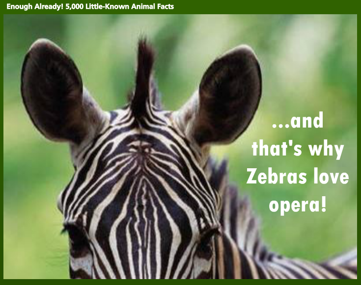
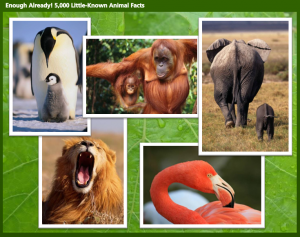
So instead I created (the end of) a course called “Enough Already! 5,000 Little-Known Animal Facts”, which starts on the last part of the last fact about the last animal.
Indicating Completion and Next Steps
Spelling it Out
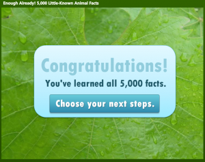
To be clear that you’ve reached the end of the course, I start with a congrats slide that also indicates you have a little more to do before you go.
Final Decisions
Final Decisions
Which leads to an animal-themed screen where you get to make decisions. Hover State Visual: Hovering over each picture reveals where you’ll go if you click on it. Hover State Audio: Hovering also reveals a bit of audio. Its purpose is to add a touch of interest, amusement, and wake you up – but there have been reports of startled coworkers and kitties as of late, so consider yourself warned.
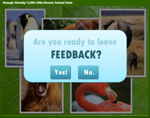
Gate Screen for Feedback
Gate Screens
After you make a selection you’ll go to a gate screen to confirm your choice. David Anderson had a gate screen challenge a few months ago where he talked about them, and you can also see the different examples created by members of the community.
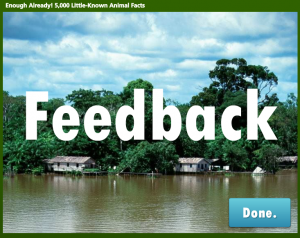
Feedback Placeholder
Room for More
In this example, if you choose anything other than “Exit” you’re taken to placeholder slides that could harbor summarizing thoughts, more resources, ideas for review, or a means of leaving feedback.