Before and After Example: Software Training
David Anderson’s Articulate challenge last week was to create an example of “bad” e-learning, and this week it’s time to turn “bad” into “good”. He wanted short, focused examples – so I chose a couple of screens and focused on context. The “before” is from a client, the “after” is from the lesson I created for the client.
What’s Context?
 My first question in every new project is: “How will the learner use this information in the real world?” Then I try to design the piece from the learner’s post-course real-world point of view to show them why they’ll care about it and when where and how it’s going to come in handy. Using effective context can add lot of interest and learner motivation, too.
The Bad E-Learning “Before” – Where’s the Context?
This client had two “before” versions of this training. The learner is a salesperson who needs to know how to use the photo options on his mobile sales device. The first “before” version used the “show me, try me, test me” approach. Both versions were real and both went live.

Bad-E-Learning-Inspired Mimosa
The Show-Me-Try-Me-Test-Me Debacle
How I wish I could show you this one! It was done in Captivate (not Captivate’s fault), navigation was completely locked down, the pace was crazy slow, there was no intro or context, and all you saw was the computer screen with a mouse slowly moving around and the occasional text box popping up with cryptic information. Whenever you thought it was your turn to “try” it, it wasn’t.
It was as satisfying and enjoyable as using a voice-response phone system when the robo operator can’t understand anything you’re saying. I could only make it through two or three minutes of this course before I had to literally hang up on it and figuratively go have a mimosa on the veranda to compose myself.

The “Before” Training
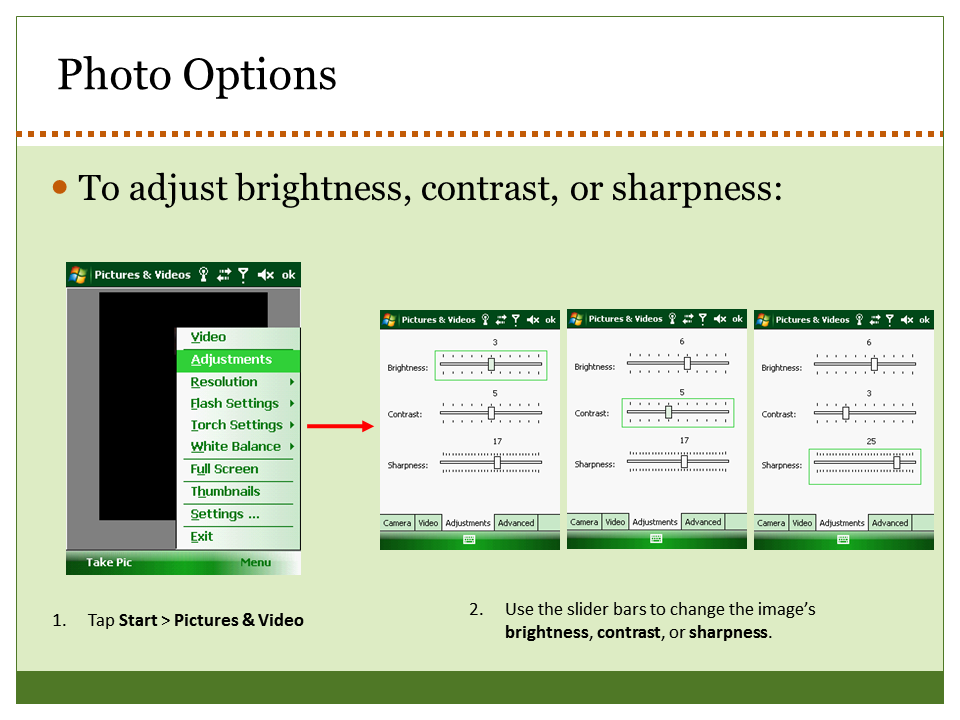
The Slide-With-Animated-Text-Box Version
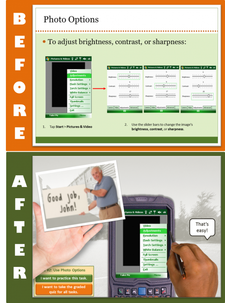
The other “before” version is still bad, but you’re never under the delusion that your input is desired or needed and you have a little freedom of navigation, so it’s less offensive. As training, it’s just animated software documentation. It’s context-free and a big snooze, jam-packed with information you’d never be able to retain when presented like this.
The Good E-Learning “After” – There’s the Context!
One Little Hitch
In the real course I teach the salesperson to use the camera during the sales process where they really need it. Since I can’t show you anything about their sales process in this example, I had to get creative.
Plan “B”
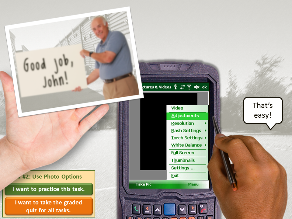
Since a manager often takes a new salesperson out into the parking lot to introduce him to the basics of the newly-issued device, that’s the context I used. I knew learners would glaze over when hearing about sexy things like “white balance adjustments”, so I tried to think of a context in which photo adjustments in the parking lot with the manager would have meaning.
I came up with the idea of the salesperson taking practice shots of his manager to show what can go wrong when taking a photo, and then showing him how to make photo adjustments so his manager looks better. (There’s some motivation!) Putting the manager in silly poses added some much-needed humor, too. All together, it brought some context and emotional engagement to a very dry topic.
Before vs. After
Did context help? In reality the client’s salespeople and managers love this course. They find it extremely effective as an introduction to the device, and since it’s made up of many smaller lessons, it’s easy to use as a refresher, too. In case you’re interested, here’s how I designed the course. I even showed it at SolutionFest last year!

Loving the new site, Jackie. Good job!
Thank you so much, Ashley!! I always like yours, too – so nice and clean and easy to navigate. (Just saw your great new video, too!)
This is great! I am a newbie in the elearning industry and Im learning a lot from you Jackie!
Thanks, Ashley! It’s so nice to know that this is helpful. I’m sure you’ll enjoy elearning and I hope you’ll keep in touch!