I love when people show their work. The whole creative process is inexplicable and mesmerizing and the only evidence of the path afterwards is the detritus left behind. My desk is full of mesmerizing detritus, so I thought I’d share. If Austin Kleon can do it, so can I.
This is how I designed my CCAF design model demo for last week’s Articulate challenge. Pretty typical of my process. If I’d known I’d be sharing, this would look way better.
Sketch One: The Whole Idea
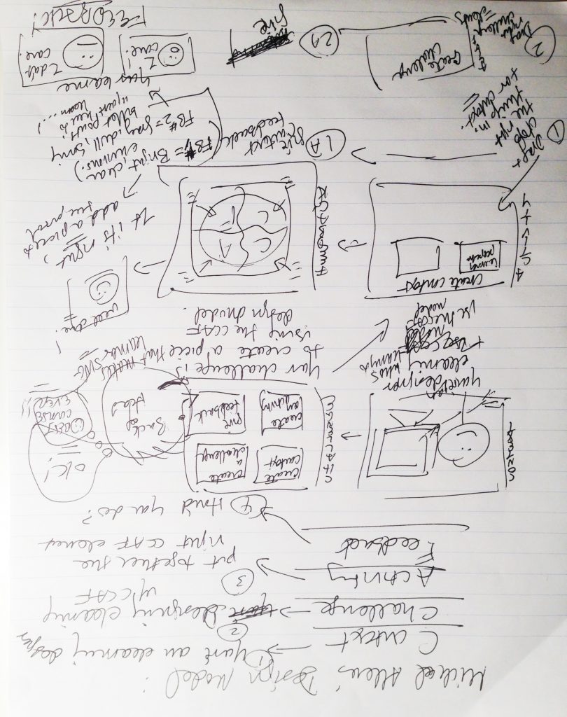
First Sketch, Page 1: The Entire Interaction Idea on Paper
I never look back at my sketches, so the surprise to me is that the whole thing was there from the start. It felt more difficult than that. I think there were just a couple of details that bugged me for days.
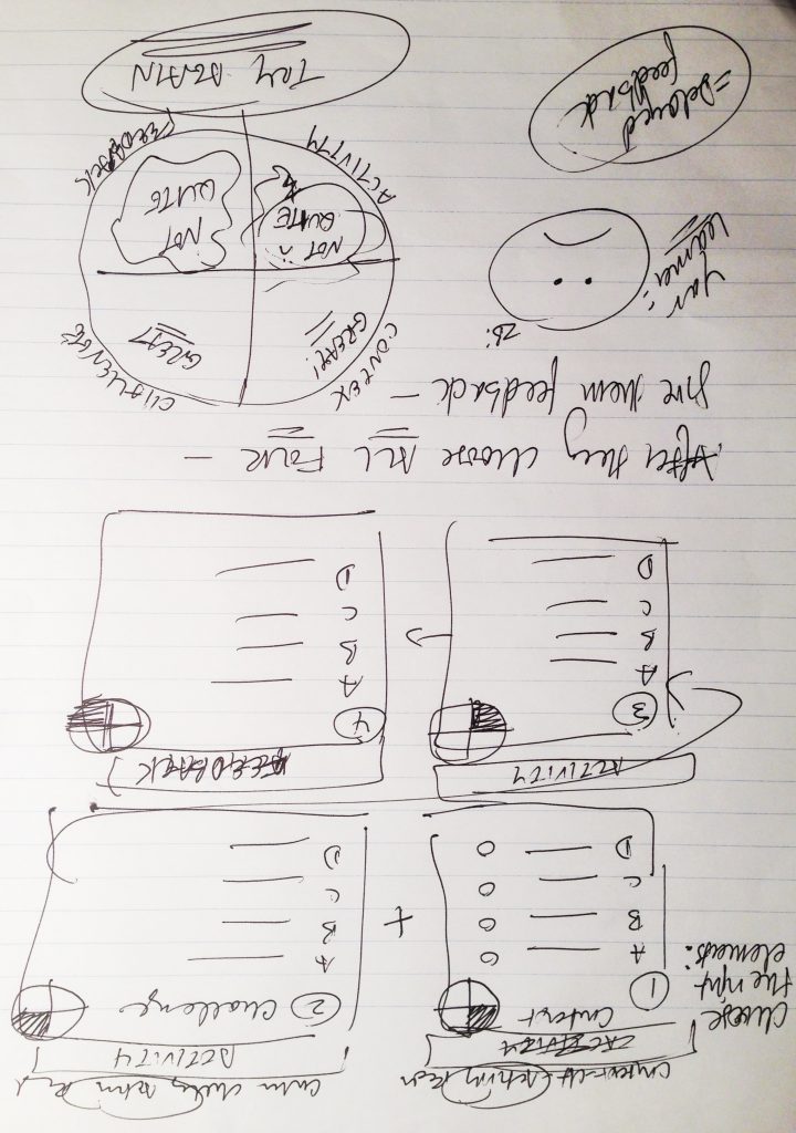
First Sketch, Page 2: More Detail About the Activity & Feedback Sections
First Screen
It’s interesting to see the quick sketch of the first screen below versus the final result. It was the simplest screen of all, but you see how much went into image and color selection and then making the details tight, clean, and balanced.
Player Tab: I was thinking of including a player tab to offer more details about CCAF, but decided that info should only be available at a point of greater need; just before and after the activity.
Writing: I didn’t work out the text or script in detail beforehand. That comes easily once I’ve got the other elements in place.
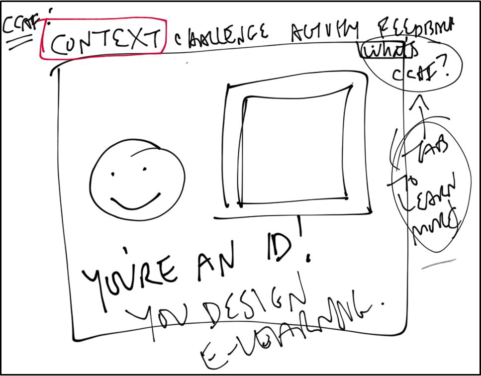
First Screen: 30-Second iPad Sketch
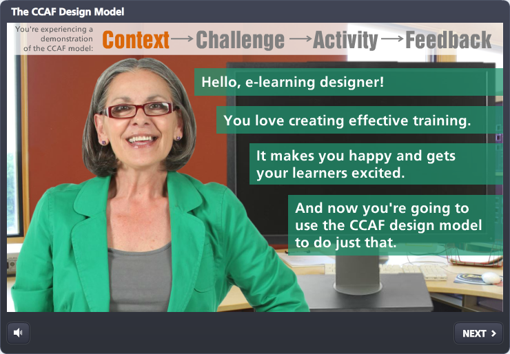
First Screen: Final Result
Activity Screens
These ate at me because it took time to get both the layout and functionality exactly the way I wanted, but I was happy when they came together at the 11th hour.
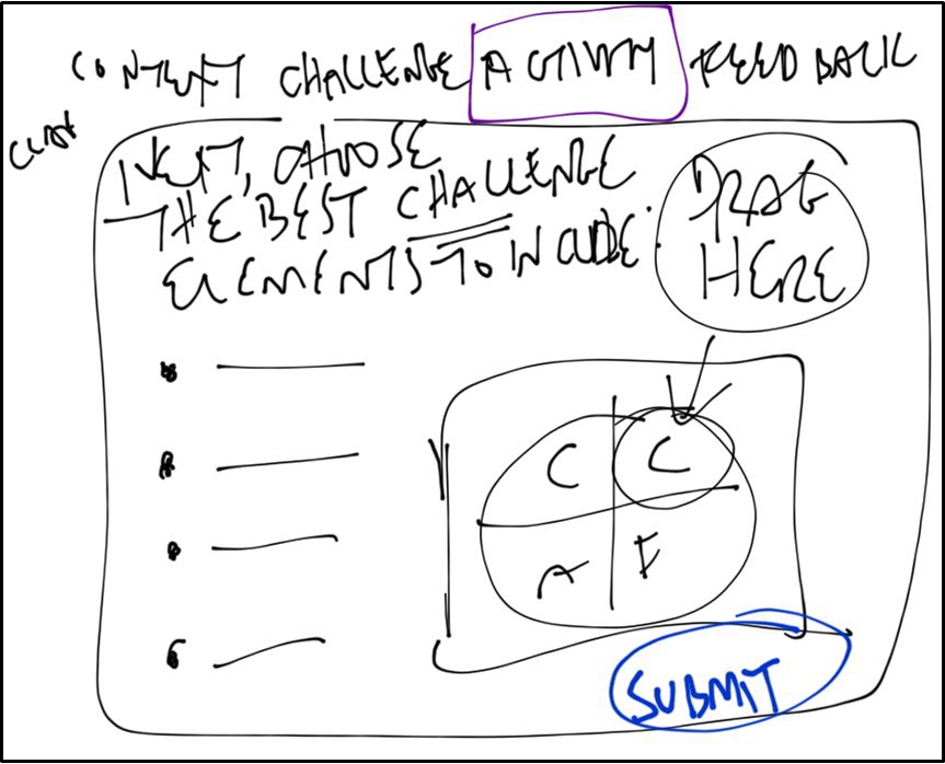
Activity Screen: Quick iPad Sketch
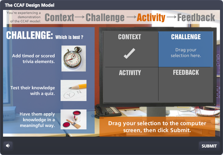
Activity Screen: Final Result
Feedback Screens
In the iPad sketch below you can see I was looking at how many parts of the CCAF activity the user got wrong. I knew the score couldn’t be the focus of the feedback, but it helped me map out the five learner reactions that were the focus.
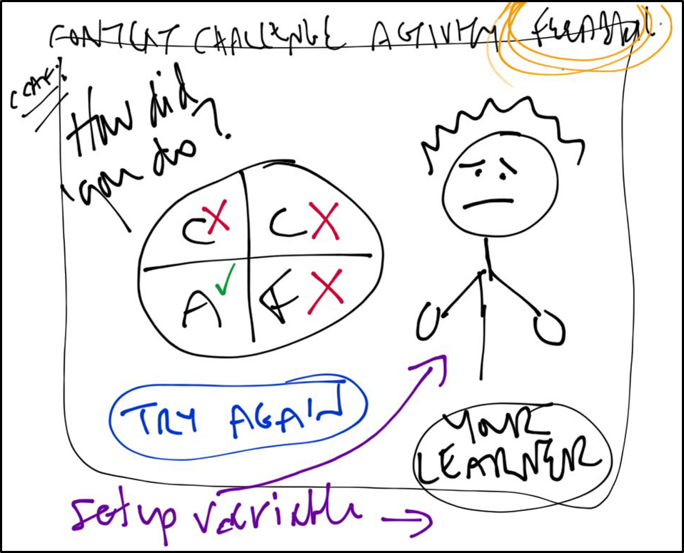
Feedback Screen: Quick iPad Sketch
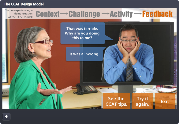
Feedback Screen: Final Result
Colors: Obey the Wall
All of the final-version slides show my text-box color decisions. If they’re:
- About the ID, they’re the same green as her jacket.
- About the learner (including designing for him), they’re the same blue as his shirt.
- An instruction or indicator that applies to the whole interaction, they’re the same orange as the wall.
An Eye-Opening Exercise
I don’t know if this exercise was helpful to you, but it’s helped me! I’ve never observed my own process like this before and it makes me appreciate the time and effort it takes to go from A to Z. Sounds ridiculous since I’m the one doing it, but it’s hard to see when you’re caught up in the process. Once I’m done with something I focus on the result, but I don’t go back and look at it like this.
Have You Shown the Messy Side of Your E-Learning Work?
I’d love to see if you’ve shared the messier parts of your e-learning projects, too! If you have, I hope you’ll share your shares.
This is great Jackie! I’m always interested to find out how other IDs approach and create their courses. I like to sketch and make notes on paper as well I find it frees up my thinking and I don’t feel constrained. If I have an idea for an interaction I also like to experiment a bit on the authoring tool to see if its actually possible! Thanks for sharing :-)
Thanks so much for your comments, Matt! Yes, like you, I find if I start by designing in the software it’s really limiting and much slower. On paper I can scribble out all aspects of a piece really quickly and build on it and/or edit from there. I’ll also do a quick mock-up in the software early on if I need to work out how to engineer something on a practical level. Can’t tell you how much I appreciate your comments!! :)