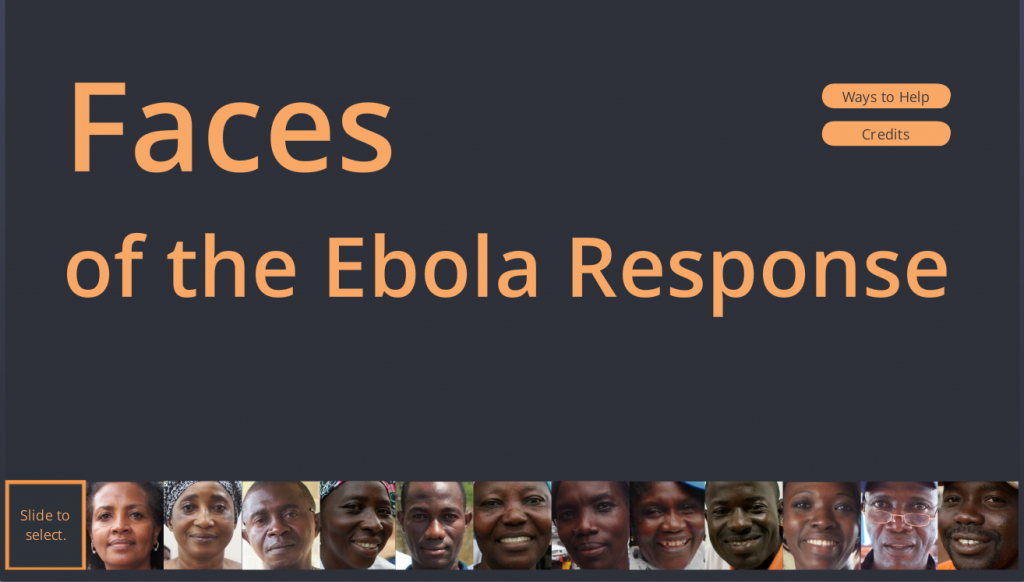
Select Image to Launch Demo
This week’s Articulate ELH Challenge is to design a learning interaction around the Ebola outbreak. Though I started with a branching scenario about patient triage, it wasn’t resonating with me because it wasn’t what I wanted to say.
The Idea
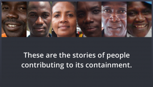
The Individuals
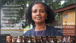
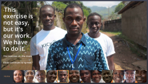
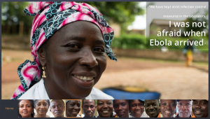
What I wanted to say is that there are people exactly like you and me on the ground who are calmly and quietly taking natural and positive action in response to the situation. This is easy to miss in an unending stream of panicky headlines.
I looked for information and lucked out by finding these profiles from the World Health Organization. Since I couldn’t possibly improve upon the content I simply worked to enhance it by framing it in a way that supports what they’re doing, helps educate people about what’s going on, and possibly motivates them to take action.
The Interaction
The Focus
I wanted simplicity, with complete focus on the individuals. It was tempting to have a more elaborate intro that involved maps and background information about the outbreak, but in the end the photographs and related personal stories tell the tale.
A Simple Intro
Slider Navigation
The Slider
From the start I envisioned a slider with a movable frame you could use to select a person’s image, and was very happy when I figured out how to do it.
It essentially involved making the slider track completely transparent and creating a frame image that I used as a picture fill for the thumb. That plus a whole lot of fine cropping and alignment work – and voilà! – the slider I had imagined. I also made liberal use of other Storyline features including motion paths, built-in animations, and advanced text control.
The Music
Finding music for this was initially quite tough. I could find lots of West African music, but very little of it evoked the mood I was after. Even when I found songs that did, I had no way of knowing if the message being conveyed – whether literally or culturally – would be appropriate, and the topic is simply too sensitive to risk a bad choice.
Fortunately I know a guy who knows his way around djembes and mbiras (that’s a picture from when we were shopping for instruments in Turkey), and he generously offered to let me use some music he wrote and recorded. Many thanks to him for that. I chose the song “Numbers” from a CD of kalimba music he did a few years back since I thought it conveyed a sense of calm, steady progress and it had an opening that worked well for this piece.
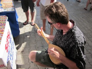
Dan Sweigert Getting Musical
See it in Action
If you’d like to see it, make sure you have audio and get ready to be inspired by some remarkable individuals right here.
Select Image to Launch Demo
This is great. I love the look of this, but I always appreciate that you break it down and let us get in your head as to the design process. You are an inspiration!
Thanks, Kristin! With all that going on in my head – why not share it? I’m glad if it helps at all. :)
This is fantastic Jackie!
Thank you Darlesa! I appreciate it!!
Dear Jackie, This is really impressive. Touching !
Hi Ilse – Thank you! I’m so glad you like it. Yes, their stories are very touching.
Great work as usual Jackie! This really draws you in and evokes such emotion. Well done and looking forward to see what you will come up with in the next challenge!
Thanks Regena. I’m always looking forward to seeing what I’ll come up with next, too! :)
You did a beautiful job on this Jackie, it’s really very inspiring to see people taking productive and practical action in the face of this scary disease.
Thanks Dan – and thanks for letting me use your music! It was perfect for creating an effective mood and sense of place.
This one’s a “house favorite” around Articulate. Nicely done, Jackie.
That’s great to hear, David! I’m glad they like it. :)
Jackie – I love this. As an instructional designer in the health care industry, it was refreshing to see the human side of Ebola, especially when most of us are thinking about the disease in other ways. The large, high resolution images, the personal quotes, and the music really evoke an emotional response that’s been missing from the media coverage. Your interaction was just fantastic.
Now, I have a silly technical question, and this probably has a simple answer but I can’t seem to figure out how to do it in my own Storyline projects. When I open your demo, it fills my entire browser. How did you get the player to fill up the whole space? What were the exact settings/player size? Thanks Jackie.
Hi Eric – I’m happy to hear you love this! I think we’re wired to look at a news story like this and (a) worry for our own safety, and (b) fret about which faceless agency is going to “do something” – but in the end, resolving it comes down to people like these who apply their best selves and best skills in a calm, compassionate way. (And the industry you’re in is jam-packed with talented, compassionate people.)
Not a silly technical question at all! The settings to get this large-screen effect are simple, but not obvious. They’re in Player settings under Other. I set the Browser Size to “Display at user’s current browser size” and Player Size to “Scale player to fill browser window”.
My tip: The viewing size is a decision I make when I start designing the piece. If I’m considering full-screen I need to be sure that my image assets are going to look good at that size and not get pixelated. To test it, I put some text and images I want to use on a few slides, then publish to see what they’ll look like at full screen. (You can’t use Preview to see it full screen – you have to publish.) Here’s a great tutorial with screen captures and more info about the Browser and Player settings too.
Thanks for your great comments, Eric! I really appreciate them.
Thanks for the explanation, Jackie!
Beautifully done, thanks for sharing the stories of the brave folks on the ground. Also, creative use of the Storyline Slider feature. Color me impressed!
Hi Tanya! I’m glad you liked it. All credit to WHO and – more importantly – the brave folks on the ground, but it was great to have a chance to creatively frame and present it in Storyline.
Thanks so much for your comment!
Great job on the Faces of Ebola, Jackie… Nice streamlined look and feel and each page a message…
Thank you, Michael! I appreciate that – and Storyline 2 came through beautifully on this one. :)
Made me cry!
Hi Cairyn – I know what you mean! Each one is a touching story all by itself. Put them all together and it’s quite powerful.
You really have an eye for beautiful design – even on this blog page. Your clients are lucky to have you designing their instruction. Thanks for sharing!
Hi Sherri –
Thank you for such a lovely comment! Believe me, I’m equally lucky to design for them. Not only are they wonderful (and incredibly easy) to work with, they let me be as creative as I’d like to be. What more could I ask??
Thank you for stopping by – I really appreciate it. :)
This is beautifully done, Jackie! I hope you don’t mind, but I have just featured your module as an educational resource on my website: (http://lifescienceinteractive.com/). I have credited both yourself and the WHO (for the development and content, respectively). Please do let me know if that is ok with you. I just wanted to share this with as many people as possible! :)
Hi Anne – Of course I don’t mind! If you think it’s worth sharing, that’s pretty great. :)
Thanks for going the extra mile to get it out there – and for letting me know!
You’re very welcome! :)
This is such a wonderful example of transformative learning in instructional design.
That’s a great observation! Thank you so much for your comment. :)
I like the graphics, the text layout and size, and the way you enhance the pictures. Also, a cool use of the slide. It adds something though not quite sure what.
Thank you so much, David! I agree that the slider adds that little je ne sais quoi. :) I think it’s partly because it makes the user experience more fluid, but I also wanted the user to be able to see every person’s face throughout – in this case on the slider – to emphasize that it’s all about them.