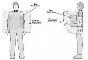
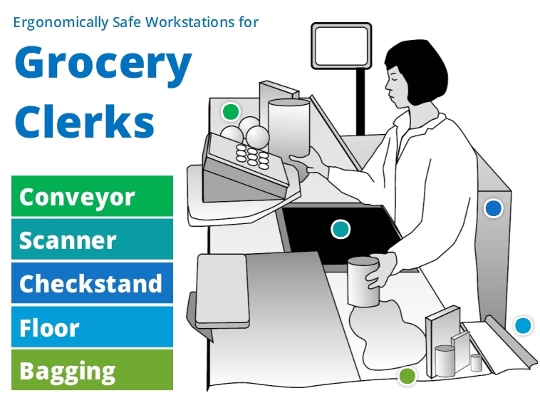
This week’s Articulate challenge is to create an ergonomics training demo, so I sat up a little straighter and started brainstorming.
The Idea
I usually see ergonomic guidelines for sitting at a computer or lifting boxes, and wanted to find something different. I had some entertaining ideas, but then I realized the challenge comes down to images. With more time I could make my own, but it’s not that kind of week.
OSHA to the Rescue!
Luckily for me, after endless searching, I found a less-traveled topic and good images at OSHA. I included the full document as an attachment in the demo.

OSHA Ergonomic Guidelines for Retail Grocery Stores

OSHA Grocery Store Ergonomics
. . . .
. . . .
. . . .
. . . .
. . . .
. . . .
. . . .
The Design
I kept it simple and let the images be the stars. It actually took me quite awhile to make all of the design decisions – (layout, what to present, how much to present, how to present it, colors, navigation, hover states, player choices, and on and on) – so though it’s simple, it took time.
See The Result!
What do grocery clerks’ toes really need? Check out the demo to find out!

This is a really elegant example. I also chuckled at your comments regarding the time-consuming tasks if design and layout. Those areas are usually the time tigers.
Exactly!! If I just knew what the darned thing was going to end up like it would sure be a breeze to build. :) (Thanks, David!)