Select Image to Launch (New) Demo
I was always fond of this little passport how-to I did in Storyline 1, but when Articulate was kind enough to feature it on their E-Learning Examples page recently and people seemed to like it – it got me thinking about how I could update it using Storyline 2’s great features.
Navigation: Before & After

Before: A Tab-Based Layout

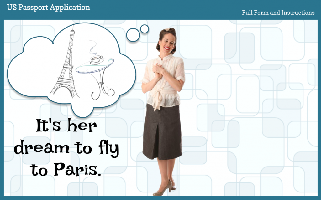
After: A Paris-Bound Jet Guides You
One of my favorite features in Storyline 2 is the slider for its ease of use and power to deliver a lot of information in a compact way.
I knew it would be perfect to get the entire application on one screen where the user could see everything from a high-level overview to a mid-level peek to detailed animations showing how to fill it out – simply by sliding the Paris-bound jet down the runway.
The thing is, you could still create this basic design in Storyline 1 (using this layout for a more compact presentation and navigating via clicking or tapping) – but there’s something about the slider that makes things like this easier to ideate, create, and (on the learner end) use.
Updated Animations

John Hancock Would Be Proud of the Signature Animation
The other feature-based update I made was to the animations. In the original I relied on a fade animation to bring in handwriting and typing, but being able to use the new built-in wipe animation improved the look and feel quite a bit, so I was happy about that.
See the Jet-On-the-Runway Slider!
Here’s the updated jet-fueled slider demo, and here’s the original demo for comparison. Enjoy – and bon voyage!
Great makeover Jackie! Love how you captured the sections and the animations!
Thank you, June! I’m glad you like it. :)
I love this example. Nice work!! My only recommendation in the new version is to potentially add some directions on Page 1 to direct the user to continue to use the jet slider to get to the sub-topics. At first, I thought the slider was only for the main topics (Page 1, Page 2, and Submit. This presentation is one of the best I’ve ever seen in Storyline. I just started following your blog today and I’m already glad I did :)
Hi Jenn! Thanks so much for your great comments – and for following my blog. :)
Yes, level of instructions is always a balancing act. I did carefully consider what you’re suggesting and in the end decided to let the user explore and discover the details of how it works for herself to enhance curiosity and overall engagement.
If I think the average user will figure it out without the risk of getting too lost or frustrated, I’ll leave directions at a bare minimum. I also think if it’s a really good design users should be able to figure it out just fine. It’s a goal I keep in mind as I’m designing.
So that’s my approach – but your suggestion would work beautifully too. Thanks again for sharing your ideas!
Thanks for sharing. It’s great see the new (fantastic) Storyline 2 features put into practice in a sleek and profession way. It keeps ideas fresh in my mind. I love your blog and learn so much from it.
Lynne
Hi Lynne! I’m so glad if it helps give you some fresh ideas. Thanks for following my blog, too! It would be a far lonelier site if there wasn’t anyone here to share with. :)
Beautifully done Jackie. I wish I would have had that wipe animation back when I was creating software training and wanted to show fields being typed into on a screen and the final signature. I’ll remember to use the wipe next time since I now have Storyline 2. You chose a fun setting to present what can often be a boring topic.
Thank you, Dan! It’s so funny that something as simple as a wipe animation can make such a big difference in the final impression – but it can. I’m glad you’ll be keeping it in mind. :)
Jackie, the slider is cool but my favorite part is the “hit you in the face” directions stating this is the functionality – so necessary and frequently overlooked. Great job once again! Thanks for sharing.
Best,
Ellen
Thanks, Ellen! That’s a great point. I faaaaaaar prefer that directions are as minimal, simple, and easily digested as possible.
I have almost ZERO patience wading through cramped, detailed directions – especially in e-learning where I feel our job is to design to avoid that excess weight (cognitively as well as in screen crowding) as much as possible.
you rock! thanks for your wonderful posts and love the passport interaction
Jackie,
Your Passport Application demo was an absolutely well-thought design. I haven’t tried the Storyline yet but am in the middle of learning its capabilities. I would love to apply your demo sample to my future user guide to our processes.
Thank you, Lily! I’m so glad you found it helpful. :)
Have fun learning Storyline. It’s my fave development tool!