• Skip to primary navigation
  • Skip to main content
  • Skip to primary sidebar

Jackie Van Nice

E-Learning Goodness by Jackie Van Nice

  • Home
  • About
  • Blog
  • Portfolio
    • Articulate’s ELH Challenges
    • Sales Mobility Software
    • Product Sales
    • Sexual Harassment
    • Code of Conduct
  • Freebies
    • Free Storyline Templates
    • Free PowerPoint Templates
    • Free Images
    • Freelancing Tips
    • Free Resources to Help Get Started in eLearning
  • Work With Me
  • Contact

Articulate Storyline

What Do I Think of Storyline? Well, Since You Asked…

March 30, 2014 By Jackie Van Nice 8 Comments

Select Image to Launch Demo

Select Image to Launch Demo

This week’s E-Learning Heroes Challenge is to come up with a “Top 10” list of things you’d tell someone about Storyline. You can collect your favorite resource links and curate them any way you’d like.

I basically took everything that I normally say to someone who asks me about Storyline, put it all together with appropriate links, and tied a bow on it. (Not unlike last week’s challenge where I did the same for what I tell future freelancers.)

Main Menu

Main Menu

The Design

One advantage of the gallery layout on my blog is that I can instantly see what sort of design I should do to contrast with my recent work. Since my last two entries haven’t had vibrant color palettes, and since spring is officially here, I went for bright and springy with a little bit of silliness and a little bit of elegance.

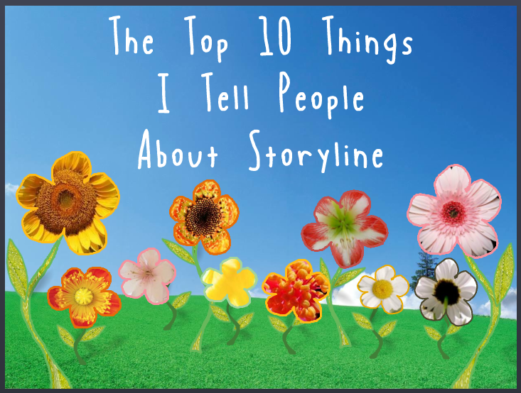
I also didn’t want a main menu with squares or buttons that linked to the 10 points. I wanted the menu to be a creative, vibrant, graphic embodiment of the theme. Once I made that decision, the idea for the springing-up flowers came easily.
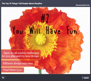
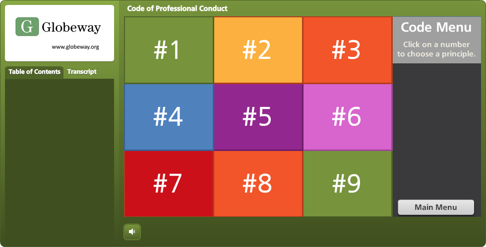
Content Page #2

Content Page #2

Main Menu Flowers: I wanted flower shapes that I could fill with photo captures from their related content pages. So I took out my trusty Wacom tablet and started drawing the basic outlines of the flowers, stems, and leaves. I did it in Storyline by going to Insert > Shape > Lines > Scribble and drew them right on the slide.

Then I adjusted the outline weight and color and did a picture background fill for each shape using a tight capture from each of the larger flower photos.

To make the flowers pop in their hover states, I increased the weight of the flower’s outline by a pixel or two, and increased the size of each flower by about 4 pixels in width and height.
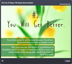
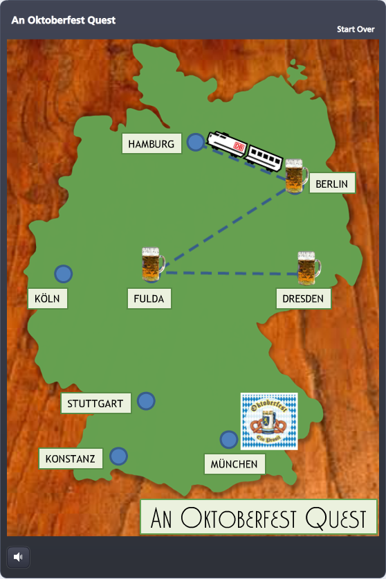
Content Page #5

Content Page #5

Audio: The sound effects for the flowers are two different sounds on top of each other. One’s a pop and one’s a spring. The singing birds are a piece of audio that I looped. I knew it was possible, but had never done it before. A quick Google search took me to this simple how-to. (Thanks, David!)

Content Page Colors: To get colors for my text, fills, and outlines that went perfectly with the flower images, I used the heck out of the eyedropper tool.

Photos: They’re all from Microsoft Clipart. I wanted big, clean, bold, colorful images.

Fonts: I’ve used the title font, Blue Chucks, a couple of times lately. Same with the paragraph font Copse. When you’re a cute font, you’re gonna get used.

Content Page #9

Content Page #9

The Content

It is what it is! This is what I tell people who ask, and these are the resources I direct them to.

The Finished Product

You can see it in all of its springy loveliness right here.

Filed Under: E-Learning Tagged With: Articulate Storyline, Community, E-Learning Design, ELHChallenge, Emotional Engagement, Professional Development, Software Training, Technical Training, Templates

This is Why Freelancers Need Floaties

March 24, 2014 By Jackie Van Nice 11 Comments

Select Image to Launch Demo

Select Image to Launch Demo

This week’s Articulate E-Learning Heroes Challenge is to create a photo collage that tells a story.

I’ve just gotten home from a (great!) week at the E-Learning Guild’s Learning Solutions Conference in Orlando, and the theme that kept coming up was freelancing. Not just in sessions, but in countless random conversations, and I found myself offering a lot of advice to hopeful freelancers.

I Smell a Theme

So because there’s only so much space in my head and this is the topic currently on tap in there, my photo collage story this week is about a guy who wants to freelance. The points I’ve included are a summary I quickly put together for this piece, but it’s similar to what I was sharing all week.

The Story

Select Image to Launch Demo

Select Image to Launch Demo

If I’m going to tell a story, I need a starting point. So I overlaid our (miserable) hero on top of the rest of the photo collage so that I could establish his yearning-to-go-freelance motivation. The underlying photos and their content, each of which reveals a portion of our hero’s journey, can be visited in any order. And of course you get to see the result of his efforts at the end.

Visual DesignVisual Design

I kept the visual design pretty simple. The photos are framed in a pseudo-Polaroid fashion. The caption font on the top photo is Dawning of a New Day. The title font on the pop-ups is Swiss921 BT, and the main pop-up font is Candy Round BTN Condensed.

I reused a beach and palm tree from a recent post about freelancing, mostly because I wanted the tree for the end scene.

And I reused poor Ian again. I’ve forced that poor man into service as an airline pilot and a beer-guzzling traveler in recent weeks and wanted to give him a rest, but I needed someone who could fit into the outfit at the end, and he had the perfect figure. (Sorry, guy.)

Storyline DesignStoryline Design

When clicked, each photo in the collage pops up on a slide layer with more info. Then I have each photo disappear after viewing it. That way I was able to set up a new layer of interest below.

That interest includes having each photo, in miniature, drop down into the palm tree and hang there like an ornament. You can then click on those ornaments to review their content. I did this by adding a second slide layer for each collage photo.

And, of course, I had to show Ian’s transformation after he’d followed his own plan, but I could only show that after all photos had been viewed. To do this, I created a variable for each photo. After all of them have been visited, Ian and his final outfit are triggered to appear.

The ResultSee the Result!

You can see Ian in all his freelance glory here. Enjoy!

Filed Under: Working for Yourself Tagged With: Articulate Storyline, Characters, Community, E-Learning Design, ELHChallenge, Freelancing, Instructional Design, Mobile, Portfolio, Professional Development, Show Your Work, Visual Design

We’ll Always Have the US Passport Office

March 16, 2014 By Jackie Van Nice 12 Comments

Select Image to Launch Demo

Select Image to Launch Demo

As excited as I am about packing up and heading down to this year’s Learning Solutions conference, I wanted to squeeze in some time to play along with this week’s E-Learning Heroes Challenge, which is about creating interactive screenshots.

The Boring Document: The US Passport Application

The Boring Document: The US Passport Application

Post-Traumatic Budget Analyst Syndrome

I’m pretty sure David wanted us to focus on software for this challenge. I keenly noted this about the time I was posting my completed entry.

He’d remarked in his post how much training all of us create based on documents, charts, and software (then clearly outlined his software challenge in detail) – but “documents” apparently struck a nerve and I was suddenly having a flashback to my life as a Budget Analyst in a very large, document-heavy organization where a big part of the job was getting my peers to understand and (ostensibly) care about reams of vital-yet-soul-deadening documents and forms.

So my reeling mind started working on creative ways to present a stultifying form using the interactive screenshot approach.

The Boring Document

Looking for a dull form? Who ya gonna call? Though the IRS has nothing but contenders, I chose the US Passport Application because:

1. I understand it. (Enough.)
2. I knew I could set up a quick bit of context to show when and why someone would use it.
3. I was hopeful that the context would tap into the learner’s own motivations enough to make them want to, you know – be motivated.

Midcentury Looney Tunes Design

A Midcentury Looney Tunes Design

The Style

Choosing Paris as a motivational destination was pretty easy. And after I chose the character, the background, the groovy font, and the clipart, it had become sort of a midcentury Looney Tunes kind of thing. So that worked.

Oh, and I liked the blues, but I detested the passport form’s own mustardy color. But I eventually realized it would be a lot easier to integrate it into the color scheme rather than try to mitigate it with other colors.

The Views

But mostly I wanted to focus on a design that made it easy to navigate and understand the document. So I planned three views:

The Multiple Page View

The Multiple Page View

The Multiple Page View: Treating the multiple-page form like a tabbed interaction seemed like a clean approach, so I created my own tabs on the right. It’s simple, with just two pages, but you could make the tabs much smaller and use it for a far more extensive doc, too.

I also put a “Finish” tab there so you could escape at any time, and because I wanted to show the happy aftermath of having effectively used this form, and I needed a link to get there.

The Single Page Overview

The Single Page Overview
Using a Mouse Hover

The Single Page Overview: This is on the same page as the multiple page view; it just requires hovering your mouse. I chunked the form into numbered sections. When you hover over a number, that section becomes highlighted on the right, and on the left a short explanation appears. The hover effects are simply states attached to the number icons.

Section Detail View

The Section Detail View

The Section Detail: When you click on one of the numbered sections (and this is where the interactive screenshot part of the interactive screenshot challenge comes in), you go to a detailed view of that section. I put each of these on a slide layer.

To make the details a bit more involving and helpful, I added some abbreviated instructions and a little demo of what should happen on the form using sound effects and animations.

Of course, these detailed sections could include any number of things. You could have a video showing or telling why a particular item is critical, you could link out to other resources or help, or you could come up with other ways of illustrating what you need to convey for that section.

Attaching the Document: I also thought it made sense to attach the full doc in the player. If this were a real e-learning piece, I’d certainly do that.

Success = Paris!

Or at least it does in this interaction. Here’s the finished piece. I hope you enjoy it, and may you always have great ideas for presenting forbidding documents of your own.

Select Image to Launch Demo

Select Image to Launch Demo

Filed Under: E-Learning, Front Featured Tagged With: Articulate Storyline, Audio, Characters, Community, E-Learning Design, ELHChallenge, Emotional Engagement, Instructional Design, Languages, Visual Design

A Revealing Submenu

March 6, 2014 By Jackie Van Nice 5 Comments

Click Image to Launch Demo

Click Image to Launch Demo

You’ll see this simple-but-fun submenu when I post a portfolio sample for another course – but I like it, so it’s getting its own post.

I created it for a subsection covering the nine parts of this organization’s code of conduct. I wanted it to be attractive, responsive, kind of fun, meaningful to the organization, and track which sections had already been visited, while still making each one easy to revisit.

The Idea

I thought it would be fun to have it look a bit like a game board. As the learner clicks on each section, it reveals part of a photo.  Once the photo is fully revealed, you’ve finished that section. I had lots of photos to choose from, but narrowed it down by looking for one that:

  • I could make square to fit the tic-tac-toe/Brady Bunch layout I had in mind,
  • Included people from the same general part of the world that learners would be from,
  • Would show people involved in an organization-related activity, but I didn’t want to reveal what they were doing until the learner had visited almost all nine sections of the code.

The Pieces and Parts

The Grid: I used the bright course color palette to create the nine boxes. Since the organization refers to their Code sections by number, it was appropriate to label them with each section’s number, as opposed to a description or image. Looks more like a game that way, too.

The Side Reveal: So learners could see the name of each Code section before visiting it, I added a trigger to each square in the grid. When you hover over each one, a slide layer shows the section name on the right side.

Side Reveal on Right With Mouse Hovering Over Grid Section #5

Side Reveal on Right With Mouse Hovering Over Grid Section #5

The Photo Reveal: The photo is on the slide master. I created each square as an inserted object on the slide, then keyed the text directly into it. When the learner clicks, the visited state is revealed. The only difference between the normal and the visited state is that I removed the fill color for the square. I still wanted the number to be visible after the square was visited so that it would be easy to go back and revisit the section, and I liked the different-colored outlines that remained after the fill color was gone.

Clicking Reveals a New Piece of the Photo

Clicking Reveals a New Piece of the Photo

See it in Action

This is just a demo of the menu, of course. The section header slides it branches to in the real course take you off into scenarios and all kinds of fun stuff. But you can see the menu sample here.

Thank You, Tim!

By the way, in this sample you’ll briefly see the section header slides I used in the course. These slides are heavily based on Tim Slade’s lovely – and free! – template that he so kindly shared on his site.  Tim’s a gifted and generous designer and you should check out the rest of his site while you’re busy getting the template. (Thanks, Tim!)

Section Header Slide Based on Tim Slade's Design

Section Header Slide Based on Tim Slade’s Design

Filed Under: E-Learning Tagged With: Articulate Storyline, E-Learning Design, Instructional Design, Visual Design

At Last! A Drinking Game I Can Win

February 27, 2014 By Jackie Van Nice 10 Comments

At Last! A Drinking Game I Can Win

Select Image to Launch Demo

For this week’s Articulate E-Learning Heroes Challenge, David Anderson dared us to create a simple game. (Oh, it’s on.) I created an Oktoberfest Quest game, wherein our hero drinks his way across Germany in order to reach the hallowed beer tents of Oktoberfest in Munich. Somebody had to do it.

A Triumvirate of Inspiration

Timing: David put out the challenge only hours after I’d participated in the weekly #lrnchat discussion on Twitter. Everyone was terribly serious as they discussed how to work collaboratively in groups – until someone brought up beer as a motivational tool. Well, THAT got them dancing in the Twittery aisles, and the whole evening changed. I don’t drink much, but I made a large mental note of what got them engaged: The mere mention of beer.

Topic: As they say, go with what you know. After collecting entirely too many degrees in German, teaching German, and studying, working, and living in Germany – I thought to myself: “maaaaaybe something German…?”

Potential Game Features: I wanted to focus on designing a game board and some sort of progress meter. Since a map of Germany seemed like a natural game board, and a giant Maßkrug slowly filling with beer seemed like an outstanding progress meter, I decided to try those.

Maßkrug

Maßkrug

Design

Since my primary elements, the map of Germany and the Maßkrug, were better suited to a portrait orientation, I flipped the standard Storyline layout so they could inhabit the full screen.

Once I decided to use the game to teach German dining customs, I put a wooden background underneath the map to evoke the feel of a restaurant table, and the checkered tablecloth behind the Maßkrug for the same reason.

I also knew that sound effects would be critical, especially for filling the Maßkrug. I got lucky and found some evocative ones.

Progress

There are two measures of progress: linear progress on the map, and liquidy beer progress in the Maßkrug.

Linear Progress

Linear Progress

Linear Progress: I thought a little Krug at each completed stop on the map would be a good tracker, and moving by train would make it feel like you’re making game progress, and also evoke the sense of traveling through Germany.

At each stop I used a zoom region to zoom in tightly on the city, and then an immediate “Box Out” transition on the following question slide so that, together, it would feel a bit like you’re zooming from the macro map to the micro restaurant where our protagonist needs some help. 

Beer Progress: Every time you answer a question correctly, the Maßkrug fills up a little more. By also using it to briefly recap the teaching point, it doubles as a bit of learning reinforcement.
And speaking of learning stuff, I chose to make it an all-or-nothing game. You’re required to answer each question correctly in order to go forward. One wrong answer and you’re back in Dresden waiting for the train.

Beer Progress

Beer Progress

I credit Michael Allen with this torture. I saw a banking example of his where you decide whether or not to approve a series of checks for payment. One wrong decision, and you’re back to check one. It ticks you off just enough that you get determined to beat the stupid thing, and while you’re at it, you learn the principles being taught.

The Big Finish

I won’t spoil it for you, but it’s kind of awesome.

Play It

My Oktoberfest Quest game is here, but you should also check out the other creative, amazing, and beautiful game ideas posted by others in the comments section of David’s original post here.

Update! Free Template Now Available

Since creating this, I’ve designed a free Storyline template of this game and done some videos to help you customize your own. All the scoop you need is right here!

Filed Under: E-Learning Tagged With: Articulate Storyline, Audio, Characters, Community, Context, E-Learning Design, ELHChallenge, Free Download, Games, German, Instructional Design, Languages, Motivation, Show Your Work

  • « Go to Previous Page
  • Go to page 1
  • Interim pages omitted …
  • Go to page 16
  • Go to page 17
  • Go to page 18
  • Go to page 19
  • Go to Next Page »

Primary Sidebar

Welcome!

I’m an award-winning instructional designer and proud Articulate Super Hero who creates e-learning for large organizations. I blog to explain my design process, share tips and tricks, and help others succeed. I hope you enjoy my refreshing gallery of e-learning goodness!

  • View jackietrains’s profile on Instagram
  • View jackievannice’s profile on LinkedIn

Tags

Articulate 360 Articulate Rise Articulate Storyline Articulate Studio Audio Avatars CCAF Characters Community Context Design Makeover Dials Drag & Drop E-Learning Design ELHChallenge Emotional Engagement Free Download Freelancing Games German Glossary Instructional Design Languages Makeover Menu Mobile Motivation Pantone Portfolio PowerPoint Professional Development Quick Reference Quizzes Sales Training Scenarios Show Your Work Software Training Storyline 360 Tables Technical Training Templates Typography Video Visual Design Voiceover

Top Posts & Pages

  • Portfolio
    Portfolio
  • Home
    Home
  • Sexual Harassment Training
    Sexual Harassment Training
  • Sales Mobility Software Training
    Sales Mobility Software Training
  • Navigating a Tasty Circular Menu
    Navigating a Tasty Circular Menu
  • Articulate's E-Learning Heroes Challenges
    Articulate's E-Learning Heroes Challenges
  • About
    About
  • Free Visual Storyboard Template
    Free Visual Storyboard Template
  • Free Storyline Templates
    Free Storyline Templates
  • How to Go Full-Screen & Lose the Player in Storyline
    How to Go Full-Screen & Lose the Player in Storyline

Copyright © 2026 Jackie Van Nice and E-Learning Goodness by Jackie Van Nice