Select Image to Launch Demo
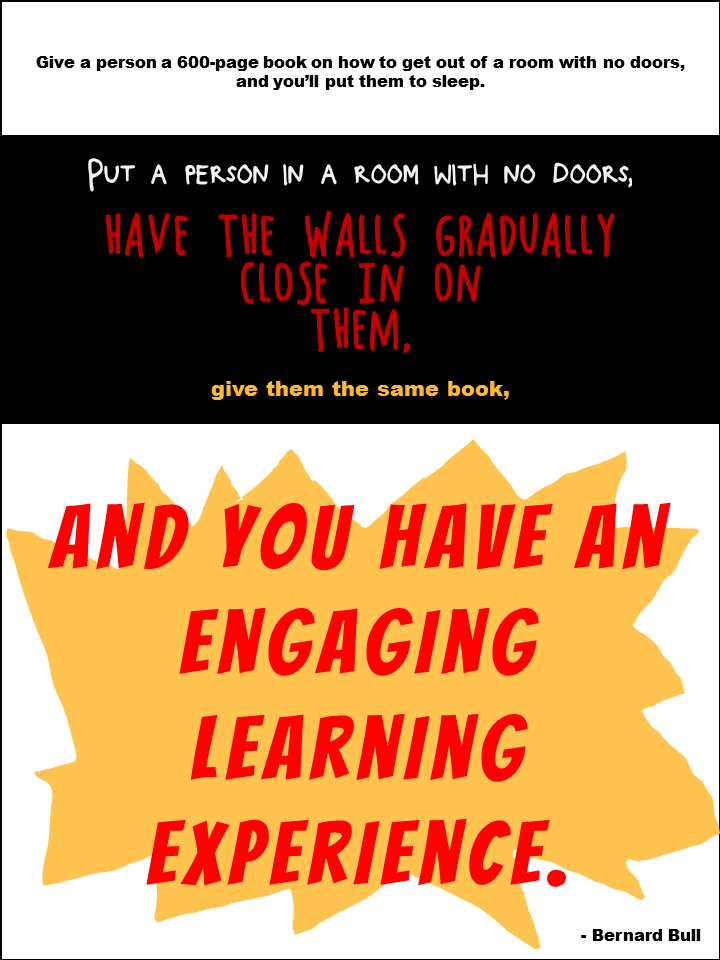
This week’s Articulate challenge is to teach some typography by creating a game or interaction. I dove in – excited that I could finally use Storyline’s new features out in the real world!
The Idea: Motion Paths & Dance
Motion paths are a huge plus in Storyline, so I wanted to feature them. Looking at proper typographic form got me thinking of proper human form, which got me to ballet, which led me to letters dancing to ballet music. Dancing letters using Storyline’s motion paths it would be!
Typography as the Star
The Typography
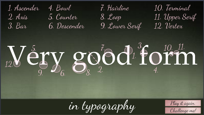
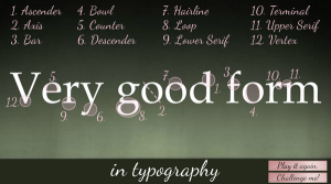
Many explanations of typographic anatomy use the word “Typography” as their example. I chose “very good form” so I could demo the concepts and stick with my theme.
Visual focus is on the typography throughout and it’s used on every screen. It engages the learner, introduces the concepts, acts as a progress meter, provides feedback, and wraps things up. I used one serif font (Book Antiqua) and one script font (Dancing Script). After settling on 12 typography terms to teach, I forged ahead.
Minimal Design
Minimal Visual Design
Rather than running wild with the theme by adding dancers, Christmas trees, snow, costumes, and scenes from the ballet I kept it simple – guided by the simplicity of the typography.
The main images are a ballet stage as the background and some ballet shoe ribbons. Rather than showing snow, I implied it on the opening screen by having each half of the word “good” fall gently into place.
Learner Control
The Interaction
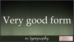
Rather than announcing itself as an interaction where you’ll learn typographic terms, it starts with a fun bit of music and animation that sets the mood, theme, and topic before a small button appears that says “Teach me some terms”. Nothing is forced; you’re enticed to explore.
Feedback and Options
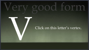
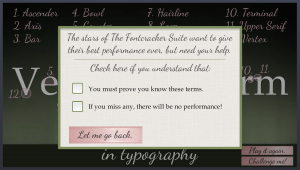
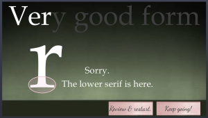
The learner also has enough options and information to feel they’re in control. If you choose “Challenge me!” for example, a message lays out clear expectations by letting you know what’s needed to succeed and gives you your options. Feedback is clear. If you make an incorrect choice you receive correction and can choose to review or continue.
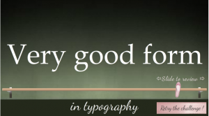
Slider as Ballet Barre for Review
Best Slider Barre None
I used another of my favorite Storyline features – the slider – to create a ballet barre to review terms. (It features a lovely relative motion path, too!) It gives the learner full control and lets them focus on one item at a time.
Enjoy the Show!
If you have your audio ready, here’s the interaction in all of its very good form.
Select Image to Launch Demo


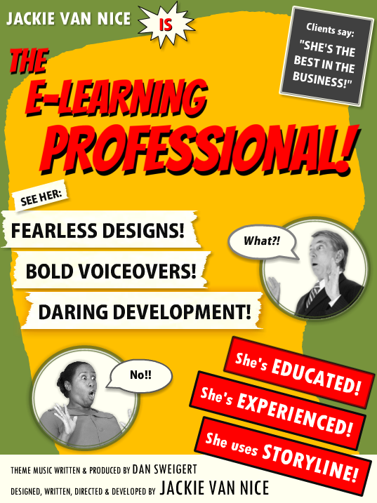

 Résumé Elements: I kept it simple and included my (boldly-phrased) skill set, education, experience, and the main software I use. The sections for education and experience were by far the biggest creative challenges, but in the end I was happy to find a quick way to blow through them that still maintains the tone and theme.

 What I think I do. I love what I do as an e-learning designer (don’t tell anyone), and between that and getting to work for myself from home, it’s hard not to be happy.