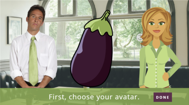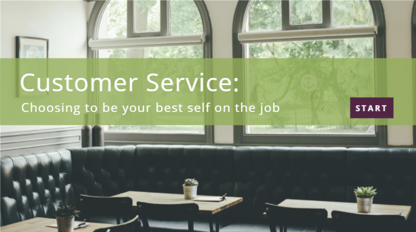
Select Image to Launch Demo
This week’s Articulate ELH Challenge is to design an example of an adaptive learning path. A random search for subject matter led me down the path to clowning.

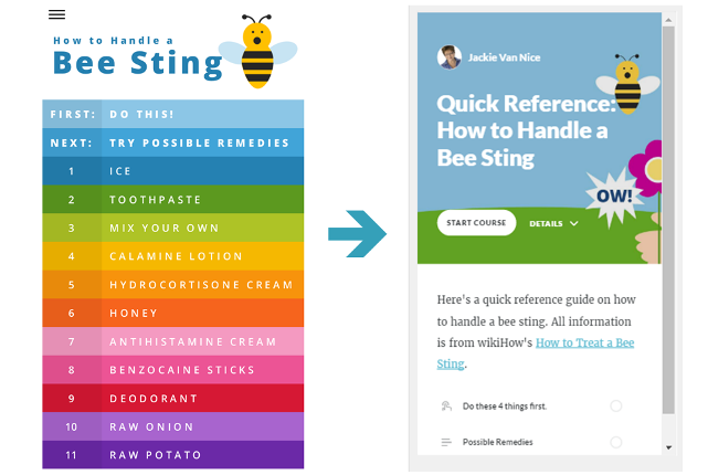
An ATD Adaptive Learning Screen
The Idea
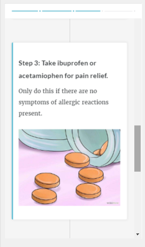
I’ve seen ATD’s use of adaptive e-learning in their Learning Portal courses, and beyond asking assessment questions to customize course content, they also ask the learner how confident they are in each response.
This makes the learner stop to think a bit more, and it gives you as the designer more information to help refine the learner’s path through the course. So an adaptive path that uses confidence levels is what I thought I’d try building.
The Design
The Adaptive Path
To keep this simple, I started with 3 assessment questions. If the learner gets them all correct (with full confidence) they’re essentially allowed to test out of the first course module, but have the option to review that content if they’d like. If the learner doesn’t get them all correct (with full confidence) they are only allowed to go to the first module.
For incorrect answers, feedback indicates the correct one.

After selecting an answer, you then indicate how confident you are in your answer.
The Assessments
As part of his introduction to this challenge, David Anderson shared a demo of how to build a branching path in Storyline that takes advantage of scoring answers by choice, rather than by question, and using the built-in results slide variables.
I couldn’t figure out a simple way to make that work with the added confidence levels, but without them I’d have used that approach.
As it is, I based the score for each question on both the answer to the question and the learner’s self-reported confidence using number variables. In the end, the total score determines the path.
Quick Visuals
Articulate 360 Content Library Clown
To keep this as time-efficient as possible, I again used as many resources available in Storyline 360 as possible. I used a couple of template screens as a starting point and customized from there. The photos, icons, and video are also from the Content Library; though I had to procure the banana image elsewhere.
The Result
As with all of life, in the end we attend the clown college we’re most ready for. That’s pretty much what happens here, too. Feel free to check out my adaptive clown demo!