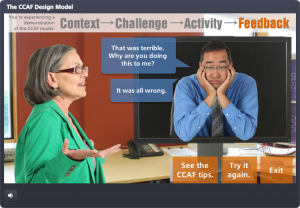
Select Image to Launch Demo
This week’s creepy-yet-practical Articulate challenge is to put together something that will help us prepare for – and survive – the upcoming Zombie Apocalypse. My idea may not have the best success rate, but it’s all I’ve got.
The Idea
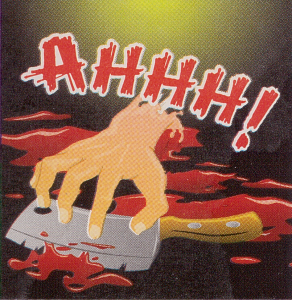
Zombie
Sticker
Inspiration
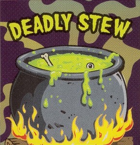
It started with some dollar store scratch-n-sniff zombie stickers. (I haven’t been curious enough to find out what zombies smell like yet.) But I started to notice categories (food, drink) and sketched out an interaction where a perky person was doing zombie market research. When outcomes for that seemed too limited, I came up with the dating idea.
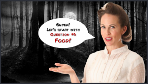
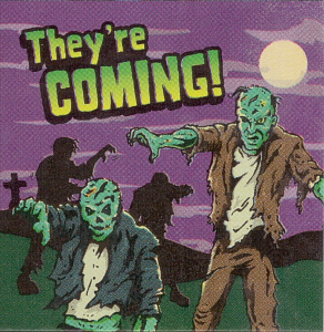
Creepy Setting — Perky Person
I knew contrast would be key. Lovely, safe, familiar things needed to be set in high relief against their opposites; hence the choices for music, fonts, script, people, food, drink, and everything else.
Tough Choices
The Interaction
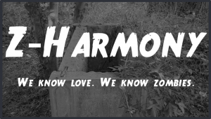
Theme
It’s all bad-horror-movie inspired, including the intro with that awesome True Crimes font. Add some of Storyline 2’s new animations and it’s a pretty good title screen.
Slider
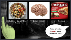
This time I filled the thumb with an image of a zombie hand and used no visible track. You slide and release the hand to choose, which seems intuitive. The only downside of using the slide-and-release option was that when I published to HTML5 it treated triggers as though they were part of a while-slider-is-dragged version – so I republished without HTML5.
Options & Outcomes
There are 3 possible outcomes. One based on zombie choices, one based on my own personal choices (largely unlike zombie ones; though lines get blurred in a couple of categories), and one somewhere in between.
Click Image to Launch Demo
Try it Out!
Who’s your perfect match? Give it a try and find out… if you DARE.