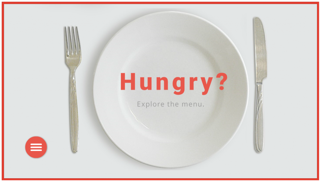
Select Image to Launch Demo
This week’s Articulate ELH challenge is to create a circular navigation menu to mimic the sorts of menus used in mobile apps, save screen real estate, and give the design a sleeker look.
The Idea
I thought I’d use the navigation menu to explore a food menu. Leaning into the circular theme led me to selecting a big round plate and all of the round dishes that ended up on it.
The Design
Building the Menu

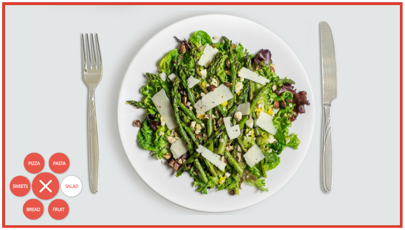
My circular menu: Note that Pasta stays selected even after the menu has been closed and reopened.
A sample Storyline file was offered as a challenge resource, but I find it easier to dig in and build things from scratch. It takes longer but it’s soooooo much easier to wrap my head around what I build on my own, plus I love the challenge of figuring it all out.
The menu items are inserted shapes nested under the main menu, which is also an inserted shape. I added two motion paths to each one – the first to move outward when the menu is selected, and second to return to the original position.
By the way, working with motion paths in Storyline is so much easier now. Being able to name the paths is helpful, but being able to align and snap motion path items is a thing of beauty. I’d have loved to have had those features when I created my Fontcracker Suite and Faces of the Ebola Response challenge entries!
The other thing I wanted to add was a “selected” menu item state AND have it retain that state even after the menu has been closed and re-opened. I think it’s helpful when a menu tells you where you are. That upped my trigger count, but I really like the result.
The food items are activated to appear when the user clicks a menu item and the state of a transparent shape on top of the plate changes to display the selected dish.

The behind-the-scenes food states for the transparent rectangle that covers the plate.
The Images
All images are from the 360 Content Library, including the main menu’s “hamburger” and X icons. The food options were dictated by how possible it was to remove the background from each one so I could put it on the plate and have it look plausible.
I used the Format > Remove Background tool in PowerPoint, which worked like a charm.
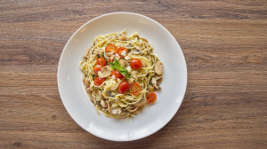
Pasta Before Removing Background

Pasta After Removing Background

Pie Before Removing Background

Pie After Removing Background

Oranges Before Removing Background

Oranges After Removing Background
The Result
After that there’s nothing left to do but choose what you’d like on the menu! You can try it out here or by selecting the image below. Buon appetito!
Select Image to Launch Demo