
Select Image to Launch Demo
 This week’s Articulate challenge is to create an interactive organizational chart or a “meet the team” sort of thing. Org charts and the like bore the heck out of me, but I like the idea of introducing someone to their new team or job, so I went with that.
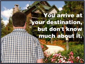
How Did We End Up On Vacation?
When you start a new job, you’re a stranger in a strange land. All I did was apply that situation to visiting a new place rather than starting a new job. In either situation, you need to get your bearings and figure out what’s going on very quickly.
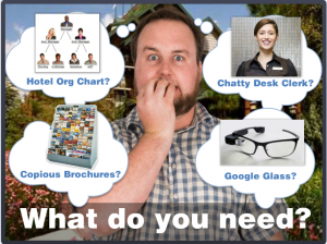
Chunking By Importance
In this case I sorted the information by relative importance, but in a work environment it could be sorted by task or department or time increment or anything else. The idea is to break it into chunks that have more meaning and don’t have to be accessed all at once, since information overload is as good as no information at all.
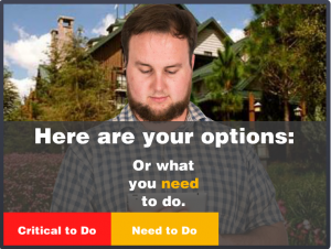
The Interaction
I had planned on (and spent way too much time on) fleshing out the detail at the end. As time ran out I trashed all of that and fleshed out the front end instead. It was the right thing to do and it ended up being a good demo of how to present information like this – including how to present it in context and at the point of need. I like it.
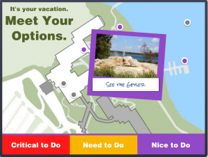
Ready to Navigate Your Vacation?
If so, feel free to take this demo out for a spin!
Select Image to Launch Demo
Hey Jackie — really excellent once again!
Are the images of the guy from a character pack? His expressions were too funny.
Thanks so much, Andrew! You’re so nice to come by and comment. :)
He’s Ben and he’s new over at http://www.elearningart.com. Yes, he’s clearly a professional funny guy.
You are the ultimate “Think out of the box” kinda ID. :)
I think I get claustrophobic inside of it. :)
Beautifully done Jackie, I love your choice of colors and images and the way you animated the character and navigation in and out. The map was very intuitive the way the colors of the dots matched up with the sections. I wonder if anyone will recognize the place?
Hey – thanks, Dan! Yeah – all of that detail and animation in the lead-in slides is what I ended up creating at the last minute rather than adding a lot of depth and snazzy stuff to the map at the end.
I thought for sure people would start saying “Hey – I know that place!” right away. But someone will get it soon enough. :)
Hi Jackie,
I was also going to ask who the guys was too.
Another great job Jackie, I especially like the Critical, Need and Nice to do aspect. I think that style could definately be used as part of a new hire induction-type module.
It was only missing one thing – Bert!! lol!
I know – what was I thinking?? Bert could have been this guy’s vacation buddy. I could have shown them swimming in the pool together and stuff. Thanks for the excellent suggestion for improvement, Matt! :)
This is great as usual Jackie! I love the way you bring your characters to life. Excellent design, awesome storyline! This gives me some inspirational ideas for NEO training :)
Thank you so much, Darlesa! Dan and I were just talking about how much we like your entry this week, too. (Your first one! Woo-hoo!!) Everything about it felt playful and engaging, while still effectively introducing the team. I have my fingers crossed you’ll be able to participate in future challenges, too. Thanks again for your very nice comment!
Love it Jackie! What a great way to offer varying levels of depth. I can easily see this working in systems or soft skills training, too. For example:
– Critical: tell me what to do
– Need to know: tell me why
– Nice to know: more background information
Great idea, Simon! Glad you liked the demo, too. :)
I love it Jackie. You’re always an inspiration. I was on the lookout for a nice interactive map example that fitted my ideas for a new course. How did you draw the map? Or was it a pre-made asset?
Hi Miranda! Thank you so much!
The map is one from that actual resort that I carefully cleaned up to remove text and other elements I didn’t want. Very low-tech. It took a little time, but wasn’t too bad. Could you do something similar?