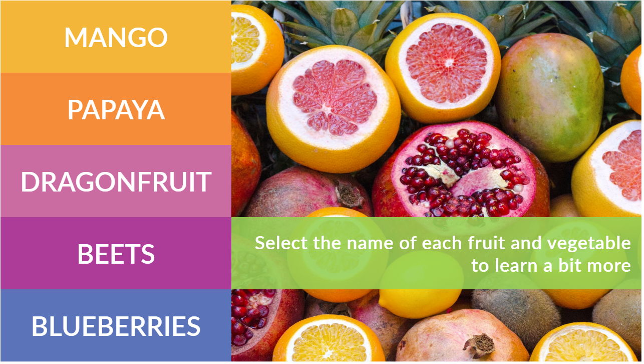
This week’s Articulate ELH challenge is to create a fresh new tabs interaction, so I went outside and picked some inspiration.
The Idea
I wanted to make this a Storyline 360 tabs interaction I could share, so with that in mind I focused on simplicity, functionality, and reusability.
The Design

The Fruity Theme Colors
Colors
I honestly just started with colors I liked and made a color palette from there. To make the template easy to reuse, I saved them as a set of Theme Colors at Design > Colors in Storyline. You can save them down with a different name and/or you can change out one or all of the colors by editing them on that screen.
Images
My theme needed some delicious-looking fruit and veg, so I inserted all of the photos into Storyline from the Content Library. If you swap them out by right clicking and choosing Change Picture, you can replace them with your own images and not lose the animations.

Mangoes in Their Visited State
Tab States
Selected: There’s no actual selected state, because the color of the selected tab matches the background of the revealed content screen, which I think is a good visual indicator of which tab you’re on. I like using that effect.
Hover: The hover state is a semi-transparent version of the tab’s color. To adjust the color or transparency, select the tab, then States > Edit States. Select the Hover state, right click on it, then select Format Shape > Fill Color. At the bottom of that screen you can adjust the color and/or level of transparency.
Visited: I like more control over my states than the built-in ones can give me sometimes, and to get that control I give them custom names. In this case I called the visited state “checked” because I’ve added a check mark to the tab’s state to show it’s been seen. You can also edit this state and remove or replace the checkmark with any image you’d like. Right now there’s a trigger on the tab’s layer to change the tab’s state to “checked” at the beginning of the layer’s timeline.
Disabled: When on a content screen, I didn’t want the user to see an active hover state for the currently-selected tab. That would be confusing and seem like a sloppy build. To keep it solid I added a transparent disabling shape on the layer and placed it directly over the tab, which effectively disables it from showing its hover state. You could always do this by adding a disabled state along with its triggers, but this is another way to do it.

Making the selected tab the same color as its content screen makes navigation clearer.
Content Screen States
Each content screen (layer) is set to show its saved state when revisited. Unless there’s a compelling reason to have the animations repeat when revisiting, I’m happier going back to review each screen without waiting for the animations to execute again.
The Fresh Result and Free Download!
Ready for some fresh and fruity tabbed fun? See the demo right here, and grab the free Storyline 360 file on its download page.

Gorgeous, as usual! Thanks Jackie!
You’re more than welcome, Jane. Thank you!! :-D
I love the colors and the design of this! Very creative to have the hover state reveal the photo beneath. I see that you did this in Articulate 360. Could it be used in Storyline 3?
Hi Debby! Thanks so much! I’m glad you like it. I don’t have Storyline 3, just 360, but I don’t believe anything here would be incompatible with 3. Let me know if you try it!