I’m so lucky I get to do work I love and share it here, and I’m delighted when readers tell me it helps or inspires them. Unfortunately I never know exactly how it’s been helpful, and sometimes that curiosity drives me a little bit crazy. If I knew that, after all, I could do more of it!

Zifang Su
Enter Zifang
Zifang Su is an instructional designer in Adelaide, Australia who recently sent me this message:
Hi Jackie – Just want to say thank you for your awesome site! Your blog posts about your design process really help me in looking at another instructional designer’s perspective and design thoughts and process, and as a result I’ve changed some of the ways I’ve done things as well. Thank you! Cheers, Zifang
Aha! I perked up, wondering if Zifang could give me some specifics about how she’s changed what she does. So I asked! She was very kind and sent me four specific examples (beautifully organized, of course) of how she’s changed the way she approaches instructional design. Here they are:

Code of Conduct Training
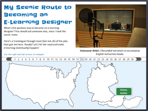
1. Using Stories and Scenarios
One of the things that struck me when looking at your portfolios and some others, plus the course I’m taking at the moment and some books I’m reading, is that using stories and scenarios can be really effective. Looking at the examples helps me to see how topics can be presented in a fun and engaging way.
2. Design of Courses
I love seeing the examples on your portfolio because they all look very different! Frankly, it’s incredible to me that someone can design all these different looking courses. Currently, my courses look very similar – but that has something to do with the restrictions placed on me at work (i.e. the online course must look similar to the powerpoint slides…). So I’m using the designs as inspirations for work-in-progress – essentially reducing many many dot points and chunks of texts and using graphics instead.
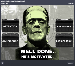
Can You Motivate This Monster?
What do I think of Storyline?
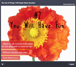
A Radiantly Delicious Template
3. Use of Colours
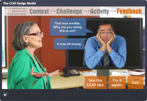
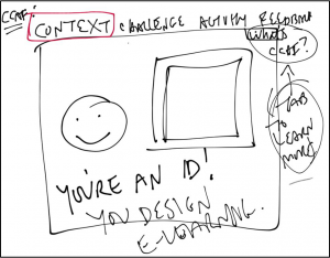
Your portfolio uses great colour schemes. I tend to be ‘traditional’ in the use of colours, e.g. black, blue, grey etc. but contrast works great (e.g. the CCAF design) so I’m reading about the use of colours, as well as experimenting on using brighter colours for my courses.
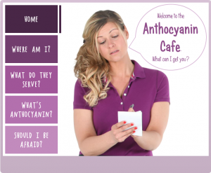
A Model Smart Enough to Teach Itself
4. Sketching for Design Stage
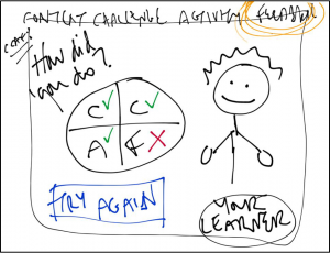
I’ve tried using storyboard templates but found them stifling and it seems like I’m spending more time typing than actually designing. I then came across one of your examples, where you showed some sketches that you did for design and I thought yep, that’s a more flexible way to do it. So now I spend my design time sketching and showing it to my team rather than trying to fit things into a storyboard template.
Show Your Work: E-Learning Messiness By Me
Show Your Work: E-Learning Messiness By Me
What I Learned
I can’t tell you how grateful I was to get this feedback! It told me what sorts of things have been most helpful and exactly how it helped change another ID’s work. It may not sound like much, but this was huge for me and will help me going forward.
I’ve also learned that even the things I think might be too silly or messy to share can have value in helping someone grow, learn, and be successful. It encourages me to ignore the editorial voice in my head that’s always saying “you’re not going to post THAT, are you??” and motivates me to keep sharing all of the the potentially silly, messy results of my own learning process right here.
Thank you, Zifang!
You can be sure I’ll keep track of Zifang from now on, and if you’d ever like to share what’s been helpful to you here or if you’d like me to talk about a particular topic, just let me know! Zifang dropped me a line using this Contact form.