Since this week marks the end of the first full year of Articulate’s weekly challenges, I decided to go back to complete all of the ones I’d missed – and there were a lot. I still have two more to complete (almost there!) but yesterday I swung back to Challenge #1: How Would You Show Meaningful Comparisons?
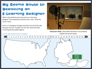
Note the Maps of the US and Germany
Getting Things Into Perspective
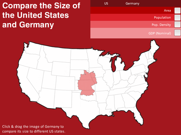
In my earlier “virtual tour” challenge I showed maps of the US and Germany next to one another to show the places I’ve worked. They weren’t meant to be at the correct scale – but every time I look at that piece I snicker at how far off it is. So I decided to do a demo to show a size comparison.
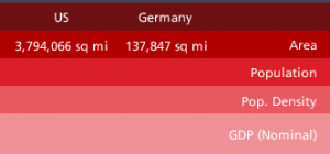
Two Countries; One Monochromatic Scheme
My US-German Palette
Two reasons for the red palette: The flag of Germany and the flag of the US. Their only common color is red. What’s interesting is how different the reds are. So I created a palette that includes both of them in an intentional way.
The other reason I wanted to do this was because I’d just completed yet another older challenge using Pantone’s current color of the year and used a monochromatic scheme for that one, too. I liked it enough to try the approach again here.

My Monochromatic Pantone Design
What a Drag it is to Compare
The idea is that you simply click on the map of Germany and drag it to different US states to compare its size. Is it effective? You can take a look at the difference between this and the maps I showed in my virtual tour (see images above) and decide.
My truly brilliant fellow challenge participant Nick Russell suggested that it would be great to have comparative data for each US state come up as you drag the map of Germany over it. It would be, but that’s going to have to wait until I’ve added quite a few more hours to each day and quite a few more days to each week. But it’s a fantastic idea, Nick!
Enjoy it Here + There’s More on the Way!
Here’s my comparative demo if you’d like to mess around with it. My goal is to complete the whole first-year set of challenges within the next week. With only two to go I’m in good shape – and I’ll keep you posted!


 This week’s Articulate challenge is