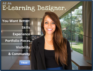
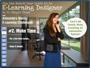
This week’s challenge was to create a step graphic to tell a story or explain a process. It came at the end of a week where I kept hearing concerns from e-learning designers who felt stuck due to lack of skills, experience, usable portfolio pieces, visibility in the field, and/or confidence. So when the challenge hit, that was my topic.

Step Graphic Main Screen
Design
I wanted it to be fresh, direct, and maybe a bit inspiring – so I chose the character, the approach, and the background based on that.
The layout bothered me for a full week. Still does, but I have to let it go. I tried countless ideas with different graphics, colors, fonts, animations, and audio. It started out with more depth (links to resources, etc.) but it was taking too long, so I stripped it down and kept it simple. My concern was keeping the user’s attention focused on an already-busy screen. It seems to work, based on the little bit of user testing I did, so I’m going with it.
The step navigation is simple. I chose buttons with a full set of states, including a clear selected state so it’s easy to see where you are.
Content
I added the intro screen to make it clear that you should probably be (a) an e-learning designer who (b) has these goals, if the content is going to apply to you.
After that, it’s what I do each week for the challenges combined with a little bit of advice based on personal experience.
The Result
Ready to give it a try? Take a look! And if you’re an e-learning designer who feels stuck or wants to learn more and improve your skills, you might want to give the challenges a try. They’ve worked for me!






 Visual Design
 Storyline Design
 See the Result!
 “How did you get started as a freelancer?” is the most common question I’ve gotten in the last 10 years, and it’s a great one.
 You’ll notice I do no advertising or marketing or promotion, other than getting myself out there a little bit and doing some minor networking in ways that are very natural – including some blogging and tweeting. I put far more of my energy into learning more and doing the best work I can, and everything else just flows.