• Skip to primary navigation
  • Skip to main content
  • Skip to primary sidebar

Jackie Van Nice

E-Learning Goodness by Jackie Van Nice

  • Home
  • About
  • Blog
  • Portfolio
    • Articulate’s ELH Challenges
    • Sales Mobility Software
    • Product Sales
    • Sexual Harassment
    • Code of Conduct
  • Freebies
    • Free Storyline Templates
    • Free PowerPoint Templates
    • Free Images
    • Freelancing Tips
    • Free Resources to Help Get Started in eLearning
  • Work With Me
  • Contact

Blog

Escape Room Game: When Birthday Parties Go Wrong

May 2, 2018 By Jackie Van Nice 17 Comments

Select Image to Launch Demo

Select Image to Launch Demo

This week’s Articulate ELH challenge is to create an escape-room-style game. (Scary!)

Party Equipment

Party Equipment

The Idea

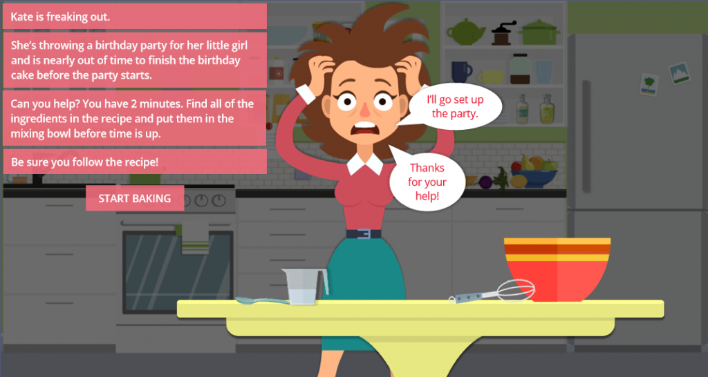
My first escape idea was going to have you desperately trying to catch your international flight before it took off, but the mega-talented Jodi Sansone beat me to it (great minds) and did a lovely job, so it was back to the drawing board. In the end I came up with the idea of frantically trying to make a last-minute birthday cake for a little girl’s birthday party: Let the terror begin.

The Design

Images

My first step was was to build a vector kitchen. As the days went by I couldn’t help but wonder if I could have saved time and energy by building a real kitchen.

The Kitchen Stage

The Kitchen Stage

These are mostly flat design vector images. I pulled a few from the 360 Content Library as icons or illustrations and manipulated their size, shape, and/or color (juicer, grinder, a few objects on the results screen, maybe the measuring cup… it’s all kind of a blur at this point), but I purchased most and manipulated them in Adobe Illustrator. The focus is on the table and mixing bowl in the foreground.

The Game

The Birthday Girl

The Birthday Girl

I wanted three outcomes:

  1. Success: You got the right ingredients in the bowl in the allotted time and achieved the desired result.
  2. Failure: Your time ran out and things didn’t end well.
  3. Keep going and try again: You put an incorrect ingredient in the bowl and have to dump out the bowl and start over, but the timer is still running.

The Timer

Update: I’ve made the timer available as a free download right here! The issue was the timer and finding a way to give it a two-minute duration that I could reliably start, stop, and restart. Very long story short – after trying lots of options I needed to design and build something quickly, so I winged it with an incredibly simple animated timer.

Timer recipe:
  • 1 two-minute-long ticking sound effect
  • 1 timer ding sound effect
  • 1 image of a kitchen timer with a white face
  • 1 inserted yellow circle shape
  • 1 inserted red circle shape

Timer 1Timer 2Timer 3Timer 4

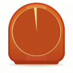
Superimpose the yellow and red circles on the timer face, in that order, and give each one a 59-second wheel entrance animation. Place the red circle so it starts at the 59-second mark on the timeline. The clock and yellow circle start at the beginning of the timeline, along with the ticking sound effect. The ticking will end when you trigger the timer ding to go off at the end of the 2 minutes, at which point you could jump to a layer or another slide or whatever you’d like to do.

Once in action you’ll see the yellow circle animating in for the first minute, turning the face from white to yellow. In the second minute you’ll see it go from yellow to red, letting you know you’d better get that cake in the oven.

In this game the timer helps increase the sense of urgency, looks flat and cute, and serves its purpose.

The Drag-and-Drop

In the end, this was pretty straightforward. There are three items that require a two-step drop process before they can be used successfully, but you’ll find written hints to give you a clue about what to do and every item is labeled if you tap on it. Searching for clues and things you can use is all part of the game!

The Result

Ready to make a cake for the birthday girl? Grab an apron and make it happen!

Select Image to Launch Demo

Select Image to Launch Demo

Filed Under: E-Learning, Front Featured Tagged With: Articulate 360, Articulate Storyline, Community, Drag & Drop, E-Learning Design, ELHChallenge, Emotional Engagement, Free Download, Games, Motivation, Show Your Work, Storyline 360, Visual Design

A Yummy, Fresh and FREE Tabs Interaction!

May 1, 2018 By Jackie Van Nice 4 Comments

Select Image to Launch Demo

Select Image to Launch Demo

This week’s Articulate ELH challenge is to create a fresh new tabs interaction, so I went outside and picked some inspiration.

The Idea

I wanted to make this a Storyline 360 tabs interaction I could share, so with that in mind I focused on simplicity, functionality, and reusability.

The Design

The Fruity Theme Colors

The Fruity Theme Colors

Colors

I honestly just started with colors I liked and made a color palette from there. To make the template easy to reuse, I saved them as a set of Theme Colors at Design > Colors in Storyline. You can save them down with a different name and/or you can change out one or all of the colors by editing them on that screen.

Images

My theme needed some delicious-looking fruit and veg, so I inserted all of the photos into Storyline from the Content Library. If you swap them out by right clicking and choosing Change Picture, you can replace them with your own images and not lose the animations.

Mangoes in Their Visited State

Mangoes in Their Visited State

Tab States

Selected: There’s no actual selected state, because the color of the selected tab matches the background of the revealed content screen, which I think is a good visual indicator of which tab you’re on. I like using that effect.

Hover: The hover state is a semi-transparent version of the tab’s color. To adjust the color or transparency, select the tab, then States > Edit States. Select the Hover state, right click on it, then select Format Shape > Fill Color. At the bottom of that screen you can adjust the color and/or level of transparency.

Visited: I like more control over my states than the built-in ones can give me sometimes, and to get that control I give them custom names. In this case I called the visited state “checked” because I’ve added a check mark to the tab’s state to show it’s been seen. You can also edit this state and remove or replace the checkmark with any image you’d like. Right now there’s a trigger on the tab’s layer to change the tab’s state to “checked” at the beginning of the layer’s timeline.

Disabled: When on a content screen, I didn’t want the user to see an active hover state for the currently-selected tab. That would be confusing and seem like a sloppy build. To keep it solid I added a transparent disabling shape on the layer and placed it directly over the tab, which effectively disables it from showing its hover state. You could always do this by adding a disabled state along with its triggers, but this is another way to do it.

Making the selected tab the same color as its content screen makes navigation clearer.

Making the selected tab the same color as its content screen makes navigation clearer.

Content Screen States

Each content screen (layer) is set to show its saved state when revisited. Unless there’s a compelling reason to have the animations repeat when revisiting, I’m happier going back to review each screen without waiting for the animations to execute again.

The Fresh Result and Free Download!

Ready for some fresh and fruity tabbed fun? See the demo right here, and grab the free Storyline 360 file on its download page.

Filed Under: E-Learning, Front Featured Tagged With: Articulate 360, Articulate Storyline, Community, E-Learning Design, ELHChallenge, Free Download, Instructional Design, Storyline 360, Templates, Visual Design

Navigating a Tasty Circular Menu

April 22, 2018 By Jackie Van Nice 8 Comments

Select Image to Launch Demo

Select Image to Launch Demo

This week’s Articulate ELH challenge is to create a circular navigation menu to mimic the sorts of menus used in mobile apps, save screen real estate, and give the design a sleeker look.

The Idea

I thought I’d use the navigation menu to explore a food menu. Leaning into the circular theme led me to selecting a big round plate and all of the round dishes that ended up on it.

The Design

Building the Menu

My circular menu: Note that Pasta stays selected even after the menu has been closed and reopened.

My circular menu: Note that Pasta stays selected even after the menu has been closed and reopened.

A sample Storyline file was offered as a challenge resource, but I find it easier to dig in and build things from scratch. It takes longer but it’s soooooo much easier to wrap my head around what I build on my own, plus I love the challenge of figuring it all out.

The menu items are inserted shapes nested under the main menu, which is also an inserted shape. I added two motion paths to each one – the first to move outward when the menu is selected, and second to return to the original position.

By the way, working with motion paths in Storyline is so much easier now. Being able to name the paths is helpful, but being able to align and snap motion path items is a thing of beauty. I’d have loved to have had those features when I created my Fontcracker Suite and Faces of the Ebola Response challenge entries!

The other thing I wanted to add was a “selected” menu item state AND have it retain that state even after the menu has been closed and re-opened. I think it’s helpful when a menu tells you where you are. That upped my trigger count, but I really like the result.

The food items are activated to appear when the user clicks a menu item and the state of a transparent shape on top of the plate changes to display the selected dish.

The behind-the-scenes food states for the transparent rectangle that covers the plate.

The behind-the-scenes food states for the transparent rectangle that covers the plate.

The Images

All images are from the 360 Content Library, including the main menu’s “hamburger” and X icons. The food options were dictated by how possible it was to remove the background from each one so I could put it on the plate and have it look plausible.

I used the Format > Remove Background tool in PowerPoint, which worked like a charm.

Pasta Before Removing Background

Pasta Before Removing Background

Pasta After Removing Background

Pasta After Removing Background

Pie Before Removing Background

Pie Before Removing Background

Pie After Removing Background

Pie After Removing Background

Oranges Before Removing Background

Oranges Before Removing Background

Oranges After Removing Background

Oranges After Removing Background

The Result

After that there’s nothing left to do but choose what you’d like on the menu! You can try it out here or by selecting the image below. Buon appetito!

Select Image to Launch Demo

Select Image to Launch Demo

Filed Under: E-Learning, Front Featured Tagged With: Articulate 360, E-Learning Design, ELHChallenge, Instructional Design, Menu, Navigation, Show Your Work, Storyline 360, Visual Design

Dining Out in Italy: Do It For the Progress Bars and Badges

April 17, 2018 By Jackie Van Nice Leave a Comment

Select Image to See Demo

Select Image to See Demo

This week’s ELH Challenge is to show how to use badges, awards, and achievements in e-learning. I don’t always use a ton of these in my client projects, so this was a nice chance to play.

The Idea

Since showing progress and achievements for their own sake doesn’t do much to connect with learner motivation, I wanted an end goal that would be motivating to achieve and a learning goal that would enable the learner to achieve it.

I decided on a simple language learning demo that puts you in the position of having to use enough Italian to navigate dining out in Italy. Learner gotta eat.

The Design

I wanted this to be simple and intuitive, so I didn’t use any written or audio instructions (with the exception of “Try Again”) or try to flesh out restaurant scenes or interactions in any detail. The focus is on the language and the related progress and achievements.

Italian flag colors

Italian flag colors

Color-wise I thought about including an Italian flag somewhere, but it seemed like an overused and unnecessary indicator. Instead I grabbed the RGB and hex codes for the Italian flag and used those colors on a largely monochromatic stage throughout.

The Reinforcing Progress Bar

Though I’ve used beer mugs, mountains, mai tai glasses, scoreboards, typography states, and I-don’t-even-know-what-else to show progress – I’ve never designed a standard progress bar. So I thought I’d give it a shot.

Somewhere in David Anderson’s suggested resources this week (I’d point to it but have lost it in the shuffle), Tom Kuhlmann was giving the basics of progress meters. I took away that putting them on master slides isn’t a bad idea and that indicating chunks of progress can be quite simple, which was very helpful and enough to get going.

I have 4 quiz questions in this demo, each equating to 25% progress on the bar. Each question focuses on one small bit of vocabulary. For reinforcement, I embedded that bit of vocabulary directly into the progress bar once it had been used correctly.

The Badges

I added what are basically earned badges alongside the progress bar. Since they’re images that illustrate the target vocabulary in that section, it seemed like another good bit of reinforcement.

My progress bar with embedded target vocabulary and corresponding badge awarded for achievement.

My progress bar with embedded target vocabulary and corresponding badge awarded for achievement.

Feedback

There are four ways to figure out whether your answer was correct or not: The look on the server’s face, what he’s saying in Italian, your progress (or lack of it) shown via the progress bar and badges, and whether or not you see the Try Again button.

Since this is more about exposure to vocabulary in context and not every word is meant to be understood, there’s more value to mulling over and playing with the options rather than simply counting something as wrong and moving on. That’s why each question is set to let you play/guess/answer as many times as you’d like.

The Result

Ready to see if you can navigate going out to dinner in Italian? You can give it a try right here. Buon appetito!

Filed Under: E-Learning Tagged With: Articulate Storyline, E-Learning Design, ELHChallenge, Instructional Design, Show Your Work, Storyline 360, Visual Design

Pantone’s Ultra Violet: Best Worn With Sunscreen

April 15, 2018 By Jackie Van Nice 6 Comments

Select Image to See Demo

Select Image to See Demo

This week’s Articulate ELH Challenge is to design a template or interaction featuring Pantone’s color of the year: Ultra Violet.

The Idea

The name, of course, made me think of ultraviolet (UV) light, and since it’s part of the light spectrum, a slider interaction to explore it seemed like a good way to go.

The Design

Attitude: One of Pantone's suggested color palettes to use with Ultra Violet, and the one I used

Attitude: One of Pantone’s suggested color palettes to use with Ultra Violet, and the one I used

The Colors

I used Ultra Violet for the titles, labels,  other text, and everything in the UV section – but after that I was going to need a range of colors to create a whole light spectrum.

To the rescue came Pantone’s Attitude palette, which had a color I liked for the sun (Citrus), one I could use for the infrared spectrum (Raspberry), and other brights I could use in the visible spectrum.

For the UV spectrum I put Ultra Violet in the middle and used one Ultra Violet shade darker and one Ultra Violet tint lighter on either end.

The Slider

After inserting a sun icon from Storyline 360’s Content Library (love that so much), I colored it using a Pantone Citrus fill, then also used it as the thumb image on the slider.

Ultraviolet details revealed in Ultra Violet

Ultraviolet details revealed in Ultra Violet

Other than that, it’s a simple slider with light spectrum details I built on layers that are revealed as you slide the sun icon to each section. I also decided to make the larger sun’s arrow “rays” disappear when you’re viewing the layers to give it a cleaner look.

I added an Ultra Violet slider prompt using an arrow marker that shows up after a few seconds. Once you move the slider it’s programmed to remain hidden.

The Result

In the end it seems the ultraviolet spectrum is all about sunscreen for us, but you can view this Ultra Violet result just as well in the shade.

Filed Under: E-Learning Tagged With: Articulate 360, Articulate Storyline, E-Learning Design, ELHChallenge, Pantone, Show Your Work, Storyline 360, Visual Design

  • « Go to Previous Page
  • Go to page 1
  • Go to page 2
  • Go to page 3
  • Go to page 4
  • Interim pages omitted …
  • Go to page 25
  • Go to Next Page »

Primary Sidebar

Welcome!

I’m an award-winning instructional designer and proud Articulate Super Hero who creates e-learning for large organizations. I blog to explain my design process, share tips and tricks, and help others succeed. I hope you enjoy my refreshing gallery of e-learning goodness!

  • View jackietrains’s profile on Instagram
  • View jackievannice’s profile on LinkedIn

Tags

Articulate 360 Articulate Rise Articulate Storyline Articulate Studio Audio Avatars CCAF Characters Community Context Design Makeover Dials Drag & Drop E-Learning Design ELHChallenge Emotional Engagement Free Download Freelancing Games German Glossary Instructional Design Languages Makeover Menu Mobile Motivation Pantone Portfolio PowerPoint Professional Development Quick Reference Quizzes Sales Training Scenarios Show Your Work Software Training Storyline 360 Tables Technical Training Templates Typography Video Visual Design Voiceover

Top Posts & Pages

  • Portfolio
    Portfolio
  • Home
    Home
  • Sexual Harassment Training
    Sexual Harassment Training
  • Sales Mobility Software Training
    Sales Mobility Software Training
  • Navigating a Tasty Circular Menu
    Navigating a Tasty Circular Menu
  • Articulate's E-Learning Heroes Challenges
    Articulate's E-Learning Heroes Challenges
  • About
    About
  • Free Visual Storyboard Template
    Free Visual Storyboard Template
  • Free Storyline Templates
    Free Storyline Templates
  • How to Go Full-Screen & Lose the Player in Storyline
    How to Go Full-Screen & Lose the Player in Storyline

Copyright © 2025 Jackie Van Nice and E-Learning Goodness by Jackie Van Nice