Select Image to Launch Demo
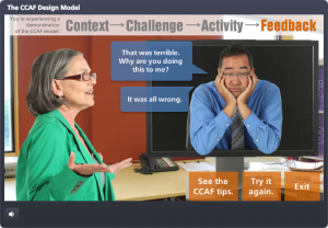
This Articulate challenge is to create a two-slide interaction that includes a content screen and a gate screen. Gate screens give learners some control and a chance to interact with the course, so they’re a nice touch.
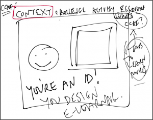
The Idea
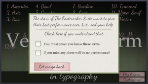
I wanted to use a gate screen to be sure the learner is ready for a final quiz.

Four-Quadrant Menu
The Design
I wanted one screen that was a tight title slide/main menu combo. As soon as I started playing with basic layouts I realized I had a big cross in the middle that looked like the Swiss flag, so that worked. And since travel in Switzerland is spectacular, I thought that should be the topic.
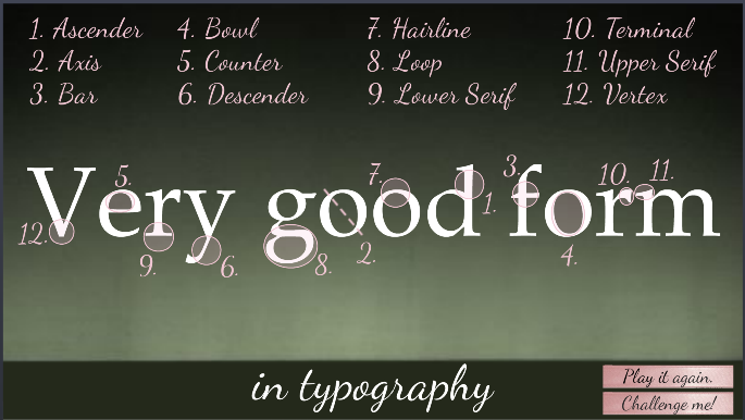
I was after a menu that made good use of hover states and the entire screen – so I split it into four quadrants and created three course sections and a final quiz.
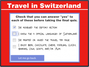
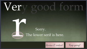
Gate Screen In Use
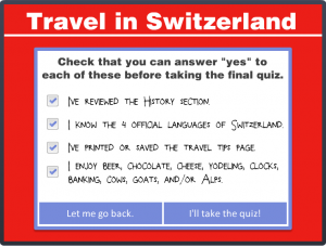
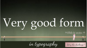
Gate Screen Completed
The Gate Screen
One way to see if someone’s ready for a quiz is to remind them of what it’s going to cover, so that’s what I did.
Once the learner has checked off each item to confirm they’ve adequately reviewed it, the option to take the quiz becomes available. They’re also given the option to return to the main menu at any time.
See It!
I don’t know why I’m so fond of this one. Maybe my Swiss grandparents would have been proud? Who knows, but I like the compact, responsive design. It’s kind of like those little German (and Italian and French) cars that zip up and down the Alps.
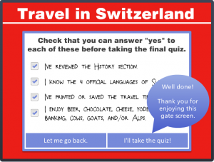
Success!