
Select Image to Launch Demo
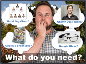
 This week’s Articulate challenge is to create an interactive organizational chart or a “meet the team” sort of thing. Org charts and the like bore the heck out of me, but I like the idea of introducing someone to their new team or job, so I went with that.
How Did We End Up On Vacation?
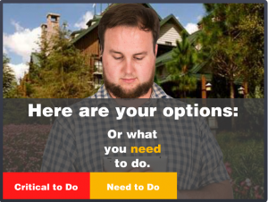
When you start a new job, you’re a stranger in a strange land. All I did was apply that situation to visiting a new place rather than starting a new job. In either situation, you need to get your bearings and figure out what’s going on very quickly.
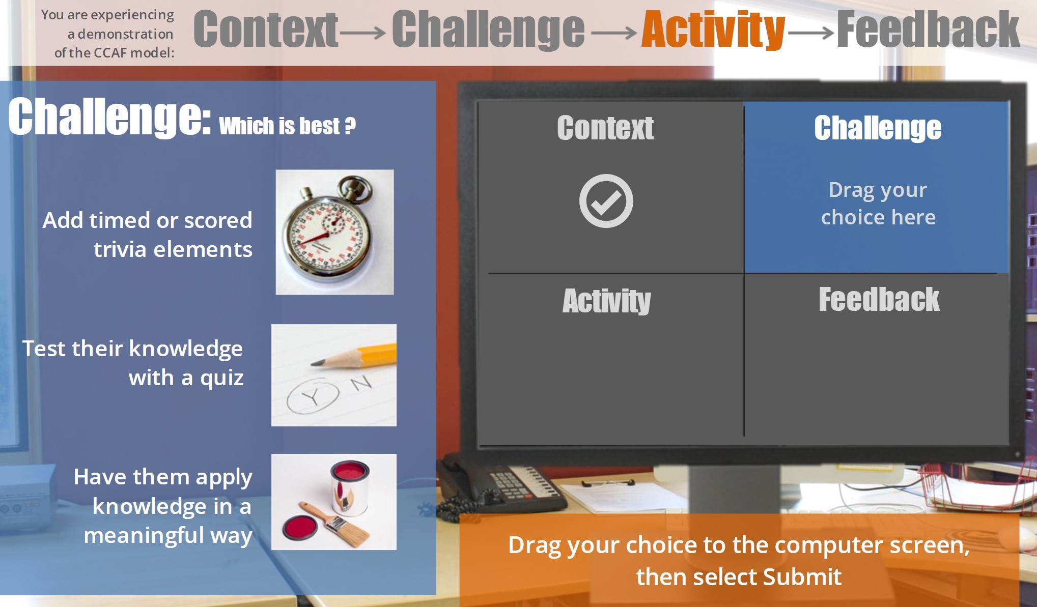
Chunking By Importance
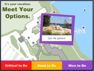
In this case I sorted the information by relative importance, but in a work environment it could be sorted by task or department or time increment or anything else. The idea is to break it into chunks that have more meaning and don’t have to be accessed all at once, since information overload is as good as no information at all.
The Interaction
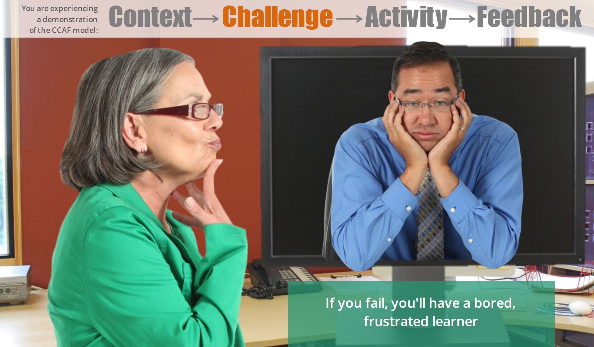
I had planned on (and spent way too much time on) fleshing out the detail at the end. As time ran out I trashed all of that and fleshed out the front end instead. It was the right thing to do and it ended up being a good demo of how to present information like this – including how to present it in context and at the point of need. I like it.
Ready to Navigate Your Vacation?
If so, feel free to take this demo out for a spin!
Select Image to Launch Demo

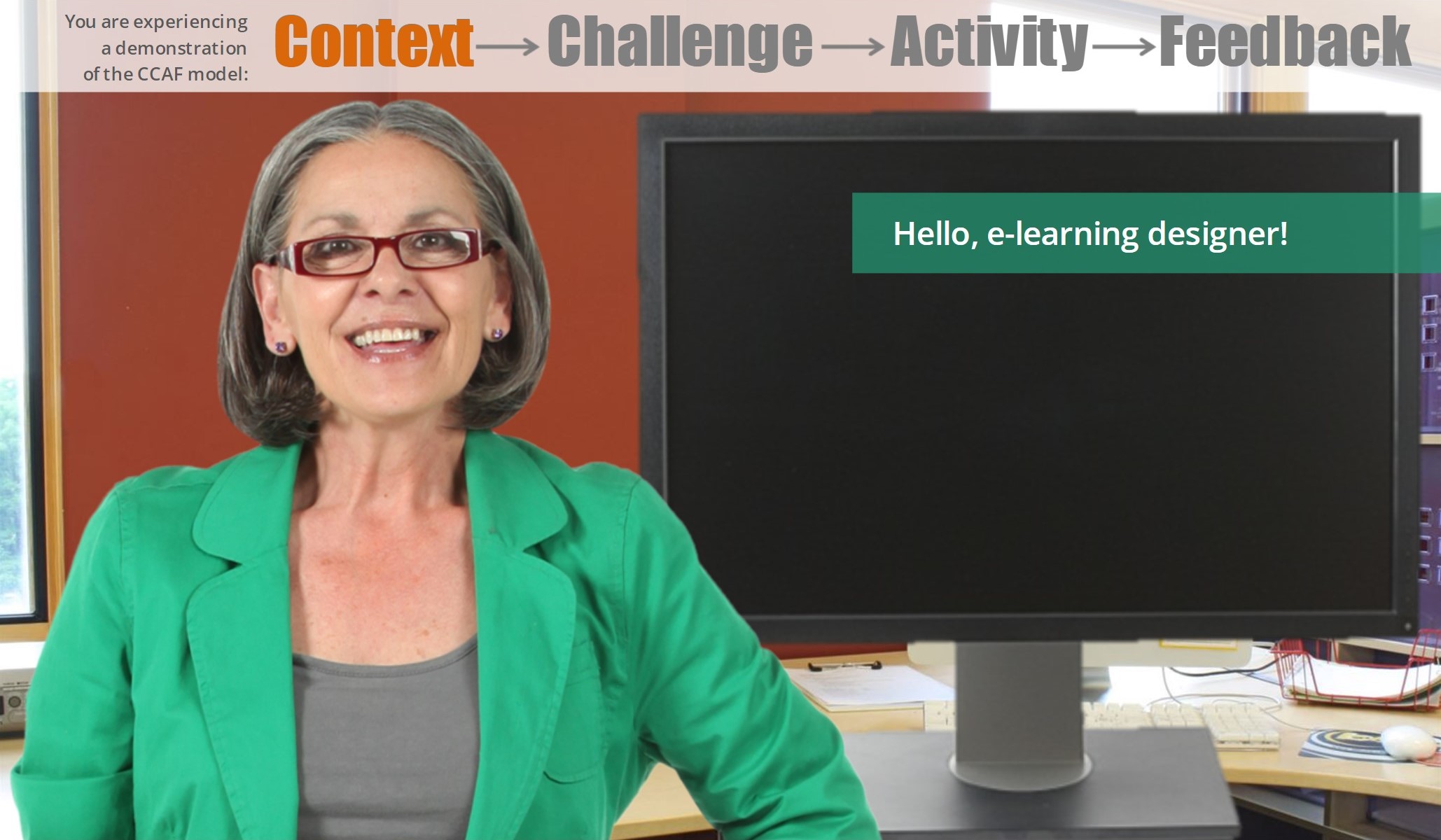
 My first question in every new project is: “How will the learner use this information in the real world?” Then I try to design the piece from the learner’s post-course real-world point of view to show them why they’ll care about it and when where and how it’s going to come in handy. Using effective context can add lot of interest and learner motivation, too.
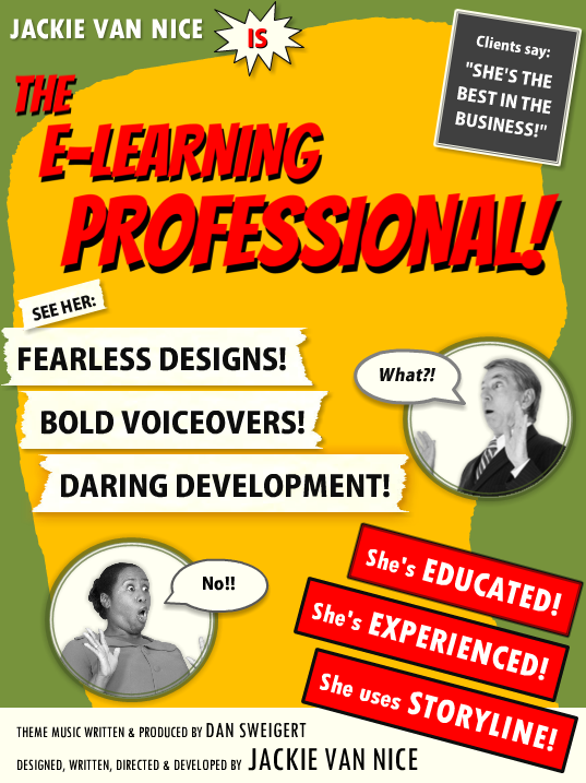

 Résumé Elements: I kept it simple and included my (boldly-phrased) skill set, education, experience, and the main software I use. The sections for education and experience were by far the biggest creative challenges, but in the end I was happy to find a quick way to blow through them that still maintains the tone and theme.