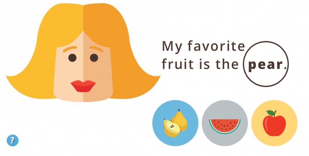
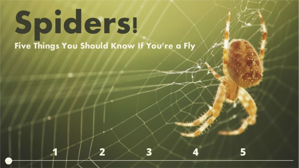
This week’s challenge is to create a photo slider. I’d never made one before, but with Storyline 2 and a few photos in hand, I was ready!
The Idea
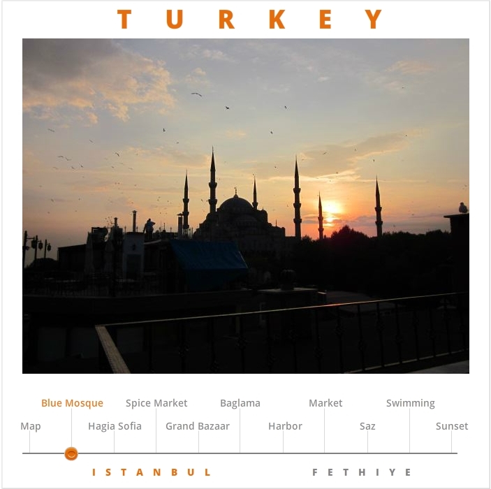
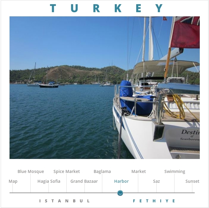
To make the slider I trotted out some pics I took in Turkey. I wanted the demo to be simple, invite exploration, and be self-explanatory.
The Design
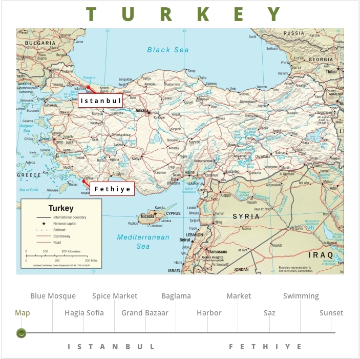
To establish the scene I started with an overview map of Turkey with my two photo locations highlighted.
I wanted the user to be able to see the topics of the photos up front so it’s easy to get a quick overview of the content and go directly to whatever they’d like.
Color provides the visual cue to tell you where you are. The title (Turkey), location (Map, Istanbul, or Fethiye) and the slider thumb all change color in unison depending on what you’re viewing.
I’m actually quite happy with the idea and the effect. It’s subtle in this demo, but I’d love to use it again.
Ready for Some Turkey?
You can see the demo right here!
*See: Mars Needs Women. These things happen after a long day.


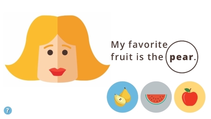
 The Idea: Vocabulary Practice
 I wanted it to be in Turkish, partly because it would be way cool and partly because I need the practice, but to save time I stuck with English.
 I kept it emoji-simple. From layout to images to instructions it’s easy to figure out, easy to navigate, and easy to understand the teaching points.